A brand can have the right logo, a carefully selected color palette, and a strong visual identity—and still feel inconsistent.
Often, typography is part of the reason.
Fonts influence how people experience written information before they consciously process every word. A typeface can make a brand feel editorial, technical, friendly, luxurious, energetic, traditional, or highly functional. The same message can create a completely different impression depending on how it is presented.
That does not mean choosing a font should be based on personal taste.
Your brand typography should support the brand’s positioning, personality, audience, content requirements, and visual system. It also needs to work across the environments where the brand actually appears: websites, social media, presentations, advertisements, documents, packaging, and digital products.
In 2026, this matters even more because brands are producing content across more formats and at greater speed. A typography system needs to be recognizable, flexible, readable, and practical enough for repeated use.
This guide explains how to choose fonts for your brand, how to build a typography system, how many fonts you actually need, which mistakes to avoid, and how typography fits into a larger brand identity and design system.
What You'll Learn
ToggleWhat Is Brand Typography?
Brand typography is the intentional selection and use of typefaces, fonts, weights, sizes, spacing, hierarchy, and text styles that form part of a brand’s visual identity.
It is more than choosing one attractive font.
A complete typography system determines how different types of information should look and behave.
For example, a brand might define:
- one typeface for headings;
- another for body text;
- specific weights for hierarchy;
- consistent heading sizes;
- paragraph spacing;
- button styles;
- captions;
- labels;
- numerical information;
- special display treatments.
Together, these decisions create a recognizable typographic language.
This is why typography should be considered alongside your brand identity rather than treated as an isolated design choice.
Why Typography Matters in Branding
Typography performs several jobs simultaneously.
First, it needs to communicate information clearly.
Second, it contributes to the personality of the brand.
Third, it creates hierarchy.
Fourth, it helps establish visual consistency.
And finally, typography can contribute to recognition.
Imagine two fictional brands selling the same type of product.
The first uses a narrow serif typeface, generous spacing, restrained layouts, and elegant editorial proportions.
The second uses a geometric sans serif, large headlines, tight spacing, and bold interface elements.
The words could be identical.
The brands would not feel identical.
Typography is therefore part of the visual meaning surrounding the words.
Typography Is Not the Same as Font Selection
This distinction is important.
Font selection is choosing the typefaces you will use.
Typography is how you use them.
You can choose an excellent typeface and still create poor typography through:
- weak hierarchy;
- insufficient contrast;
- inconsistent sizes;
- poor line spacing;
- excessive font weights;
- difficult reading widths;
- inconsistent alignment;
- inappropriate text treatments.
A strong brand typography system therefore combines typeface selection with rules for application.
The Main Types of Fonts
You do not need to become a typographer to make informed brand decisions, but understanding the major categories helps.
Serif Fonts
Serif typefaces contain small finishing strokes at the ends of letters.
They are commonly associated with qualities such as tradition, editorial sophistication, authority, heritage, and refinement.
They can work particularly well for brands that want a more established or literary character.
However, “serif = premium” is an oversimplification.
A serif can also feel traditional, academic, playful, contemporary, or highly expressive depending on its construction and application.
Sans Serif Fonts
Sans serif typefaces do not have traditional serifs.
They are widely used in digital interfaces, corporate identities, technology brands, editorial systems, and modern visual identities.
They can communicate qualities such as clarity, simplicity, neutrality, efficiency, and modernity.
Again, there is considerable variation.
A geometric sans serif and a humanist sans serif can produce very different impressions even though both belong to the sans serif category.
Display Fonts
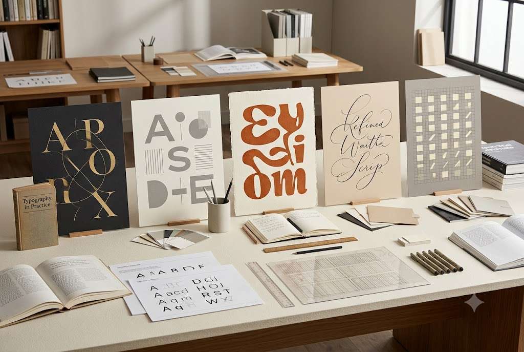
Display typefaces are designed primarily for larger sizes and expressive applications.
They can be useful for headlines, campaigns, packaging, logos, editorial covers, and other prominent brand moments.
They are usually less appropriate for long paragraphs.
A display font can give a brand distinctive character, but it should be used strategically rather than everywhere.
Script and Handwritten Fonts
Script and handwritten styles can communicate personality, craft, elegance, informality, or creativity.
They can work well for particular brand categories and campaigns.
However, they are usually more difficult to use consistently across an entire digital system.
If used excessively, they can also reduce readability and make the identity feel less controlled.
Monospace Fonts
Monospace typefaces allocate equal horizontal space to characters.
They have strong associations with computing, code, technical systems, engineering, and certain contemporary editorial styles.
They can be useful as an accent typeface even when they are not suitable for primary body text.
How to Choose Fonts for Your Brand
The most effective way to choose a brand font is to start with strategy rather than browsing font libraries randomly.
Step 1: Start With Your Brand Personality
Before opening a font website, describe how you want the brand to feel.
Consider a spectrum rather than a list of generic adjectives.
Is the brand:
Formal or casual?
Traditional or contemporary?
Quiet or expressive?
Technical or human?
Premium or accessible?
Serious or playful?
Minimal or decorative?
This gives you a decision-making filter.
For example, a financial technology company may need to communicate reliability and clarity without looking indistinguishable from every other technology company.
A children’s creative education brand may require a completely different typographic personality.
The font should support the strategic character.
Step 2: Understand Your Audience
Typography should also make sense to the people who encounter it.
Consider the audience’s expectations.
A typeface that feels appropriate for a luxury editorial publication may not be appropriate for a productivity application.
A highly expressive display font may work for an independent fashion label but become distracting for a legal service.
Audience expectations do not mean following stereotypes.
They mean understanding the visual conventions people already encounter in a particular category and deciding deliberately whether to follow, adapt, or challenge them.
This connects typography with the broader work of brand positioning.

Step 3: Consider Your Category
Study the typography used by competitors.
Do not do this to copy them.
Do it to understand the visual territory.
Suppose you are building a brand in a category where nearly every competitor uses:
- bold geometric sans serifs;
- black and blue;
- large uppercase headings.
You now know the category has a recognizable visual pattern.
Your strategic question becomes:
Should our typography reinforce that expectation or create a meaningful distinction?
That decision should connect with your competitive positioning and brand differentiation strategy.
Step 4: Define the Job Each Typeface Needs to Do
Do not choose fonts simply because they look good together.
Give each typeface a role.
For example:
Primary typeface: headlines and major brand communication.
Secondary typeface: body copy and long-form reading.
Accent typeface: selected campaigns, labels, or special visual moments.
A brand may only need one typeface.
Another may need two.
Very few brands need a large collection of unrelated typefaces.
How Many Fonts Should a Brand Use?
There is no universal rule that says every brand must use exactly two fonts.
A better approach is to ask:
How many typefaces does the system need to create hierarchy and personality without creating unnecessary complexity?
For many brands, one carefully selected typeface with multiple weights can provide everything required.
For others, pairing two complementary typefaces creates useful contrast.
For example, you might use:
Editorial serif + neutral sans serif
or
Expressive display + functional sans serif
The important thing is not the number.
It is the relationship between the typefaces.
How to Pair Fonts
Font pairing is about creating useful contrast without creating visual conflict.
A simple principle is:
Contrast in character, consistency in purpose.
For example, a distinctive serif headline typeface can work with a restrained sans serif body typeface.
The contrast gives the system personality while the simpler body typeface protects readability.
Two highly expressive fonts may compete for attention.
Two fonts that are almost identical may provide little meaningful contrast.
When testing a pair, examine them in actual brand applications rather than only viewing the alphabet.
Create a sample containing:
Headline
A short supporting statement.
A paragraph of realistic body copy.
A button.
A caption.
A navigation label.
This will reveal far more than looking at isolated specimens.
Typography Hierarchy: The Part Many Brands Miss
Choosing fonts is only the beginning.
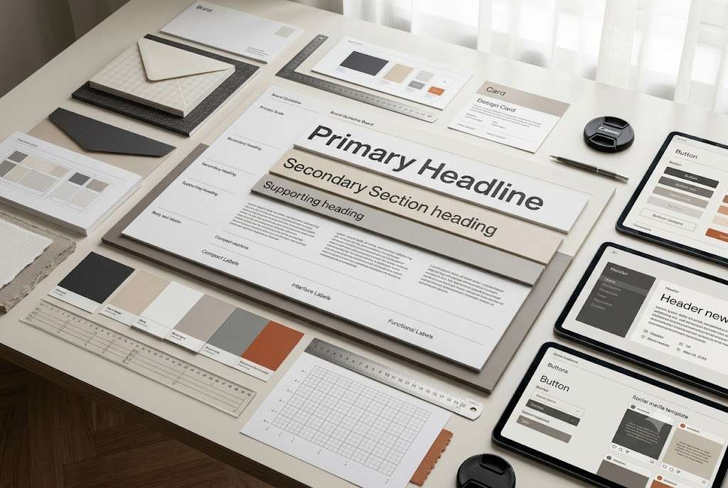
A brand also needs hierarchy.
A simple hierarchy might look like:
H1 — Main headline
Large and distinctive.
H2 — Section heading
Clearly subordinate to H1.
H3 — Supporting heading
Smaller but still prominent.
Body — Main reading text
Optimized for comfortable reading.
Caption — Supporting information
Visually secondary.
Label — Interface or organizational text
Compact and functional.
The exact sizes will depend on the medium.
A website, Instagram post, presentation, and printed brochure should not necessarily use identical sizes.
The hierarchy should remain conceptually consistent while adapting to the application.
Typography and Readability
Brand personality should never become an excuse for poor readability.
This is particularly important for websites and long-form content.
Consider:
- character size;
- line height;
- line length;
- contrast;
- weight;
- paragraph spacing;
- responsive behavior;
- mobile readability.
A typeface that looks excellent in a large desktop headline may perform poorly in a small mobile paragraph.
Likewise, extremely wide text columns can make long articles difficult to read even when the font itself is excellent.
Typography has to work in context.
Web Typography vs Brand Typography
Your brand typeface needs to survive the digital environment.
Before selecting a font, check whether it is suitable for web use and whether its licensing permits the applications you require.
Also check:
- available web formats;
- supported weights;
- language coverage;
- variable-font availability where relevant;
- loading considerations;
- browser behavior;
- fallback options.
A beautiful typeface that becomes impractical to deploy across your website, social templates, presentations, and documents may not be the right choice for the complete brand system.
This is one reason practical testing should happen before finalizing the typography.
Typography Licensing Matters
Typography is also a legal and operational consideration.
Not every font available online can automatically be used for every commercial application.
Before adopting a typeface, check its license and intended use.
You may need to distinguish between:
- personal use;
- commercial use;
- desktop installation;
- web embedding;
- app or software use;
- logo or trademark applications;
- client redistribution.
If a font is being used across a client brand, the licensing requirements may also affect how files are delivered to the client.
Typography is therefore part of brand governance, not just aesthetics.
How Typography Fits Into a Brand Design System
Typography becomes considerably more useful when it is documented as a system.
Instead of saying:
“Use this font.”
A stronger brand system might define:
Primary Typeface: [Selected typeface]
Secondary Typeface: [Selected typeface]
Heading Weight: Bold or semibold
Body Weight: Regular
Accent Weight: Medium
H1: Large display style
H2: Section style
Body: Reading style
Caption: Supporting style
Button: Interface style
The actual values should then be documented for the relevant platforms.
This is one reason typography is an important component of a brand design system.
A design system turns individual design decisions into repeatable rules.
A Practical Brand Typography Framework
When evaluating a potential font, use five questions.
1. Strategic Fit
Does the typeface support the brand’s positioning and personality?
2. Audience Fit
Will the audience find it appropriate, readable, and credible?
3. Distinctiveness
Does it help the brand develop a recognizable visual character?
4. Functionality
Does it work across websites, social media, documents, presentations, and other important touchpoints?
5. System Compatibility
Can it support a complete hierarchy without requiring unnecessary additional fonts?
A typeface that looks beautiful but fails several of these tests is not necessarily a strong brand choice.
Example: Choosing Typography for a Modern Strategy Studio
Imagine a fictional branding consultancy called Northline Studio.
The company wants to be perceived as strategic, sophisticated, modern, and approachable.
The founder initially selects a highly decorative serif because it looks “luxurious.”
During testing, several problems appear.
The serif works well in headlines but becomes difficult to read in longer paragraphs.
It also feels more fashion-oriented than strategic.
The team then tests a restrained editorial serif for headlines with a highly readable sans serif for body content.
The second combination provides clearer hierarchy and better communicates the intended positioning.
The important lesson is not which fonts Northline selected.
It is the process.
The typography was selected because of the brand’s strategic requirements, not because one font looked attractive in isolation.
Common Brand Typography Mistakes
Choosing a Font Because It Is Trendy
Typography trends change.
A typeface can be popular today and visually overused tomorrow.
Trends can be useful references, but they should not replace strategic reasoning.
Your brand may use a contemporary typeface while still maintaining a distinctive identity.
Using Too Many Fonts
Adding more fonts does not automatically create sophistication.
It often creates hierarchy problems.
When every heading, quote, caption, button, and graphic uses a different typeface, the system becomes difficult to control.
Using One Weight for Everything
A single font can still create strong typography.
But if everything uses the same size and weight, the reader has difficulty understanding what matters most.
Hierarchy is created through relationships.
Ignoring Long-Form Content
A font that works beautifully for an Instagram headline may be uncomfortable for a 2,500-word article.
If your brand publishes regularly, test typography in realistic content.
Your [brand content system] should not look good only in promotional graphics.
Poor Mobile Typography
Desktop typography can hide problems.
Mobile layouts expose them.
Headlines can wrap awkwardly, buttons can become cramped, and body text can become difficult to read.
Always test your brand typography at multiple screen sizes.
Confusing "Premium" With "Decorative"
A common branding mistake is assuming that sophisticated brands must use elaborate serif fonts, thin lettering, or extreme letter spacing.
Premium visual communication often comes from restraint, hierarchy, proportion, consistency, and intentionality.
The typeface itself is only one component.
How AI Changes Brand Typography in 2026
AI tools can now generate large quantities of branded content quickly.
That makes typography governance more important rather than less important.
Without clear rules, AI-assisted content can introduce:
- inconsistent typography;
- random font combinations;
- inappropriate hierarchy;
- inconsistent capitalization;
- different visual styles;
- poorly structured layouts.
A documented typography system gives both human designers and AI-assisted workflows a defined visual framework.
The principle should be simple:
Use AI to accelerate production, not to randomly redefine the brand.
The final brand system should still determine what typefaces, hierarchy, spacing, and applications are acceptable.
Creating Your Brand Typography Guidelines
Once you have selected your typefaces, document them.
Your brand guidelines should explain how typography is used.
Include actual examples rather than only listing font names.
For example:
Primary Typeface
Use for major headlines and high-priority brand communication.
Secondary Typeface
Use for body copy, supporting information, and long-form reading.
Typography Hierarchy
Define the relationship between headline, subheading, body, caption, label, and button styles.
Usage Rules
Explain appropriate weights, alignment, capitalization, spacing, and special treatments.
Examples
Show typography applied to real website sections, social graphics, presentations, and other major touchpoints.
This makes the typography easier to reproduce consistently.
Your Brand Typography Audit
Before finalizing your typography system, review the brand as it currently exists.
Look at your website.
Then examine your social media.
Review your PDFs, presentations, advertisements, emails, and digital products.
Ask:
Are we using the same typographic language?
Are headings clearly structured?
Are body fonts readable?
Are we using unnecessary typefaces?
Does the typography support our positioning?
Does it still reflect the brand we are building today?
If the answers reveal multiple inconsistencies, the issue may not require an entirely new typeface.
You may simply need a stronger typography system.
This is exactly why a brand audit should happen before making major design changes.
Brand Typography and Brand Recognition
Typography can also contribute to recognition.
People do not experience a brand through its logo alone.
They encounter repeated combinations of:
- color;
- typography;
- layout;
- imagery;
- graphic elements;
- language;
- interaction patterns.
Over time, these recurring cues can become associated with the brand.
This is one reason a consistent typography system can contribute to the broader goal of brand recognition.
Consistency does not mean making every piece of content identical.
It means creating enough recurring visual signals that different brand touchpoints still belong to the same visual world.
When Should You Change Your Brand Fonts?
Changing typography should not automatically be part of every redesign.
Consider changing your brand fonts when:
- the current typefaces no longer support the brand’s positioning;
- readability problems exist;
- licensing or technical limitations have emerged;
- the business has moved into a different category;
- the audience has changed significantly;
- the existing system cannot support new applications;
- the typography has become unnecessarily complicated;
- the current visual identity has evolved beyond its original typography.
But if the current typefaces still work strategically and functionally, changing them simply because they feel “old” may not be necessary.
Your brand audit should provide the evidence.
Brand Typography vs. Brand Identity
Typography is one component of the larger visual identity.
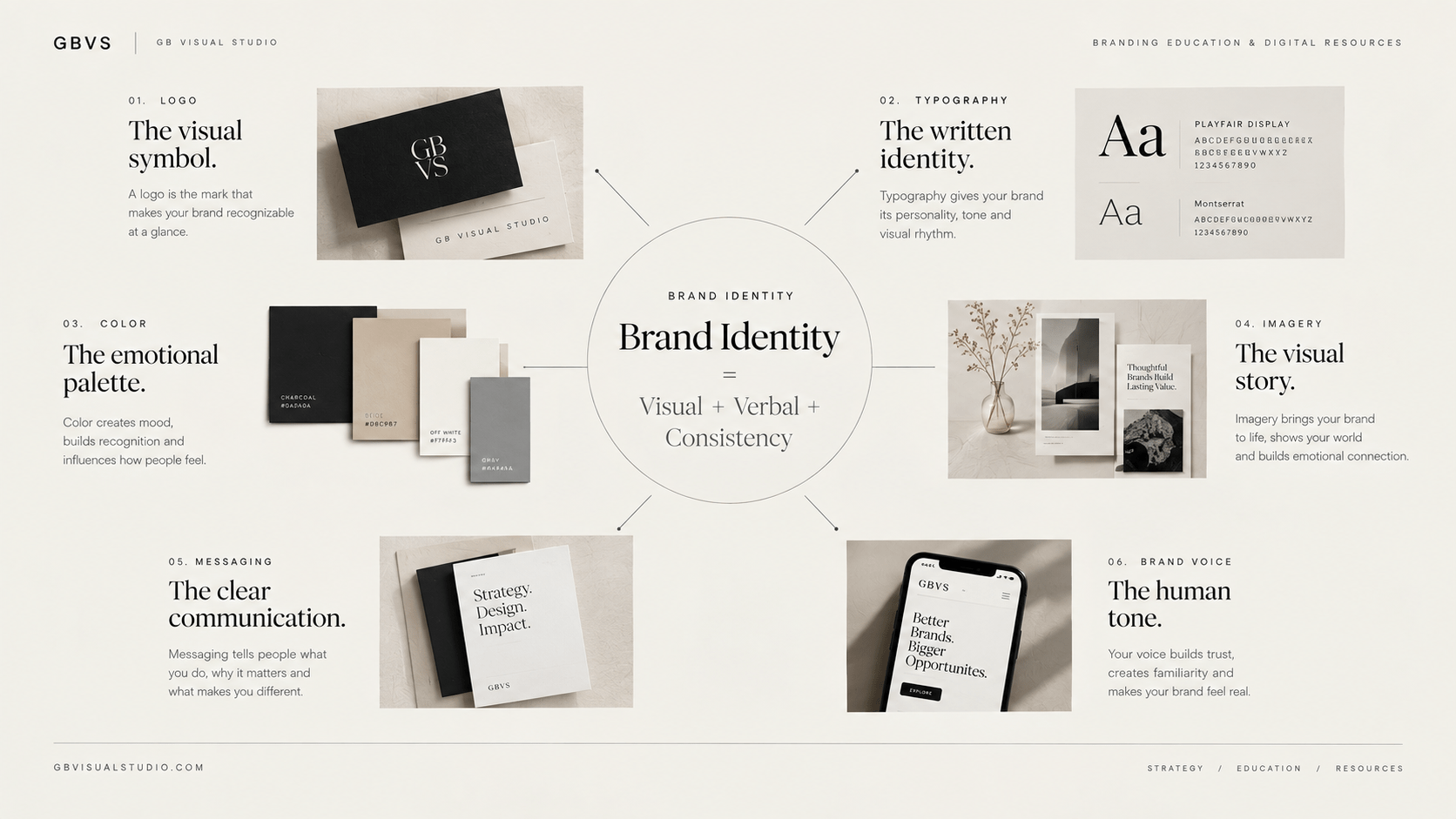
A complete identity also includes elements such as:
- logo;
- color;
- typography;
- imagery;
- graphic language;
- layouts;
- iconography;
- other visual assets.
Your typography should therefore complement the rest of the identity.
A highly expressive font paired with an extremely restrained logo and minimal visual system may create unnecessary tension.
Likewise, a neutral typeface can be elevated through a distinctive layout, color system, imagery, and graphic language.
Typography should work as part of the whole.
From Typography to a Complete Brand Design System
Once typography is defined, the next step is to connect it with the other visual rules.
Your system can combine:
Logo + Color + Typography + Layout + Spacing + Imagery + Components + Templates
This creates a more scalable way to manage the brand.
Instead of asking a designer to reinvent every Instagram post, presentation, landing page, or document, the system provides a set of established visual decisions.
Your guide to building a brand design system covers this process in greater detail.
Final Takeaway
Choosing a brand font is not a matter of finding the most beautiful typeface.
It is a strategic design decision.
The right typography should support your brand positioning, communicate an appropriate personality, work for your audience, remain readable, function across important touchpoints, and fit into a repeatable visual system.
Start with strategy.
Understand your audience.
Study the competitive environment.
Define the role each typeface needs to play.
Test fonts in real applications.
Build a hierarchy.
Document the rules.
Then evaluate the system as a whole.
A strong brand does not need dozens of fonts.
It needs typography that is intentional, recognizable, readable, and repeatable.
When the typography works with the rest of the identity instead of competing with it, even simple brand applications can feel considerably more coherent.
Frequently Asked Questions
How do I choose a font for my brand?
Start with your brand positioning and personality rather than selecting fonts based purely on appearance. Consider your audience, category, differentiation, readability requirements, applications, and the role the typeface will play in the overall typography system.
How many fonts should a brand have?
There is no fixed number. Many brands can operate effectively with one typeface and multiple weights, while others benefit from two complementary typefaces. The goal is to create hierarchy and personality without unnecessary complexity.
Should a brand use serif or sans serif fonts?
Either can work. The appropriate choice depends on the brand’s strategic personality, audience, category, readability requirements, and visual identity. Serif and sans serif are broad categories containing typefaces with very different characteristics.
What is a brand typography system?
A brand typography system defines the typefaces, weights, sizes, hierarchy, spacing, and usage rules that govern how text appears across the brand’s major touchpoints.
Can I use a free font for my brand?
Potentially, but always check the font’s license and permitted commercial uses. “Free to download” does not necessarily mean unrestricted use in every commercial context.
Should my website and social media use the same fonts?
They should generally belong to the same typography system, but exact sizes and applications can adapt to each platform. The goal is recognizable consistency rather than identical formatting everywhere.
Is typography part of brand identity?
Yes. Typography is one of the core components of visual identity, alongside elements such as logo, color, imagery, and graphic language.
Should I change my fonts during a rebrand?
Not necessarily. A brand audit should first determine whether the existing typography is actually causing a strategic, functional, or consistency problem. If it still supports the brand effectively, it may be possible to retain it while improving the broader system.