You’ve built your brand. You have a logo. You’ve chosen your colors. You know your voice.
Now you need to document it.
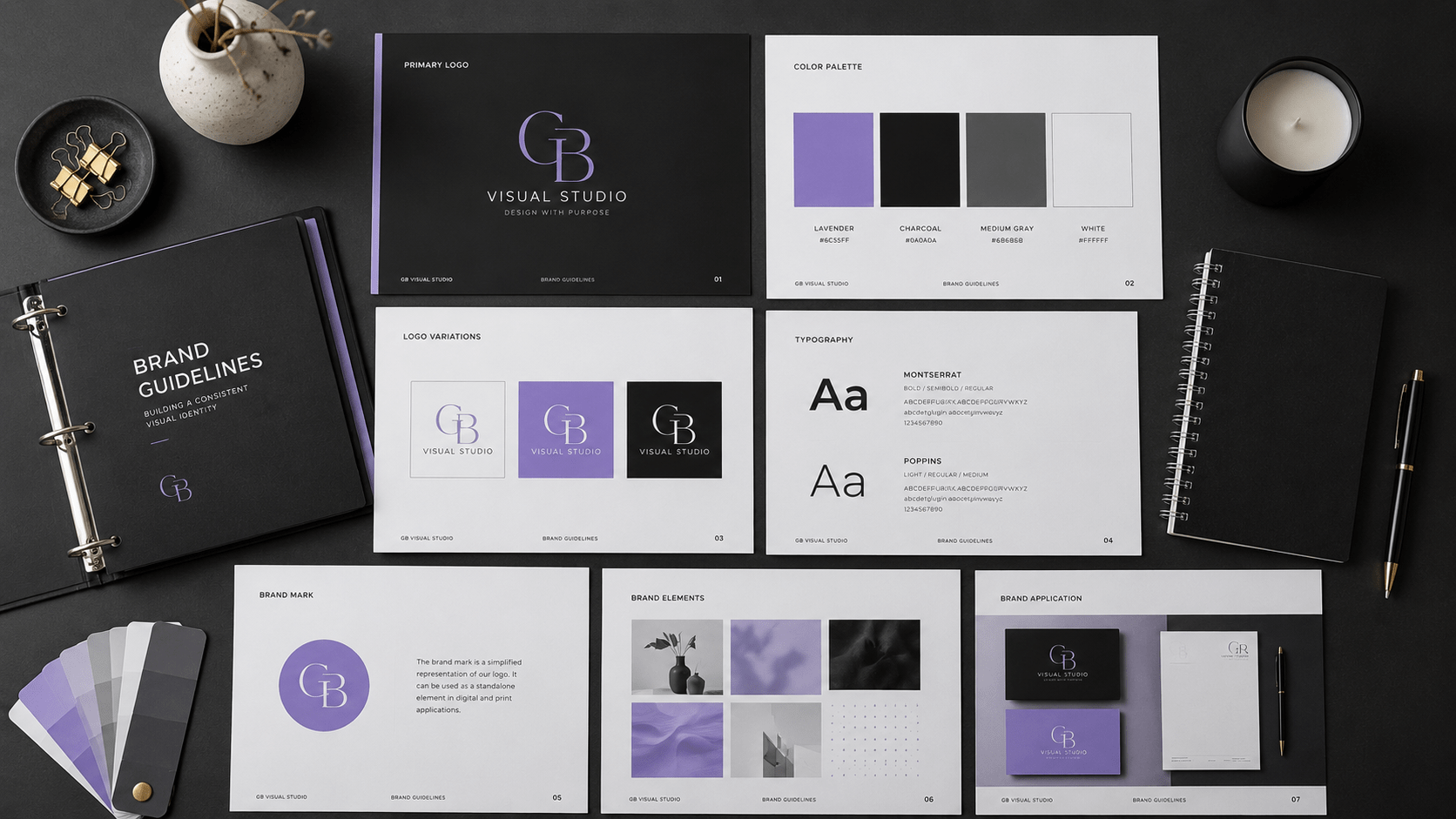
Brand guidelines are the rulebook for your brand a document (or set of documents) that shows everyone how to use your brand consistently. It’s the bridge between your brand strategy and how it actually shows up in the world.
Without guidelines, your brand gets diluted. Your logo gets resized wrong. Your colors shift across platforms. Your tone changes in emails versus social media. Inconsistency erodes the brand equity you worked so hard to build.
In this guide, you’ll learn what to include in brand guidelines, why they matter, and how to create them without overthinking it.
What Are Brand Guidelines? A Simple Definition
Brand guidelines are a documented set of standards that explain how to use your brand consistently.
They answer questions like:
- How big should my logo be?
- What colors should I use?
- What fonts do I use?
- How do I write in my brand voice?
- What imagery style fits my brand?
- How do I structure my layouts?
Brand guidelines exist to protect your brand and make it easier for anyone you, your team, freelancers, contractors to represent your brand correctly.
Think of them as instructions that say: “This is who we are. This is how we show up. Follow this format.”
Why Brand Guidelines Matter
You might be thinking: “I’m a solo freelancer. Do I really need formal guidelines?”
Yes. Here’s why.
Consistency Builds Recognition
When your brand looks and sounds the same everywhere, people recognize you faster. Recognition builds trust. Trust builds loyalty.
Without guidelines, inconsistency confuses people. “Wait, is this the same business?” that’s the question you don’t want them asking.
Guidelines Save Time
When standards are documented, you don’t have to decide every time. You don’t spend 30 minutes trying to remember which shade of blue you used. You reference the guidelines and move on.
This matters even more as you grow and work with contractors or team members.
They Protect Your Brand
Guidelines prevent misuse. They stop someone from using your logo in a way that weakens it. They ensure your brand is represented with respect.
They Give Permission
Guidelines also show people what they can do. A designer knows what fonts pair well. A contractor knows your tone. Someone creating social content knows what imagery fits.
Guidelines empower people to represent your brand correctly.
They Increase Perceived Value
Brands with clear, documented guidelines feel more professional and established. This affects how people perceive your pricing, your credibility, and your quality.
What You'll Learn
ToggleEssential Elements to Include
Brand guidelines don’t have to be 100 pages. They need to be useful.
Here are the core sections most brands need:
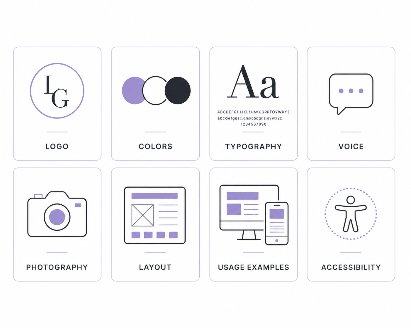
1. Brand Overview
Start with a brief statement of who you are, what you do, and what you stand for. This gives context for all the rules that follow.
Example:
“GB Visual Studio teaches entrepreneurs and small business owners how to build strategic brands. We believe positioning comes before aesthetics. Our brand is minimal, strategic, and premium.”
2. Logo Specifications
Show the logo. Explain how it should be used. Include:
- Logo file formats (PNG, SVG, PDF)
- Minimum and maximum sizes
- Clear space requirements (space around the logo)
- Color variations (full color, black, white, reversed)
- What NOT to do (don't stretch it-add effects, don't change colors)
3. Color Palette
List your primary and secondary colors with exact specifications:
- Hex codes
- RGB values
- Pantone codes (if relevant)
- When to use each color
- Accessibility notes (contrast ratios)
4. Typography
Specify:
- Primary font (headings)
- Secondary font (body)
- Font sizes for different contexts
- Font weights and styles
- Letter spacing guidelines (where relevant)
5. Voice and Tone
Describe how you communicate:
- Your brand personality
- The words you use and avoid
- Tone examples for different situations
- Do's and don'ts for writing
6. Photography and Imagery Style
Explain the visual style of images you use:
- Photography style (bright, moody, minimal, lifestyle, etc.)
- Illustration style (if applicable)
- Which stock photo sites you use
- What to avoid
- Image examples
7. Layout and Design Principles
Explain the spacing, alignment, and composition approach you use:
- Grid system (if applicable)
- Whitespace approach
- Alignment standards
- Composition principles
8. Usage Examples
Show how these elements come together in real contexts:
- Social media posts
- Website headers
- Email templates
- Business cards
- Presentations
The Visual Identity Section
The visual section is often the most detailed part of brand guidelines. It’s also the most visible people can see immediately if you’re following it.
Logo Guidelines
Your logo is the most protected element. Show:
- Full Logo (primary version)
- Logo Variations (horizontal, stacked, icon-only)
- Color Versions (full color, black, white, reversed)
- Clear Space Diagram (the minimum space around the logo)
- Minimum Size (how small it can go before it gets hard to read)
- Maximum Size (how large it should be in different contexts)
What NOT to Do
Show examples of logo misuse. This is important. People need to see what looks wrong so they don’t do it.
Common “don’ts”:
- Stretching or distorting the logo
- Adding drop shadows, glows, or other effects
- Changing the colors
- Adding text directly to the logo
- Using the logo on a patterned background without contrast
File Formats
Specify which file formats to use for different purposes:
- Logo.PNG — web use (transparent background)
- Logo.SVG — scalable (for printing or web)
- Logo.PDF — print (high quality)
The Voice and Messaging Section
This section is often overlooked, but it’s crucial. It’s harder to see than a color palette, which makes it easier to mess up.
Brand Personality
Describe your personality in specific terms:
Instead of: “We’re friendly and professional.”
Better: “We’re a knowledgeable mentor who explains complex ideas simply. We’re warm but strategic. We’re honest about what works and what doesn’t. We don’t use hype or jargon.”
Tone Examples
Show how your tone changes in different contexts:
On Social Media (Instagram):
“Conversational, inspirational, personal. We share observations and ask questions. Shorter sentences. Emoji when it feels natural.”
On Blog Articles:
“Educational, strategic, experience-driven. We explain complex concepts simply. We share real examples and common mistakes. Longer-form, but readable.”
In Customer Service Email:
“Warm, helpful, solution-focused. We prioritize understanding the issue. We’re direct but kind. We follow up.”
Words to Use and Avoid
Use:
- positioning
- strategy
- clarity
- intention
- premium
Avoid:
- "in today's fast-paced world"
- "unlock the power"
- "game-changer"
- jargon
- hype
Grammar and Style
- Active or passive voice (prefer active)
- Contractions (use them or don't)
- Oxford comma (yes or no)
- Capitalization style
- Abbreviations and acronyms
Logo Usage Guidelines
Let’s go deeper on logo usage because it’s where most brands slip up.
Primary Logo Placement
Show exactly where your logo should live:
- Website header
- Email signature
- Business cards
- Social media profiles
- Documents
Size Standards
Specify minimum sizes for different uses:
- Web: minimum 120px wide
- Print (business card): minimum 0.5 inches
- Print (letterhead): 1–1.5 inches
- Social media profile: 400x400px minimum
Clear Space (Whitespace)
The area around your logo should be clear no text or graphics crowding it.
Show a diagram with measurements. Example: “Maintain at least 20 pixels of clear space on all sides of the logo.
Background Requirements
Specify which backgrounds work:
- White backgrounds
- Brand color backgrounds
- Photography backgrounds (with opacity or overlay)
- What NOT to use (busy patterns, competing colors)
Do's and Don'ts
Do's
- Use the approved logo files
- Maintain the aspect ratio
- Use adequate clear space
- Pair with brand colors
Don't:
- Stretch or distort
- Rotate
- Add effects (drop shadow, stroke, glow)
- Change the colors
- Use outdated versions
Color Palette Standards
Colors are the most memorable part of your visual identity.
Primary Colors
Specify your main brand colors:
- Name (e.g., "Brand Black")
- Hex code: #0A0A0A
- RGB: 10, 10, 10
- Pantone: Black C (or closest match)
- Primary use: Background, primary text
Secondary Colors
List accent colors:
- Name: "Lavender"
- Hex: #BAAFFF
- RGB: 186, 175, 255
- Primary use: Highlights, links, emphasis
Neutral Colors
Include whites, grays, and neutrals used frequently:
- Off-white: #F8F8F8
- Light gray: #E8E8E8
- Medium gray: #999999
Accessibility Standards
Specify contrast ratios:
- Text on background: minimum 4.5:1 for normal text
- UI components: minimum 3:1
- Show which color combinations pass WCAG AA standards
When to Use Each Color
Give clear guidance:
- Primary color: primary backgrounds, main headers, primary buttons
- Secondary color: links, accents, highlights (no more than 20% of design)
- Neutral colors: body text, secondary text, dividers
Colors NOT to Use
If there are colors you explicitly don’t use, show them:
- We don't use neon colors
- We avoid red and orange
- We don't use metallic or gradient colors
Typography Guidelines
Typography is how people read your brand. It matters:
Primary Font (Headings)
Specify:
- Font name: Montserrat
- When to use: All headings (H1, H2, H3)
- Weights available: Bold (700), SemiBold (600)
- Sizes: H1 = 48px, H2 = 36px, H3 = 28px
- Line height: 1.2
- Letter spacing: 0 (or specify if different)
Secondary Font (Body)
Specify:
- Font name: Poppins
- When to use: Body text, paragraphs
- Weights: Regular (400), Medium (500)
- Size: 16px for web, 12pt for print
- Line height: 1.6 (for readability)
- Letter spacing: 0.5px
Font Pairing Rationale
Explain why these fonts work together:
“Montserrat is modern and geometric (headings). Poppins is friendly and round (body text). Together they create a professional but approachable aesthetic.”
Usage Examples
Show real examples:
- Headline in Montserrat Bold
- Body text in Poppins Regular
- Emphasis text in Poppins Medium
What NOT to Do
Show real examples:
- Don't use more than two fonts
- Don't use decorative fonts for body text
- Don't set body text smaller than 14px
- Don't use all caps for body text (headings are okay)
Photography and Imagery Style
Imagery is often overlooked in brand guidelines, but it’s powerful.
Photography Style
Describe the visual aesthetic:
- Lighting: Natural, soft, not overly bright
- Composition: Clean, minimal, often negative space
- Subjects: Real people, real situations (not staged)
- Color Treatment: Warm tones, muted saturation
- Mood: Professional but approachable, never corporate
Stock Photos vs. Original
Specify:
- Prefer original photography when possible
- Use Unsplash and Pexels for complementary images
- Avoid generic stock photos (avoid Shutterstock clichés)
Illustration Style
If you use illustrations:
- Line weight: thin or thick?
- Color: flat or gradient?
- Style: minimalist, detailed, playful?
- Show examples
Image Examples
Include 3–5 example images that fit your aesthetic. Show what does and doesn’t work.
Common Mistakes in Brand Guidelines
I see brands make these mistakes in their guidelines:
Mistake 1: Too Prescriptive
Guidelines that are too rigid stifle creativity and become outdated quickly.
Better approach: Give principles and examples, not absolute rules for every scenario.
Mistake 2: Incomplete Visual Documentation
They specify the logo and colors but forget about imagery, icons, illustrations, or layout principles.
Better approach: Document everything people will need to represent your brand.
Mistake 3: No Real-World Examples
Guidelines that show isolated elements but no actual application.
Better approach: Show how everything works together on a website, social media post, or email.
Mistake 4: Missing Voice Guidelines
The visual part is perfect, but there’s no guidance on how to write or communicate.
Better approach: Include tone of voice, messaging examples, and do’s and don’ts.
Mistake 5: Nobody Knows They Exist
Guidelines are created, locked away, and never shared with the people who need them.
Better approach: Make them accessible. Share them with your team, contractors, and partners.
How to Create Your First Guidelines
You don’t need to hire an agency or spend months creating guidelines.
Step 1: Gather Your Brand Assets
Collect:
- Logo files (all versions)
- Color palette with codes
- Font files or names
- Brand photography examples
- Social media posts that feel right
- Website screenshots
Step 2: Document the Visual System
For each element, create a one-page reference:
- Logo: show it, list the files, show clear space
- Colors: list hex codes and usage guidelines
- Fonts: show headings and body text
- Imagery: show 3–5 examples
Step 3: Write Your Voice Guidelines
Describe your brand personality in 3–5 sentences. Then show examples:
- A good social media post
- A good email
- A good blog opening
Step 4: Create Usage Examples
Show 2–3 real examples of your brand in use:
- A social media post
- A website section
- A business card or email signature
Step 5: Format It
Options:
- Google Doc (simplest, easy to share)
- Notion (organized, searchable)
- PDF (professional, locked)
- Figma (visual, interactive)
Start simple. You can expand later.
Tools to Use
- Canva — design and share guidelines (affiliate)
- Figma — design-focused guidelines
- Notion — documentation and organization
- Google Docs — simplest option
Conclusion
Brand guidelines seem like a tedious, administrative task. But they’re actually one of the most valuable investments you can make in your brand.
Guidelines free you from reinventing decisions every time. They ensure consistency. They protect your brand equity. They make it easier for anyone to represent your brand correctly.
You don’t need perfect guidelines. You need useful ones.
Start by documenting what you already have: your logo, colors, fonts, and voice. Put it in a document. Share it. Build from there.
The brands that are recognized and remembered aren’t necessarily the most beautiful. They’re the most consistent.