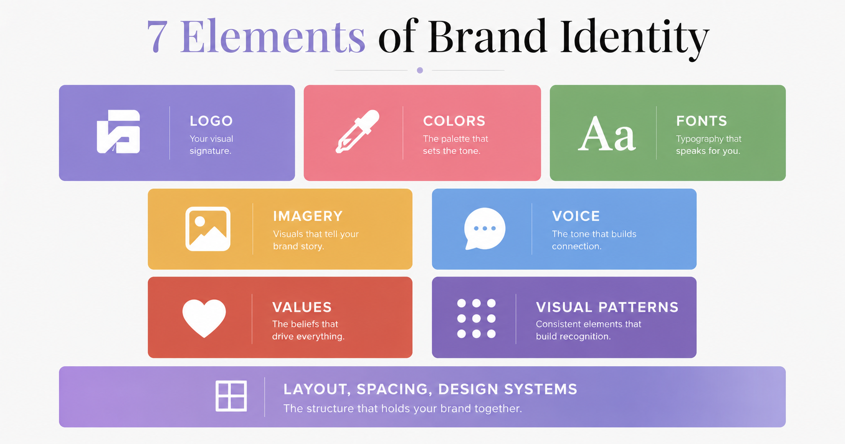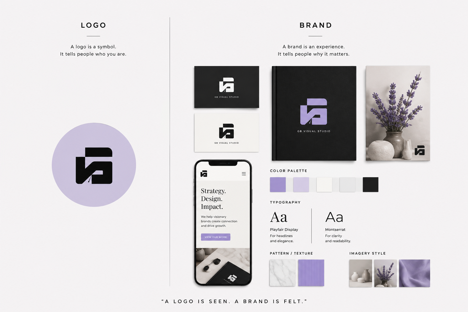
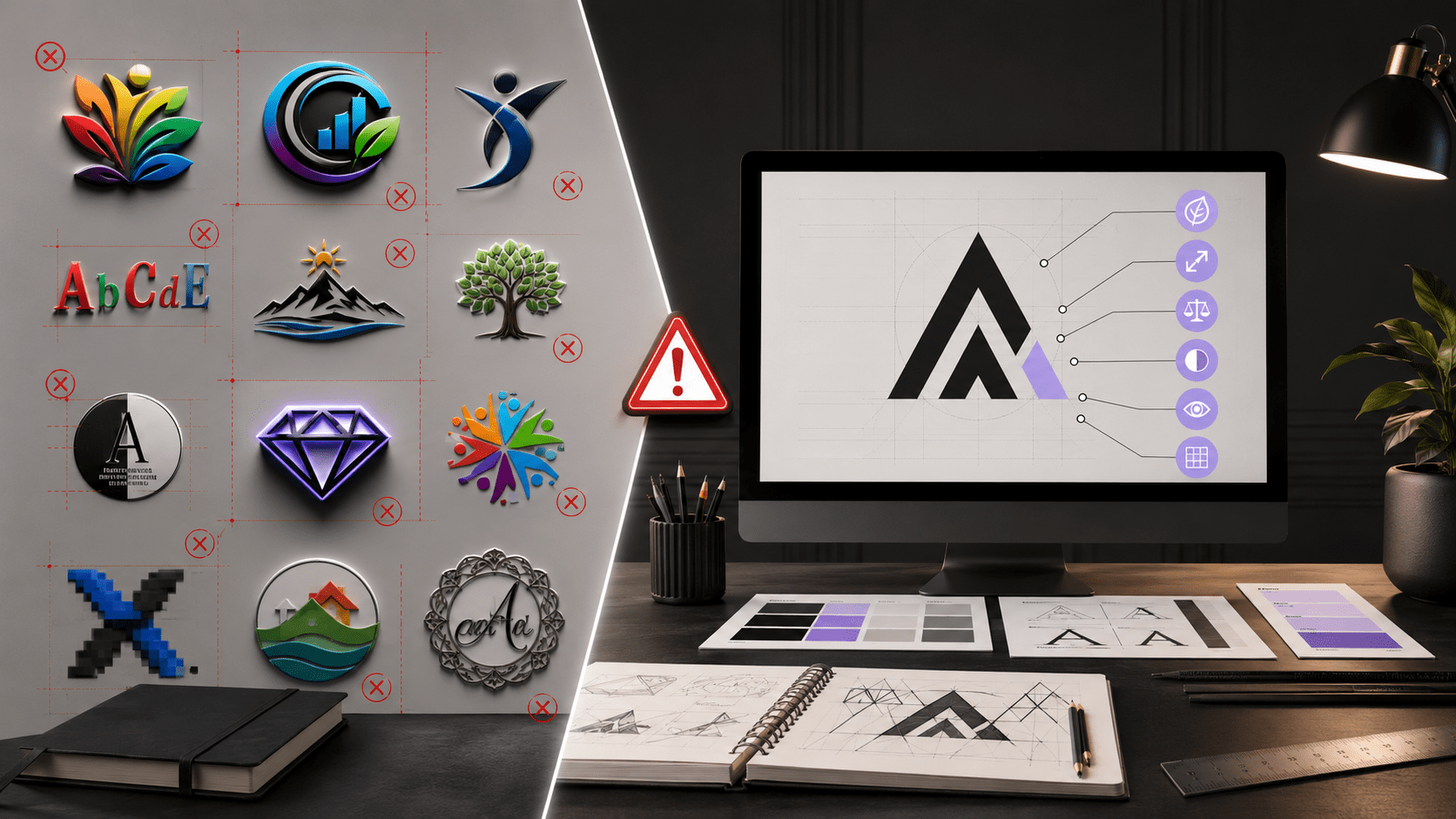
Let’s start with the truth: Your logo is not your brand.
Your brand is the feeling people have when they think of you. Your logo is a visual symbol that should represent that feeling.
But here’s what happens: People spend $5,000 on a “premium” logo design and then act like that logo did all the work. The logo didn’t. Your entire brand strategy did.
That said, a bad logo will damage your credibility. It will make you look unprofessional, confused, or cheap. And that’s the opposite of what you want.
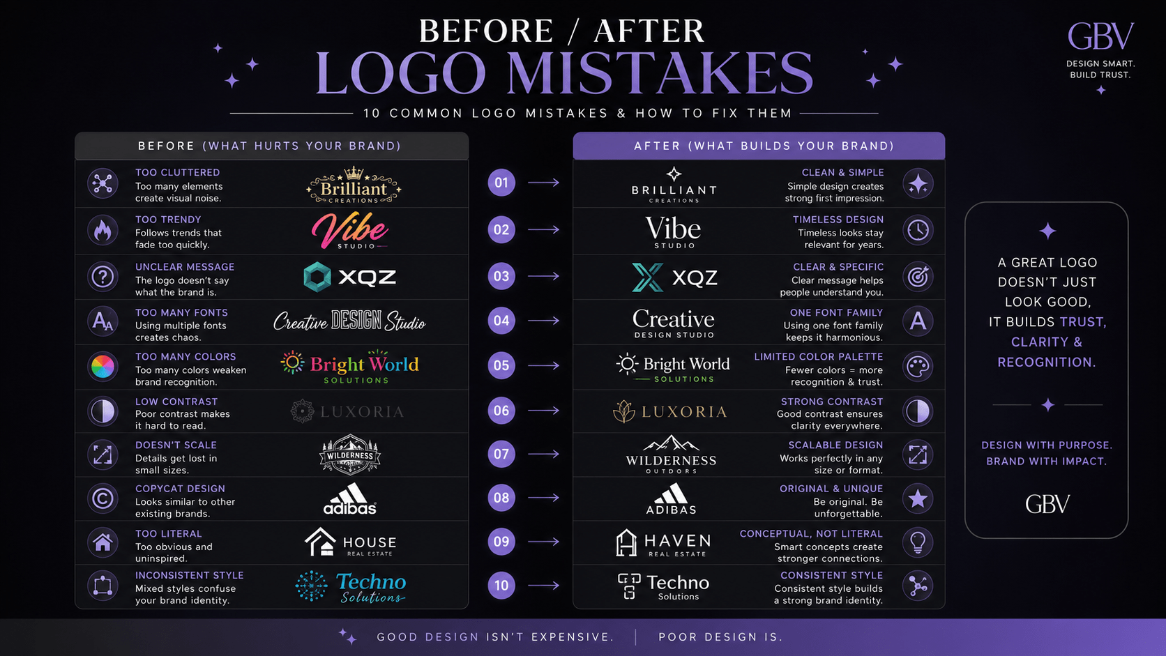
So let’s talk about the 10 most common logo design mistakes and how to avoid them.
What You'll Learn
ToggleThe 10 Logo Mistakes That Kill Credibility
Mistake 1: Making Your Logo Too Complicated
You want your logo to be memorable, so you add detail. More elements. More complexity. Gradients. Effects. Shadows.
What you actually get: a logo that doesn’t scale. It looks good at big sizes but becomes unreadable at favicon size. It prints poorly. It looks cluttered.
The fix: Simplicity is strength. The best logos in the world are simple. Apple. Nike. Target. They work at any size because they’re not trying to do too much.
The rule: If your logo can’t be recognizable at favicon size (16x16px), it’s too complicated.
Does Your Logo Have These Problems?
Professional audit against design standards (same checklist designers use). Takes 10 minutes. Reveals everything your logo needs.
Mistake 2: Using Trendy Design Elements
You see a design trend you love (gradients, rounded corners, thin lines) and you want it in your logo. So you build a logo based on the trend.
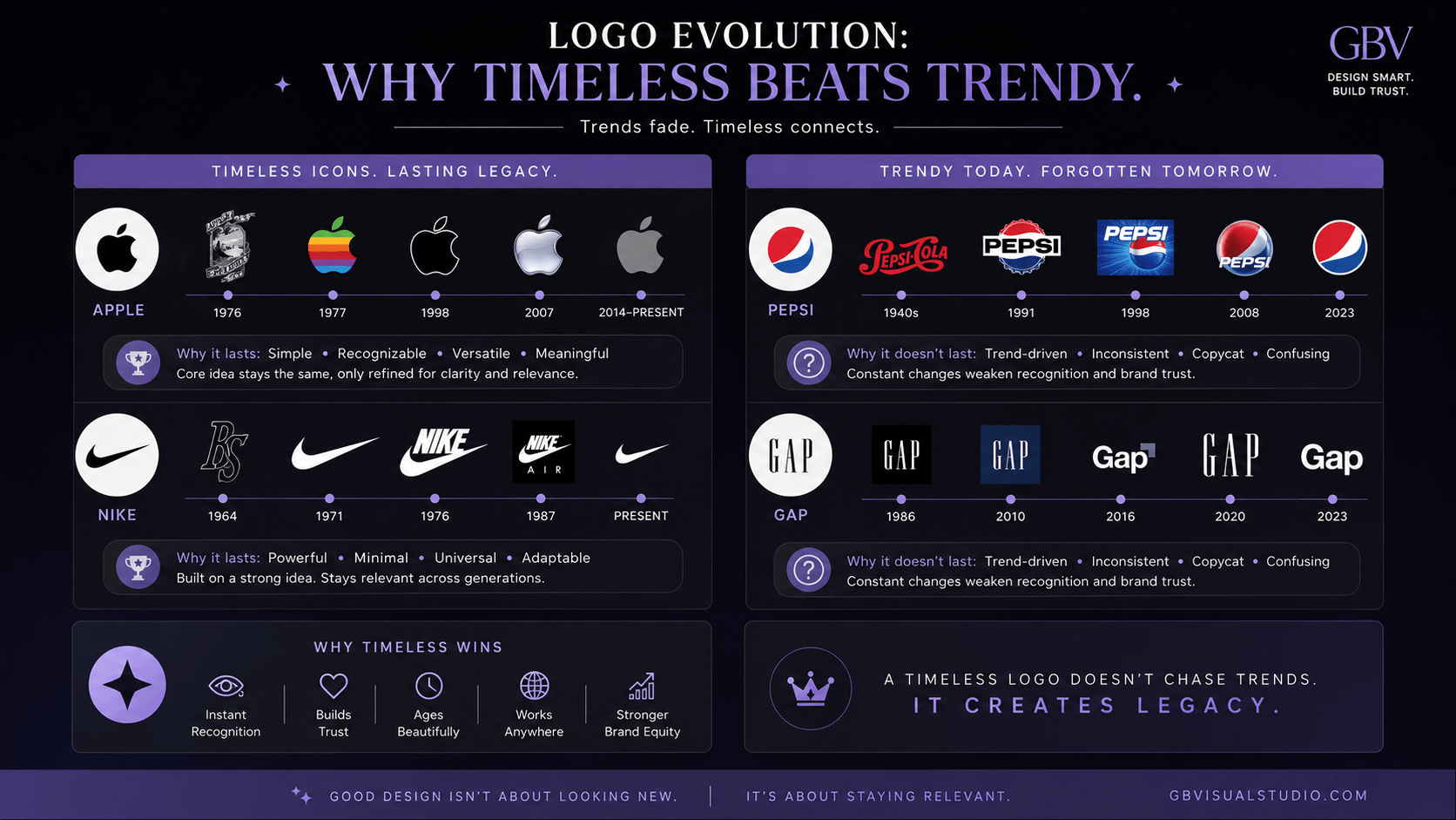
The problem? Trends die. Your logo is supposed to last 10+ years. If it’s built on a trend, it looks dated in 2 years.
The fix: Your logo should be timeless, not trendy. Classic design principles beat chasing trends every time.
Mistake 3: Poor Typography (If Your Logo Has Text)
Many logos include the business name in text. If that text is hard to read, your logo is a failure.
Common issues:
- Text that’s too small to read
- Script fonts that look elegant but aren’t readable (especially at small sizes)
- Kerning (letter spacing) that’s off
- Text and image that don’t have visual hierarchy
The fix: If your logo includes text, it needs to be readable at every size. Choose clear, well-spaced fonts. Make sure the hierarchy between text and image is obvious.
Mistake 4: Too Many Colors
You want your logo to be vibrant and interesting, so you use 5-6 colors. Now your logo is complicated, expensive to reproduce, and doesn’t work in one-color (monochrome).
Many applications require a single-color version of your logo (embroidery, print embossing, etc.). If your logo only works in full color, you’ve created a problem.
The fix: Build your logo in 1-2 colors maximum. This makes it versatile, scalable, and professional. You can add colors for web/digital, but the core logo should work in one color.
Mistake 5: Not Considering How It Looks in Grayscale
Your logo looks great in color. But what happens when it’s printed in black and white? Or when someone saves it in grayscale? Does it still work?
Many logos that look distinct in color become unreadable or muddled in grayscale.
The fix: Test your logo in grayscale. Make sure it’s still readable and distinct. This is a non-negotiable.
Mistake 6: Copying Competitor Logos (Or Working Too Close to Existing Designs)
You see a competitor’s logo and love it. You don’t copy it exactly, but you build something “inspired by” it. Close, but different.
This is a legal and branding disaster. Your logo should be unique to your brand.
The fix: Work with designers who understand intellectual property. Create something original. And do trademark searches before you fall in love with a concept.
Mistake 7: Ignoring Your Brand Positioning
Your brand positioning says you’re a premium, luxury brand. But your logo is playful and casual. These don’t align.
Your logo should reinforce your positioning, not contradict it.
The fix: Your logo should reflect your brand positioning. If you’re premium, your logo should feel premium (clean, minimal, sophisticated). If you’re fun and playful, your logo should feel playful.
Mistake 8: Using Clip Art or Generic Stock Elements
You buy a logo online or use a logo maker that provides “hundreds of design elements.” You assemble a logo that looks… like everyone else’s.
Generic design screams “budget brand” and erodes credibility.
The fix: Invest in custom design. If budget is tight, find a designer just starting out who’s building their portfolio. They’ll do custom work at reasonable rates. It’s worth it.
Mistake 9: Making Your Logo Impossible to Reproduce
You have a beautiful logo design, but it uses specific font that’s not licensed, or it has effects that can’t be reproduced in print, or it requires exact color combinations that don’t translate.
The fix: Your logo needs to be reproducible in every medium. Print, web, embroidery, signage, etc. Work with your designer to ensure all fonts are licensed and all effects can be recreated in different formats.
Missing These Brand Standards?
90% of brands never create usage guidelines for their logo. That's why their logo looks different everywhere. Get the template below!
Mistake 10: Not Having a Logo Style Guide
You have a logo. You’re using it randomly—different sizes, different colors, different placements. It’s not consistent, which actually hurts brand recognition.
The fix: Create a simple logo style guide that specifies: minimum size, clear space, color versions (full color, one-color, reversed), and incorrect usage. This ensures consistency across all applications.
The Logo Audit Checklist
Ask yourself these questions about your current logo:
- □ Is my logo readable at 16x16px (favicon size)?
- □ Would my logo still work in black and white?
- □ Does my logo reflect my brand positioning?
- □ Is my logo simple, not trendy?
- □ Can my logo work with 1-2 colors?
- □ Is all typography in my logo readable?
- □ Is my logo unique and original?
- □ Can my logo be reproduced in all mediums?
- □ Do I have clear usage guidelines for my logo?
- □ Does my logo feel professional and credible?
If you answered “no” to more than 3 questions, it might be time to revisit your logo.
About to Audit Your Logo?
Use the pro checklist (same one design agencies use). Professional audit + style guide template included. Score below 7? You'll know exactly what redesign priority is.
When Should You Redesign Your Logo?
You should redesign if:
- Your logo doesn’t represent your current brand positioning
- Your logo doesn’t scale (looks bad at small sizes)
- Your logo has legal or trademark issues
- Your logo is clearly dated and looks unprofessional
- Your industry or audience has shifted significantly
You should NOT redesign if:
- You’re just bored with it (this is normal; it will pass)
- You want to “modernize” for the sake of modernizing
- You’re chasing a trend
- It’s working fine but you want something more complicated