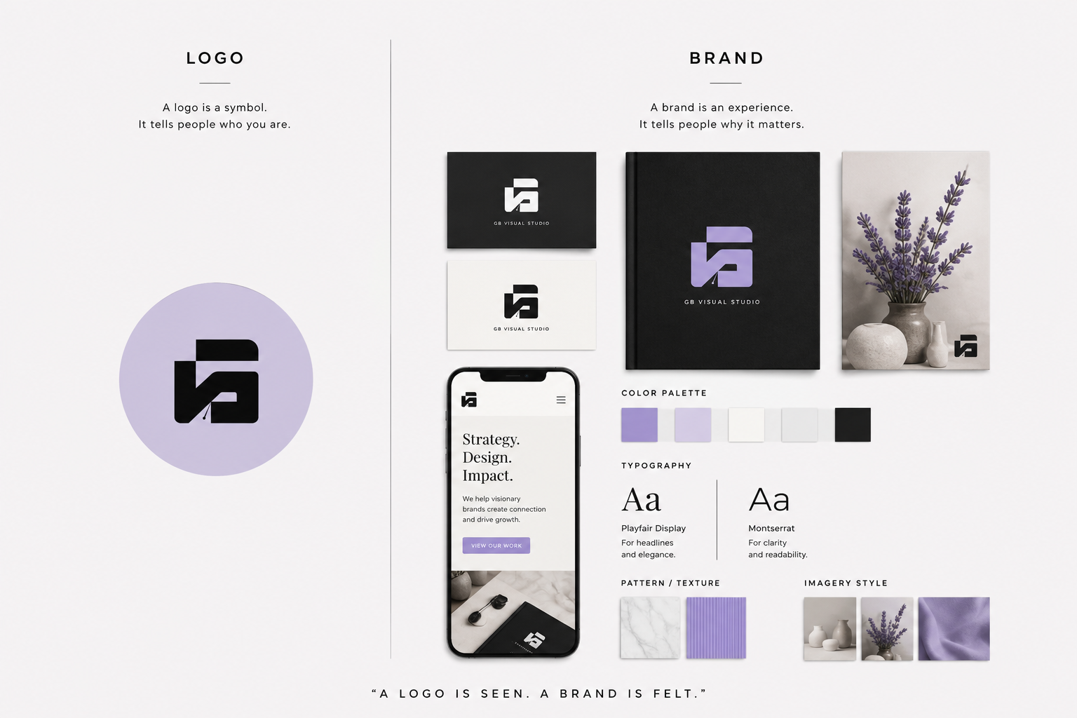
Many people think brand identity begins and ends with a logo. In reality, a logo is only one part of a much larger visual system.
Your brand identity is how your business presents itself to the world. It includes every visual element that helps customers recognize, remember, and trust your business. When these elements work together consistently, they create a professional image that supports your brand strategy and strengthens customer recognition.
Without a clear brand identity, businesses often appear inconsistent. Their website looks different from their social media, their packaging doesn’t match their marketing materials, and every customer touchpoint feels disconnected.
A strong brand identity solves this problem by creating consistency across every interaction.
If you’re new to branding, start with our Complete Beginner’s Guide to Branding, which explains how brand identity fits into the bigger picture of building a successful brand. Once you understand the fundamentals, this guide will show you the seven essential brand identity elements every business should develop.
What You'll Learn
ToggleWhat Are Brand Identity Elements?
Brand identity elements are the visual components that represent your business and make it recognizable across every platform.
They work together to communicate your personality, values, and positioning while creating a consistent experience for your audience.
These elements don’t exist to make your business look attractive alone. Their purpose is to make your business recognizable, memorable, and aligned with your overall brand strategy.
When every element follows the same visual direction, customers begin to associate those visuals with your business. Over time, that consistency builds familiarity, and familiarity builds trust.
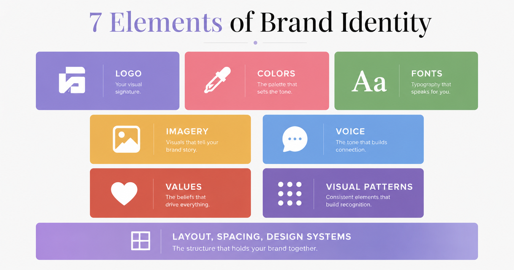
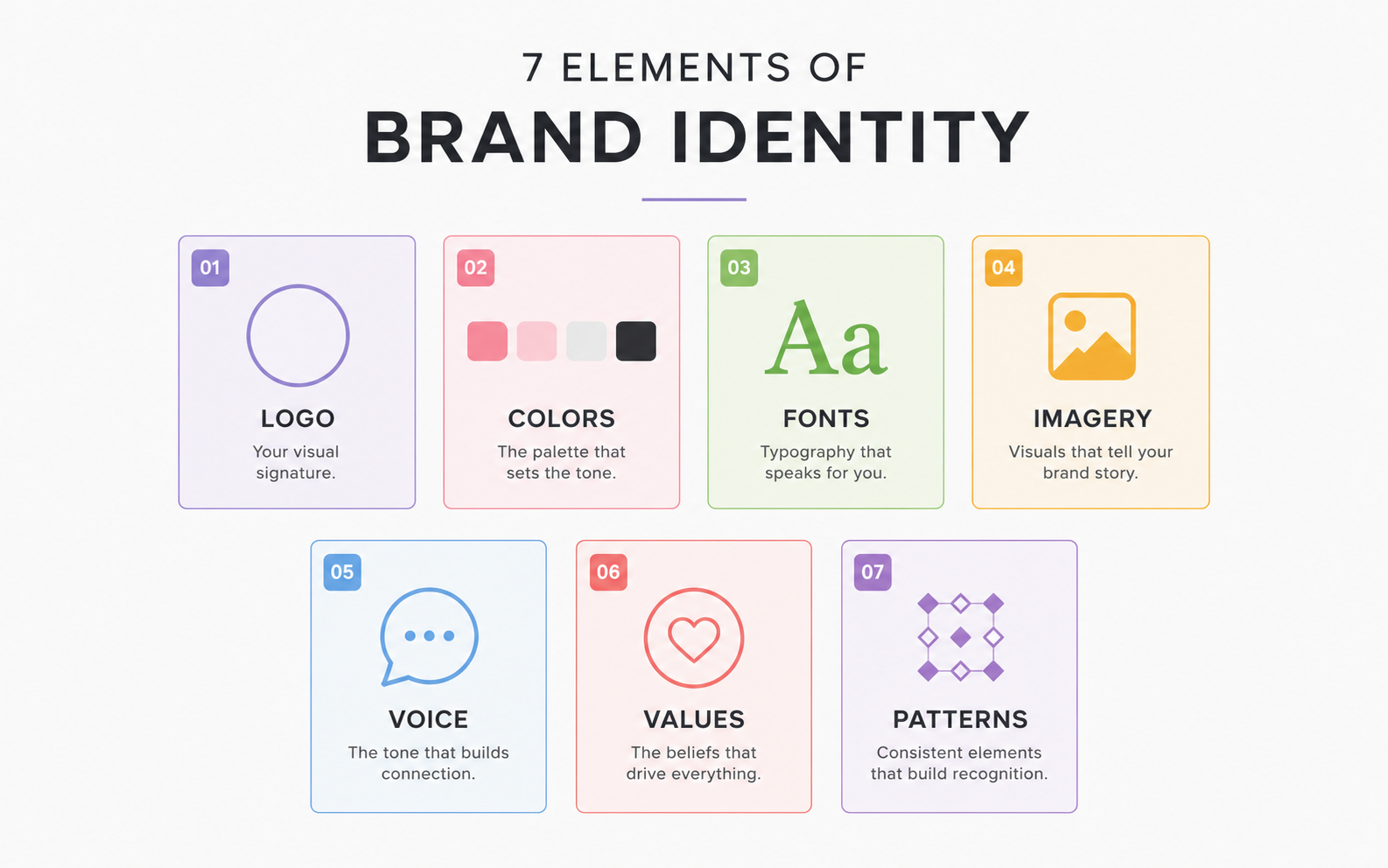
A complete brand identity usually includes:
- Logo
- Color Palette
- Typography
- Imagery
- Graphic Elements
- Brand Voice
- Brand Guidelines
Each of these plays a different role, but they are most effective when they work together.
Before designing any visual assets, it’s worth understanding what makes a brand different from a logo. As explained in our Logo vs Brand guide, your logo identifies your business, while your brand is the overall perception people have of it. Your brand identity connects these two by translating your strategy into a consistent visual experience.
Why Brand Identity Matters
Customers form opinions about your business within seconds.
Before they read your content or explore your products, they notice your visual presentation.
A polished and consistent brand identity helps your business:
- Look professional and trustworthy.
- Improve brand recognition.
- Create a consistent experience across all channels.
- Differentiate itself from competitors.
- Support long-term brand growth.
On the other hand, inconsistent branding creates confusion. Different fonts, changing colors, multiple logo variations, and mismatched graphics make it harder for customers to remember your business.
Brand identity isn’t about making everything look the same. It’s about making everything feel connected.
1. Logo
Your logo is the foundation of your visual identity.
It’s the symbol customers use to identify your business across websites, social media, packaging, presentations, and marketing materials.
A strong logo should be:
- Simple enough to recognize quickly.
- Memorable without unnecessary detail.
- Scalable for both digital and print.
- Relevant to your industry and audience.
- Timeless rather than trend-driven.
A logo doesn’t need to explain everything about your business. Its role is to create recognition.
The meaning behind your logo grows as customers associate it with positive experiences, quality products, and consistent communication.
That’s why successful brands focus on building trust alongside recognition.
If you’re unsure how a logo differs from your overall brand, our Logo vs Brand guide explains why a logo is only one part of a complete branding system.
2. Color Palette
Color influences how people perceive your brand before they read a single word.
A carefully chosen color palette helps communicate personality, create emotional associations, and improve recognition.
For example:
- Blue often communicates trust and reliability.
- Green is commonly associated with growth, sustainability, and health.
- Black can suggest sophistication, luxury, or authority.
- Yellow often conveys optimism and energy.
These meanings aren’t fixed, but they provide useful guidance when building a visual identity.
Most brands work with:
- Primary colors used most frequently.
- Secondary colors that support the primary palette.
- Neutral colors for backgrounds and typography.
- Accent colors for calls to action and highlights.
The key isn’t using many colors it’s using them consistently.
Every website page, social media post, presentation, and marketing asset should follow the same palette to strengthen brand recognition.
3. Typography
Typography is more than choosing a font.
It defines how your brand communicates visually through written content.
The typefaces you choose affect readability, professionalism, and personality.
For example:
- Sans-serif fonts often feel modern, clean, and approachable.
- Serif fonts can communicate tradition, elegance, and credibility.
- Display fonts add personality but should be used sparingly.
A practical typography system usually includes:
- A heading font.
- A body font.
- Optional accent fonts for special use.
Limiting your typography system helps maintain consistency across your website, presentations, social media graphics, and printed materials.
Like every other brand identity element, typography should support your overall brand personality instead of competing for attention.
4. Imagery
Imagery is one of the most recognizable brand identity elements, yet it’s often overlooked. While logos, colors, and fonts receive most of the attention, the photos, illustrations, icons, and graphics you use also shape how people perceive your brand.
Every image should support your brand’s personality and communicate a consistent message. Whether someone visits your website, browses your social media, or downloads one of your resources, the visual style should feel familiar.
Your imagery may include:
- Brand photography
- Product images
- Team photos
- Custom illustrations
- Icons
- Mockups
- Background graphics
For example, a luxury brand may use high-contrast editorial photography with minimal compositions, while a children’s brand might rely on bright colors and playful illustrations. Neither approach is better they simply communicate different personalities.
The important thing is consistency. Avoid mixing multiple photography styles, illustration styles, or icon sets, as this creates a disconnected visual experience.
When planning your brand identity, establish clear guidelines for imagery so every visual asset reflects the same creative direction.
5. Graphic Elements
Graphic elements are the supporting visuals that reinforce your brand identity beyond the logo.
They aren’t meant to replace your logo. Instead, they help create a recognizable visual system that appears consistently across your marketing materials.
Common graphic elements include:
- Shapes
- Patterns
- Lines
- Borders
- Icons
- Textures
- Illustrations
- Decorative accents
These elements make your designs feel connected, even when your logo isn’t present.
For example, think about a brand that consistently uses rounded shapes, soft gradients, and minimal icons. Even without seeing the logo, customers may begin to recognize the brand because those design elements appear across every touchpoint.
Graphic elements also improve design flexibility. Rather than placing your logo on every graphic, you can use supporting visuals to maintain recognition while keeping layouts clean and engaging.
When creating graphic elements, make sure they complement your logo, color palette, and typography instead of competing with them.
6. Brand Voice
Although brand voice isn’t a visual element, it’s an essential part of your overall brand identity.
Your audience should recognize your business not only by how it looks but also by how it communicates.
Your brand voice influences every piece of written content, including:
- Website copy
- Blog articles
- Social media captions
- Email newsletters
- Product descriptions
- Advertisements
- Customer support messages
A consistent voice builds familiarity and trust.
For example, a professional consulting firm may use a confident, educational, and authoritative tone. A lifestyle brand may choose a more conversational and approachable style.
The goal isn’t to sound like every other business in your industry. Your voice should reflect your brand’s personality and speak directly to your target audience.
If you haven’t defined your communication style yet, our Brand Voice Guide explains how to create a voice that’s authentic, consistent, and memorable.
7. Brand Guidelines
Creating a strong visual identity is only the first step. Maintaining it is equally important.
That’s where brand guidelines come in.
Brand guidelines are a document that explains how every element of your brand should be used. They help ensure consistency, whether you’re creating content yourself or working with designers, marketers, or other team members.
A typical brand guideline includes:
- Logo usage and spacing
- Approved color palette
- Typography hierarchy
- Photography style
- Graphic elements
- Icon usage
- Brand voice
- Design examples
- Incorrect usage examples
Without clear guidelines, your brand identity can quickly become inconsistent as different people create content using different styles.
Even if you’re a solo business owner, documenting your brand standards saves time and helps maintain consistency as your business grows.
How These Brand Identity Elements Work Together
Each brand identity element has a different purpose, but they become much more effective when they work together as one system.
For example:
- Your logo helps customers recognize your business.
- Your color palette creates emotional associations and improves recognition.
- Your typography reinforces your personality through every headline and paragraph.
- Your imagery communicates your style and values visually.
- Your graphic elements tie your designs together.
- Your brand voice creates consistency in communication.
- Your brand guidelines ensure every element is applied consistently.
When one of these elements is missing or used inconsistently your overall brand identity becomes weaker.
Consistency doesn’t mean every design should look identical. It means every customer interaction should feel like it comes from the same business.
That’s how strong brands build recognition over time.
Common Mistakes to Avoid
Many businesses invest time in designing individual assets but overlook the system that connects them.
Here are some common mistakes to avoid when developing your brand identity.
Treating the Logo as the Entire Brand
A logo is important, but it isn’t your entire identity.
Without consistent colors, typography, imagery, and messaging, even a professionally designed logo won’t create a memorable brand.
Using Too Many Fonts and Colors
Adding more fonts or colors doesn’t make a brand more creative.
Instead, it often creates visual clutter and inconsistency.
Choose a limited set of typefaces and colors, then use them consistently across every platform.
Following Every Design Trend
Design trends change quickly.
Your brand identity should remain recognizable for years, not just for the current season.
Build your visual identity around clarity and consistency rather than short-term trends.
Inconsistent Branding Across Platforms
Your website, social media, presentations, packaging, and marketing materials should all feel connected.
If every platform uses different colors, layouts, or imagery, customers may struggle to recognize your business.
A documented brand guideline helps prevent these inconsistencies.
Final Thoughts
A memorable brand isn’t built with a logo alone. It’s built by creating a visual system that communicates the same message wherever customers interact with your business.
Each of the 7 brand identity elements plays a specific role, but their real strength comes from working together. A consistent logo, thoughtful color palette, clear typography, purposeful imagery, supporting graphic elements, a defined brand voice, and well-documented brand guidelines all contribute to a stronger, more recognizable brand.
As your business grows, maintaining consistency across these elements becomes just as important as creating them. That’s why successful brands don’t treat brand identity as a one-time design project they see it as an ongoing investment in recognition, trust, and long-term growth.
If you’re building your brand from the ground up, don’t focus on individual assets in isolation. Start with a clear strategy, understand your audience, and develop a brand identity that reflects your business at every touchpoint.
Frequently Asked Questions
The seven essential brand identity elements are:
- Logo
- Color palette
- Typography
- Imagery
- Graphic elements
- Brand voice
- Brand guidelines
Together, these elements create a consistent visual and verbal identity that helps customers recognize and remember your business.
Brand identity elements help create a consistent experience across every customer touchpoint. They improve brand recognition, communicate your business personality, and build trust over time.
Without consistency, customers may struggle to recognize your business, making it harder to establish credibility and long-term loyalty.
A logo is an important part of your brand identity, but it isn’t the only element.
A logo helps people identify your business, while your colors, typography, imagery, graphic elements, and brand voice work together to reinforce your brand’s personality and create a consistent experience.
If you’re unsure about the difference, read our Logo vs Brand guide to understand how a logo fits into a complete branding system.
Yes.
You don’t need a large budget to build a professional brand identity. What matters most is consistency.
Start by defining your audience, choosing a simple logo, selecting a limited color palette, establishing typography, and documenting basic brand guidelines. As your business grows, you can expand and refine these assets.
Brand identity refers to the visual and verbal assets that represent your business, such as your logo, colors, typography, imagery, and brand voice.
Branding is the ongoing process of shaping how people perceive your business through strategy, communication, customer experience, and consistency.
If you’re just starting your branding journey, our Complete Beginner’s Guide to Branding explains these concepts in greater detail.