Most people think choosing brand colors is simply about making a logo look attractive.
It isn’t.
Your brand colors influence how people feel before they read your headline, explore your website, or decide whether they trust your business.
That’s why color psychology in brand guidelines is one of the most important parts of building a memorable brand.
Every successful brand uses color intentionally not randomly.
Whether you’re building a startup, growing a personal brand, or scaling an established business, your colors communicate emotion, personality, and credibility before you say a single word.
In this guide, you’ll learn how color psychology in brand guidelines influences customer perception, how to build a strategic brand color palette, and how to document your choices so your brand stays consistent across every touchpoint.
What You'll Learn
ToggleWhy Color Psychology Matters
Think about the brands you recognize instantly.
Before you remember their slogan, products, or website, you probably remember their colors.
That’s because color creates recognition.
Recognition builds familiarity.
Familiarity builds trust.
And trust influences buying decisions.
Your audience forms an impression of your business within seconds. During those first moments, they aren’t analyzing your services or comparing your pricing. They’re responding to visual signals.
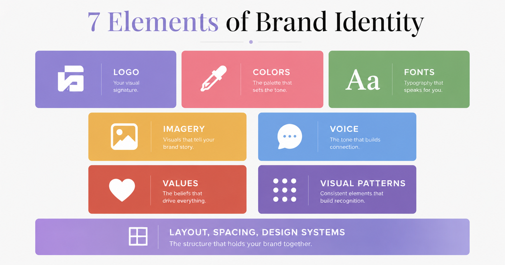
Your logo.
Your typography.
Your imagery.
Your layout.
And most importantly your colors.
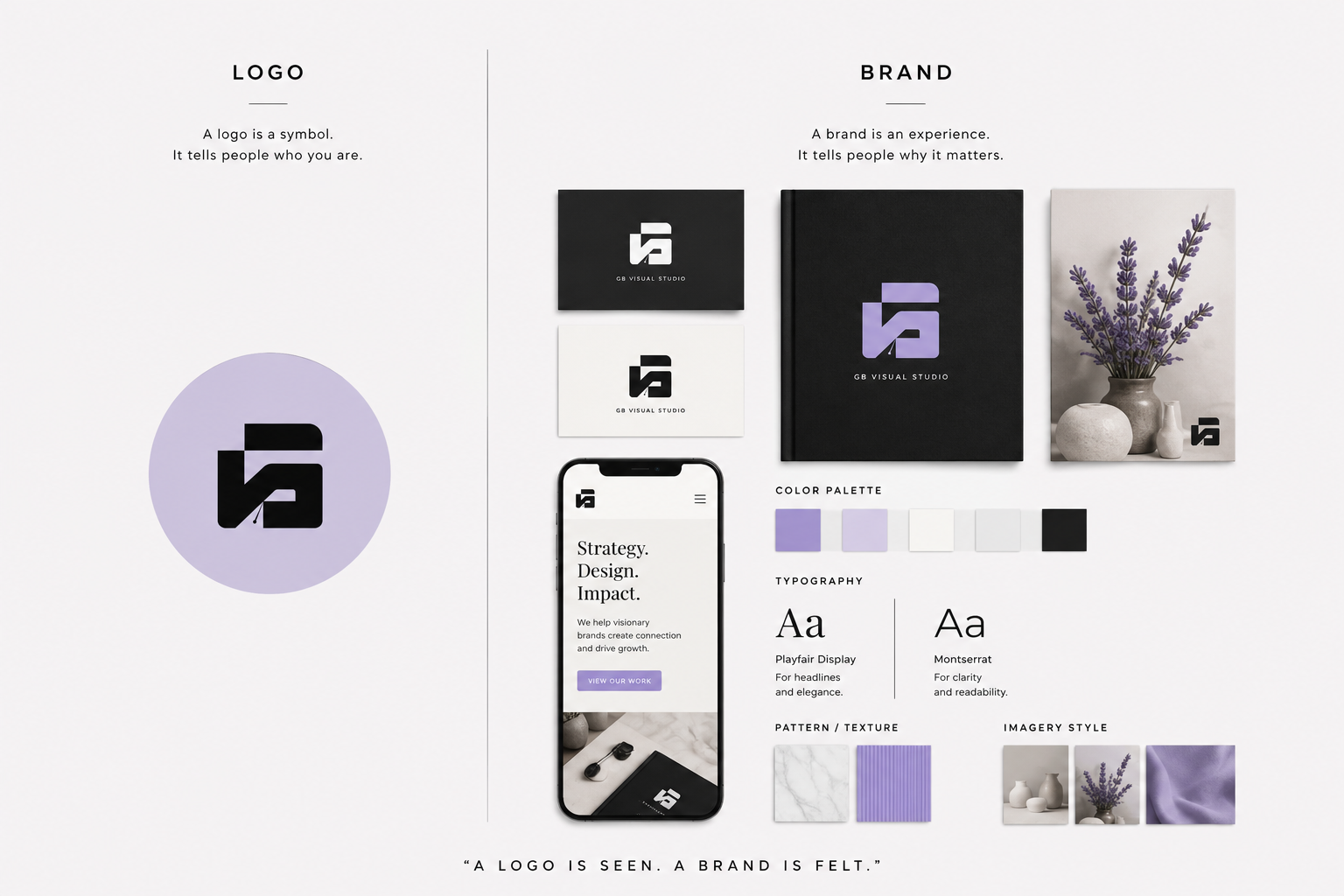
When those elements work together consistently, your brand becomes easier to recognize and easier to remember.
That’s exactly why color psychology in brand guidelines deserves far more attention than it usually receives.
Color isn’t decoration.
It’s communication.
What Is Color Psychology?
Color psychology is the study of how colors influence human emotions, perceptions, and behaviors.
Although personal experiences and cultural differences shape how people interpret color, many emotional associations remain surprisingly consistent.
Blue often communicates trust.
Green feels natural and balanced.
Red creates excitement and urgency.
Black feels premium and sophisticated.
White suggests simplicity and clarity.
These emotional associations help people make quick decisions without consciously thinking about them.
That’s why marketers, designers, and psychologists continue studying the relationship between color and decision-making.
Understanding brand color psychology allows you to choose colors that reinforce your positioning instead of contradicting it.
A premium luxury brand and a children’s toy company shouldn’t feel the same.
Their color choices should reflect entirely different personalities.
Why Color Psychology Belongs in Brand Guidelines
Professional brand guidelines aren’t simply collections of logos and fonts.
They’re instruction manuals for creating a consistent brand experience.
Without documented color standards, different designers, marketers, developers, and content creators begin making their own decisions.
Over time, the brand slowly becomes inconsistent.
Customers notice that inconsistency even if they can’t explain why.
Including color psychology in brand guidelines ensures every color has a purpose.
Instead of saying,
“Use purple because it looks nice.”
Your brand guidelines should explain:
“Purple represents creativity, innovation, confidence, and premium expertise.”
That single explanation transforms color from decoration into strategy.
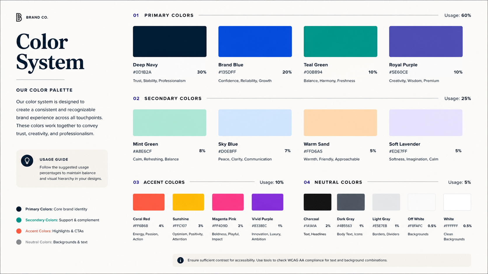
A professional branding color guide should include:
- Primary colors
- Secondary colors
- Accent colors
- Text colors
- Accessibility rules
- HEX values
- RGB values
- CMYK values
- Usage examples
- Color proportions
Every decision should support your overall brand identity design.
Build a Brand People Remember
Your colors should do more than look beautiful they should communicate the right message every time.
Understanding Emotional Color Meanings
| Color | Common Emotions | Best For | Watch Out For |
|---|---|---|---|
| 🔵 Blue | Trust, reliability, security, intelligence, calmness | Banks, SaaS, technology, healthcare, consulting, corporate brands | Can feel cold or distant if overused without warmer accent colors. |
| 🔴 Red | Passion, energy, excitement, urgency, confidence | Food, retail, entertainment, sports, clearance sales | Too much red can feel aggressive, stressful, or overwhelming. |
| 🟢 Green | Growth, health, balance, nature, sustainability | Eco-friendly brands, wellness, finance, agriculture, nonprofits | Using the wrong shade may make a brand feel generic or outdated. |
| 🟡 Yellow | Optimism, happiness, creativity, warmth, positivity | Children’s brands, creative businesses, education, highlights, CTAs | Excessive yellow can reduce readability and cause visual fatigue. |
| 🟣 Purple | Creativity, innovation, luxury, imagination, wisdom | Creative studios, premium products, beauty, education, AI brands | Bright purple may appear overly playful if used without balance. |
| ⚫ Black | Luxury, sophistication, authority, elegance, power | Fashion, luxury goods, premium services, high-end branding | Too much black without contrast can feel intimidating or heavy. |
| ⚪ White | Simplicity, clarity, cleanliness, honesty, minimalism | Modern brands, healthcare, technology, lifestyle, premium design | Excessive white space without visual hierarchy may appear empty. |
| 🟠 Orange | Friendliness, enthusiasm, confidence, adventure, affordability | Startups, fitness, eCommerce, food, community-driven brands | Overuse can make a brand feel loud or less premium. |
| 🩷 Pink | Compassion, care, femininity, playfulness, optimism | Beauty, wellness, fashion, lifestyle, personal brands | Bright pink may not suit industries that require a highly formal image. |
| 🟤 Brown | Stability, reliability, warmth, authenticity, craftsmanship | Coffee brands, handmade products, furniture, outdoor businesses | Dark browns can feel dull if not paired with lighter complementary colors. |
| ⚪ Gray | Balance, professionalism, neutrality, maturity, sophistication | Corporate brands, technology, architecture, consulting | Too much gray can make a brand appear uninspiring or emotionless. |
Color psychology works best when colors function together as a system rather than individually.
A carefully planned brand color palette creates consistency across your logo, website, social media, packaging, and marketing materials.
Creating a Professional Brand Color Palette
Choosing colors isn’t about finding shades that look beautiful together. It’s about building a visual system that supports your brand every time someone interacts with it.
A professional brand color palette is one of the most valuable parts of your brand guidelines because it creates consistency across every customer touchpoint. Whether someone visits your website, scrolls through your social media, opens an email, or receives your packaging, they should immediately recognize your brand.
That consistency builds familiarity, and familiarity builds trust.
Before selecting colors, start with your brand strategy.
Ask yourself:
- What does my business stand for?
- Who is my ideal customer?
- How do I want people to feel when they interact with my brand?
- What makes my brand different from competitors?
- What emotions should my visual identity communicate?
The answers to these questions should shape your brand color strategy.
Instead of choosing colors because they’re trending or because they’re your favorites, choose colors that communicate the personality of your business.
For example, a luxury interior design studio might use black, ivory, and muted gold to express elegance and sophistication. A sustainable skincare brand may rely on greens and earthy neutrals to communicate wellness and environmental responsibility. A creative agency could choose purple with charcoal and white to reflect innovation and confidence.
Every successful brand identity design begins with strategy not aesthetics.
The Building Blocks of a Brand Color Palette
Every professional palette includes several types of colors that work together.
| Color Type | Purpose |
|---|---|
| Primary Color | The signature color people associate with your brand. |
| Secondary Colors | Supporting colors used across layouts, graphics, and marketing materials. |
| Accent Color | Used sparingly for buttons, links, highlights, and calls to action. |
| Neutral Colors | White, gray, charcoal, or beige that create balance and improve readability. |
| Background Colors | Maintain visual consistency across digital and print designs. |
| Text Colors | Ensure comfortable reading and strong accessibility. |
Each color should have a clearly defined role. When every color has a purpose, your designs feel intentional instead of overwhelming.
Choosing Colors That Match Your Brand Personality
One of the biggest mistakes businesses make is choosing colors before defining their personality.
Imagine describing your brand as a person.
Would you describe it as:
- Professional?
- Friendly?
- Luxurious?
- Innovative?
- Trustworthy?
- Playful?
- Minimal?
- Bold?
Those personality traits naturally influence your brand color psychology.
A premium consulting business should feel different from a children’s education platform. Their audiences expect different experiences, so their colors should communicate different emotions.
Here’s a simple reference:
| Brand Personality | Suggested Color Direction |
| Premium | Black, charcoal, ivory, muted gold |
| Friendly | Orange, sky blue, warm yellow |
| Innovative | Purple, electric blue |
| Sustainable | Green, olive, earthy neutrals |
| Elegant | White, black, champagne, soft gray |
| Playful | Coral, aqua, bright yellow |
| Trustworthy | Navy blue, slate gray |
The goal isn’t to copy another brand.
The goal is to create a brand color palette that genuinely reflects your positioning and helps customers recognize your business instantly.
The 60-30-10 Color Rule
One of the easiest ways to create balance in your visual identity is by following the 60-30-10 Rule.
This simple principle helps distribute colors naturally, making designs easier to look at and easier to understand.
| Percentage | Role | Examples |
| 60% | Dominant Color | Website backgrounds, large sections, major design elements |
| 30% | Secondary Color | Cards, banners, illustrations, supporting graphics |
| 10% | Accent Color | Buttons, links, icons, notifications, calls to action |
Think of your dominant color as the foundation.
Your secondary color provides structure.
Your accent color attracts attention.
When every color has a job, your layouts become cleaner and your content becomes easier to navigate.
Example: Imagine a premium creative studio.
Its palette might look like this:
- 60% White for clean layouts and breathing room.
- 30% Charcoal for typography and supporting design elements.
- 10% Lavender for buttons, icons, links, and highlights.
The result feels modern, elegant, and memorable without relying on too many colors.
This is one of the simplest ways to apply color psychology in brand guidelines while maintaining consistency.
Accessibility and Contrast
Beautiful colors lose their value if people struggle to read your content.
Accessibility isn’t optional.
It’s part of creating a professional user experience.
A strong branding color guide should always include accessibility recommendations to ensure your content remains readable for everyone.
Accessibility Best Practices
| Recommendation | Why It Matters |
| Use dark text on light backgrounds | Improves readability. |
| Use light text on dark backgrounds | Maintains strong visual contrast. |
| Avoid low-contrast color combinations | Prevents eye strain. |
| Don’t rely only on color to communicate meaning | Supports users with color vision deficiencies. |
| Keep CTA buttons highly visible | Improves conversions and navigation. |
| Test contrast before publishing | Ensures accessibility across devices. |
Simple improvements like increasing contrast can dramatically improve the user experience.
Accessibility also communicates professionalism.
When people can comfortably read your content, they’re more likely to stay on your website and engage with your brand.
Strong vs Weak color contrast
| Excellent Contrast | Poor Contrast |
| Black on White | Yellow on White |
| White on Navy | Gray on White |
| White on Charcoal | Light Blue on White |
| Dark Gray on Cream | Green on Red |
| Navy on Light Gray | Pink on White |
A good design isn’t only attractive.
It’s comfortable to use.
How to Document Colors in Your Brand Guidelines
Choosing colors is only the beginning.
The real value comes from documenting them clearly.
Professional brand guidelines ensure every designer, developer, marketer, and content creator uses the same colors consistently.
Without documentation, different shades begin appearing across different platforms.
Eventually, your visual identity loses consistency.
Every brand style guide should include detailed information about each approved color.
| Section | What to Include |
| Primary Colors | HEX, RGB, CMYK, and Pantone values |
| Secondary Colors | Approved supporting colors |
| Accent Colors | Buttons, links, highlights, icons |
| Neutral Colors | Background and typography colors |
| Color Psychology | Emotional meaning behind every color |
| Usage Guidelines | When each color should be used |
| Accessibility Standards | Approved contrast combinations |
| Incorrect Usage | Examples of what to avoid |
| Digital Examples | Website, social media, presentations |
| Print Examples | Packaging, stationery, brochures |
This documentation keeps your visual brand identity consistent regardless of who creates your content.
Instead of guessing which shade of blue or purple to use, your team follows a single source of truth.
That’s exactly what professional brand guidelines are designed to accomplish.
Consistency isn’t restrictive.
It’s what transforms individual designs into a recognizable brand.
Common Color Psychology Mistakes
Understanding color psychology in brand guidelines is only the first step. Applying it correctly is what makes the difference.
Many businesses invest in a beautiful logo and a professional website but still struggle to build a memorable brand. In most cases, the problem isn’t the quality of the design it’s the lack of consistency and strategy behind the color choices.
Avoid these common mistakes when developing your brand color strategy.
| Mistake | Why It Hurts Your Brand | Better Approach |
|---|---|---|
| Choosing colors based on personal preference | Your favorite colors may not connect with your audience or reflect your brand personality. | Let your brand strategy guide your color decisions. |
| Using too many colors | Too many colors create visual clutter and weaken brand recognition. | Limit your palette to one primary, two or three secondary, one accent, and neutral colors. |
| Ignoring color psychology | Colors send emotional signals, whether you plan them or not. | Use brand color psychology intentionally to support your brand message. |
| Inconsistent color usage | Different shades across platforms make your brand look unprofessional. | Follow the same brand guidelines across every touchpoint. |
| Ignoring accessibility | Low contrast makes your content difficult to read. | Test your colors for readability before publishing. |
| Following design trends blindly | Trends change quickly, while strong brands remain consistent. | Build a timeless branding color guide that can evolve gradually. |
| Not documenting your colors | Team members begin using different shades and combinations. | Record every approved color in your brand guidelines with usage examples. |
Remember, customers don’t consciously compare every color you use. They simply notice whether your brand feels consistent.
Consistency creates confidence.
Confidence builds trust.
Real-World Brand Examples
One of the easiest ways to understand color psychology in brand guidelines is by observing brands that have mastered it.
These companies don’t use color randomly. Every color supports their positioning and is applied consistently across every customer touchpoint.
| Brand | Primary Color | Emotion Communicated | Why It Works |
| Coca-Cola | Red | Energy, excitement, passion | Creates strong emotional impact and instant recognition. |
| Blue | Trust, reliability, connection | Reinforces security and familiarity. | |
| Spotify | Green | Growth, creativity, freshness | Reflects innovation and a modern digital experience. |
| Apple | Black, White & Gray | Simplicity, sophistication, innovation | Supports a clean and premium visual identity. |
| Tiffany & Co. | Tiffany Blue | Luxury, exclusivity, elegance | Owns a distinctive color that customers instantly recognize. |
| IKEA | Blue & Yellow | Trust, optimism, friendliness | Balances professionalism with warmth. |
| Starbucks | Green | Community, sustainability, comfort | Reinforces the brand’s welcoming personality. |
Notice something these brands have in common?
They don’t constantly change their colors.
Instead, they consistently apply the same brand identity colors across websites, packaging, advertising, products, retail spaces, and social media.
That’s why they’re instantly recognizable.
Consistency is one of the strongest branding tools you have.
Final Thoughts
Your brand colors do far more than make your business look attractive.
They influence first impressions.
They shape emotions.
They communicate personality.
And over time, they become one of the strongest drivers of brand recognition.
That’s why color psychology in brand guidelines deserves to be treated as a strategic business decision rather than a design trend.
The most successful brands don’t choose colors because they’re popular.
They choose colors that reflect their values, connect with their audience, and support their positioning.
Then they document those choices, apply them consistently, and repeat them across every customer interaction.
Whether someone visits your website, scrolls through your social media, receives your packaging, or downloads one of your resources, the experience should feel unmistakably yours.
That’s the power of consistency.
And consistency is what transforms a collection of design assets into a memorable brand.
Build a Brand That People Instantly Recognize
A strong visual identity starts with strategy not guesswork.
If you’re ready to create a brand that’s consistent, memorable, and built to grow, start by documenting your colors with intention.
Explore the branding resources at GB Visual Studio, including the Professional Brand Guidelines Template, Brand Strategy Canvas, and Brand Audit Worksheet, to build a visual identity that communicates confidence, earns trust, and leaves a lasting impression.
The right colors won’t build your brand on their own but when they’re backed by a clear strategy and used consistently, they’ll help every interaction feel more recognizable, more professional, and more memorable.