A business can have a good product, an attractive logo, and a professional website—and still have a weak brand identity.
The problem is usually not one terrible design decision.
It is the accumulation of small inconsistencies.
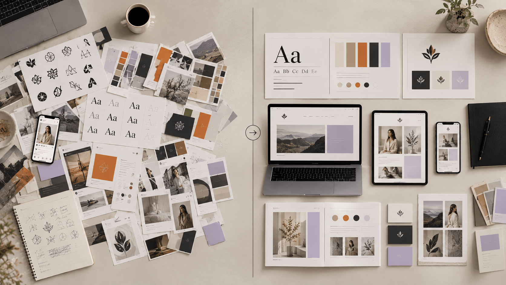
One font appears on the website and another on Instagram. The brand uses five different versions of its logo. The colors change from one graphic to another. The messaging sounds professional on the website but casual everywhere else. Every social post looks like it came from a different business.
Individually, these may seem minor.
Together, they make the brand harder to recognize and harder to understand.
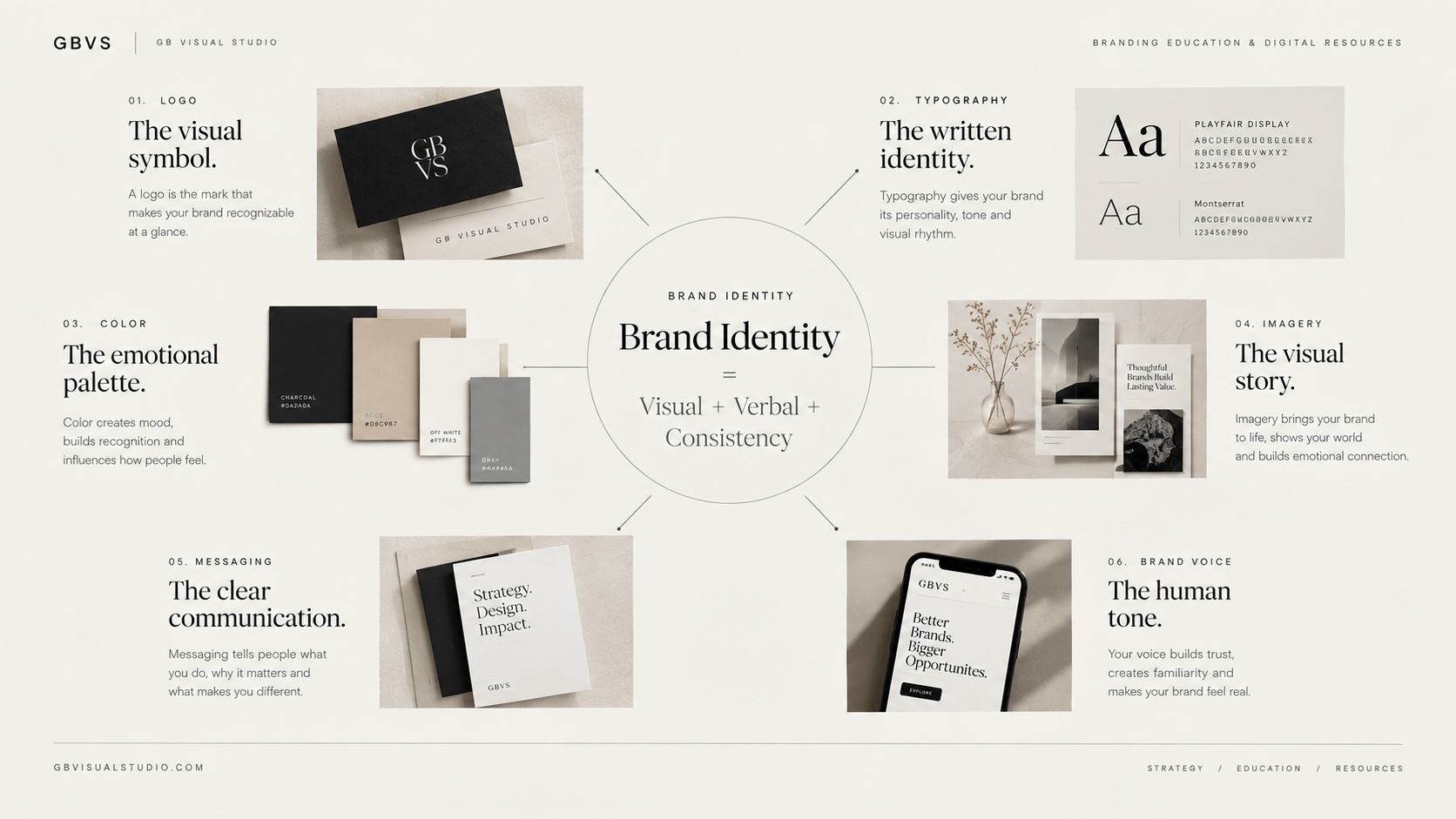
A strong brand identity is not simply a collection of attractive visual elements. It is a coordinated system of visual and verbal choices that represents the business consistently across its customer touchpoints.
If your brand currently feels scattered, you probably don’t need to redesign everything immediately.
You need to identify where the identity is breaking down.
What You'll Learn
ToggleWhat Makes a Brand Identity Weak?
A weak brand identity isn’t necessarily ugly.
That’s an important distinction.
Some businesses have visually beautiful branding that still doesn’t communicate anything meaningful. Others have relatively simple identities that work extremely well because they are clear, consistent, and appropriate for their audience.
Your brand identity has a problem when the visual and verbal decisions don’t work together.
For example, imagine a premium consulting company using elegant typography and sophisticated photography on its website, but posting bright meme templates and unrelated trending graphics on Instagram.
Each piece may look fine individually.
The brand as a whole doesn’t.
This is why an identity audit should look beyond the logo.

1. Designing Before Defining the Brand
One of the most expensive brand identity mistakes is starting with design before understanding the business.
You choose colors.
Then fonts.
Then a logo.
Then templates.
Only afterward do you ask:
Who exactly is this brand for?
That order creates problems because visual decisions are being made without a strategic reference point.
Your identity should reflect your audience, positioning, personality, and values. Shopify’s current brand identity guidance similarly identifies rushing the foundation and making arbitrary visual choices as common problems.
Before opening your design software, clarify:
What do you offer?
Who is it for?
What problem do you solve?
What makes your approach different?
How should people describe your brand after interacting with it?
If these answers aren’t clear, your visual identity will probably keep changing.
Fix: Build the strategic foundation first, then translate it into design.
For a starting point, read How to Build a Brand Identity Without a Designer.
2. Choosing Visuals Because You Personally Like Them
Your brand is not a personal Pinterest board.
You may love purple, but that doesn’t automatically make purple the right color for your business.
You may prefer handwritten fonts, but that doesn’t mean they communicate the personality your audience needs.
Personal taste can influence a brand, particularly for personal brands, but it shouldn’t be the only decision-making criterion.
Every major visual element should answer a question:
What role does this play in how the brand should be perceived?
A color should support the visual system.
A typeface should support the personality and readability.
An image style should fit the audience and positioning.
A graphic element should have a reason for existing.
When every decision has a purpose, the identity becomes easier to manage.
3. Using Too Many Colors
Another common problem is color overload.
A business starts with one primary color, then adds another because it looks good, then another for social media, another for seasonal graphics, and another because a template requires it.
Eventually, there is no recognizable palette.
This doesn’t mean a brand can never use additional colors.
The problem is failing to establish roles.
Your core palette should tell you which colors are foundational, which are supporting, and which are reserved for emphasis.
This is particularly important when your business publishes frequently.
For a deeper look at strategic color selection, read Color Psychology in Brand Guidelines.
Also remember that color decisions should account for accessibility and practical use, not only aesthetics. W3C guidance emphasizes consistent visual treatment and predictable use of colors, controls, typography, and layout.
Fix: Reduce your core palette and document exactly where each color belongs.
4. Changing Fonts Constantly
Typography is another quiet source of brand inconsistency.
You might use one font for your website, another for Instagram, another for presentations, and a completely different one in your PDF products.
The result is visual fragmentation.
You don’t need to use exactly the same typography in every possible situation, but your system should have a recognizable hierarchy.
For example:
Primary typeface: headings and brand statements
Secondary typeface: body copy
Optional accent: limited use
Then define weights and hierarchy.
Your H1 should look like an H1 every time.
Your body text should have predictable treatment.
Your buttons should have a consistent visual language.
This type of consistency isn’t just aesthetic. W3C’s cognitive accessibility guidance specifically recommends consistent typography, headings, controls, colors, and layout so users don’t have to relearn the interface from page to page.

5. Treating the Logo as the Entire Brand
A logo is important.
It is not the brand.
This mistake often leads businesses to spend enormous amounts of time modifying a symbol while ignoring the rest of the identity.
A recognizable brand also depends on its typography, colors, imagery, graphic language, messaging, and the way those elements are repeatedly applied.
Think about your brand with the logo removed.
Would someone still recognize its visual direction?
If the answer is no, that doesn’t automatically mean your branding is bad.
It may simply mean that your identity relies too heavily on one identifier.
A stronger system gives the audience multiple recurring signals.
For more context, see Logo vs. Brand: What’s the Difference?.
6. Creating Different Branding for Every Platform
Your website doesn’t need to look identical to Instagram.
Your Instagram doesn’t need to look identical to Pinterest.
Your email newsletter doesn’t need to be a copy of your website.
But they should still feel like they belong to the same brand.
This distinction is important:
Consistency does not mean repetition.
A platform has different requirements, formats, and user behaviors. Your identity can adapt while maintaining the same underlying system.
The logo, colors, typography, imagery, graphic language, and tone should have recognizable relationships across channels.
Adobe similarly recommends treating brand guidelines as a common reference across visual and verbal assets while allowing the identity to evolve with the business.
Fix: Create platform-specific templates based on one central identity rather than designing each channel independently.
7. Ignoring Brand Voice
Brand identity isn’t only visual.
Your words also contribute to how people experience the brand.
Imagine a business whose website sounds sophisticated and strategic, while its social captions constantly use slang, exaggerated claims, and aggressive sales language.
The visual identity may be consistent.
The brand experience isn’t.
Your brand voice should establish how your business communicates.
For example:
Clear, intelligent, practical, confident, human.
Those characteristics can then guide your website copy, captions, emails, product descriptions, and customer communication.
Brand guidelines increasingly include verbal elements such as voice, tone, approved messaging, and communication rules alongside visual elements.
Fix: Define three to five characteristics for your voice and explain what each means in practice.
8. Using Trends as Your Identity
Trends are useful for understanding what’s happening in design.
They become dangerous when they become your entire identity.
A visual style can become popular very quickly.
Glassmorphism.
Editorial minimalism.
Retro typography.
AI-generated imagery.
Bold gradients.
Whatever is trending today may become common tomorrow.
A brand should be able to participate in trends without becoming dependent on them.
Use trends as expression, not foundation.
Your core identity should survive when the trend disappears.
A useful test is simple:
If I removed this current design trend, would the brand still be recognizable?
If the answer is no, your identity may be too dependent on aesthetics rather than strategy.
9. Having No Brand Guidelines
You may think you don’t need brand guidelines because you’re a one-person business.
But even a solo founder benefits from a reference system.
Without one, you repeatedly make the same decisions.
Which logo should I use?
Which color?
Which font?
How much space should the logo have?
Which image style fits?
How should this caption sound?
A simple brand guide eliminates unnecessary decisions.
It doesn’t need to be a 100-page document.
A practical guide can document your foundation, logo variations, colors, typography, imagery, graphic elements, voice, and examples of correct application.
Brand guidelines are most useful when they explain how to use the assets, not merely list what the assets are.
10. Never Auditing the Brand
Even a well-designed identity can drift.
New templates get introduced.
New freelancers create content.
New platforms appear.
You experiment with a different font.
Someone changes a brand color slightly.
After several months, the original system can become difficult to recognize.
That is why a brand audit matters.
Adobe recommends reviewing brand assets and asking whether design and messaging remain consistent and aligned with the target audience.
Open your website, social profiles, emails, presentations, product pages, and downloadable resources.
Put them side by side.
Don’t ask:
“Do I like this?”
Ask:
“Does this still look and sound like the same brand?”
That question produces much more useful information.
How to Fix a Weak Brand Identity Without Starting Over
You don’t necessarily need a complete rebrand.
In many cases, the better approach is to identify the biggest sources of inconsistency and correct them systematically.
Start with the foundation.
Then standardize your logo.
Reduce unnecessary colors.
Define your typography.
Establish an imagery direction.
Create reusable templates.
Clarify your brand voice.
Document the system.
Then apply it consistently.
This approach is often more practical than constantly redesigning the brand whenever something feels slightly wrong.
Your objective isn’t perfection.
It’s coherence.
A Simple Brand Identity Audit
Take five pieces of content from your business:
Your homepage.
Your latest Instagram post.
Your latest Pinterest pin.
A recent email.
One product or service graphic.
Put them next to one another.
Now look at them as if you were seeing the business for the first time.
Do they appear to belong to the same company?
Do the colors relate?
Is the typography recognizable?
Does the imagery share a visual direction?
Does the writing have a consistent personality?
Does the brand feel appropriate for the intended audience?
If several answers are no, you have identified where to start.
You don’t need to fix everything simultaneously.
Fix the biggest inconsistency first.
Then move to the next.
Final Thought
Most brand identity problems aren’t caused by a lack of creativity.
They’re caused by a lack of system.
A business keeps adding new colors, templates, fonts, graphics, and styles without a clear framework for deciding what belongs.
Over time, the identity becomes visually noisy and strategically unclear.
The solution isn’t always a dramatic rebrand.
Sometimes it’s simply returning to the fundamentals: strategy, audience, positioning, personality, visual identity, and consistency.
Your brand should be flexible enough to evolve but structured enough to remain recognizable.
If you want to build that structure from the beginning, continue with Brand Identity: A Beginner’s Guide to Building a Strong Visual Identity, then explore 7 Essential Elements of a Strong Brand Identity to understand the individual components of the system.
And if your foundation still feels unclear, start with the free Brand Clarity Checklist before changing the visuals.
Frequently Asked Questions
What are the most common brand identity mistakes?
Common problems include designing before defining the brand strategy, inconsistent colors and typography, relying too heavily on the logo, changing the visual style between platforms, ignoring brand voice, following trends too closely, and failing to document brand rules.
How do I know if my brand identity is weak?
Place your website, social posts, emails, presentations, and product graphics beside each other. If they look like they belong to unrelated businesses, your identity probably lacks consistency or a clear system.
Should I completely rebrand if my identity is inconsistent?
Not necessarily. First identify which parts are causing the inconsistency. You may only need to refine the typography, color system, logo usage, imagery, templates, or brand voice rather than replace the entire identity.
How important are brand guidelines for a small business?
They can be useful even for a solo business because they create a reference for consistent decisions. As the business grows and more people or tools create content, guidelines become increasingly valuable.
Can my branding change over time?
Yes. A brand identity can evolve as the business, audience, products, and market change. The goal is not to keep every visual element permanently unchanged; it is to evolve deliberately without losing the core identity.