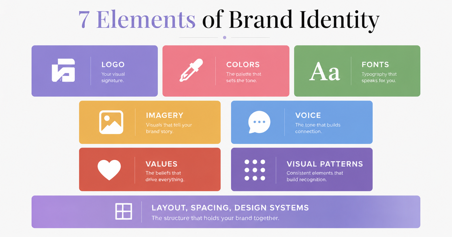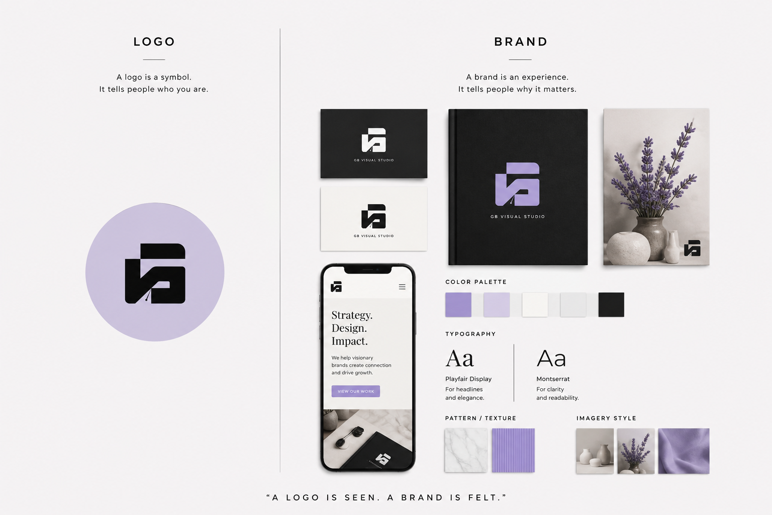
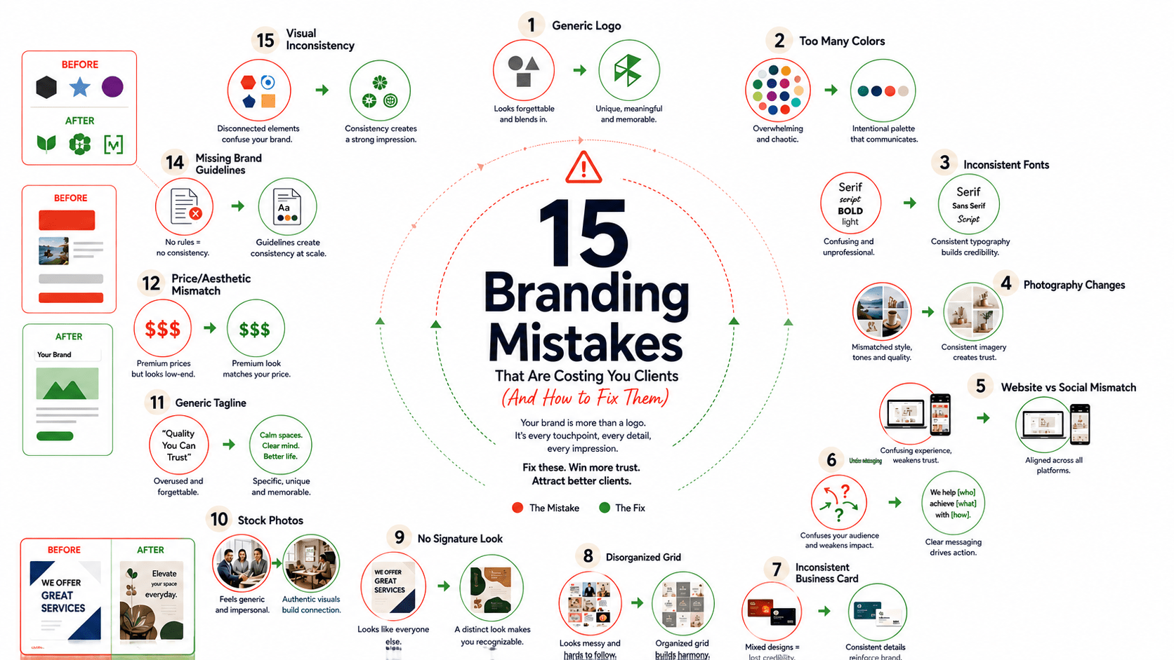
Here’s something most founders don’t realize until it’s cost them significantly: a beautiful brand identity can still be hurting your business. The logo can be clean, the colors can be on-trend, and every design system can be perfectly documented and your brand can still be silently killing your growth by sending the wrong signals to the exact customer who’d buy from you at a premium.
Brand identity mistakes aren’t just design flaws. Brand identity isn’t decoration. It’s communication. And when communication is unclear, inconsistent, or misaligned with your actual positioning, you’re not just wasting design investment you’re actively coaching customers to choose someone else.
Here are the 15 most common signs that your brand identity mistakes have turned your brand into a liability rather than an asset.
What You'll Learn
ToggleWhy Brand Identity Audit Matters More Than You Think
Before you spend another dollar on ads or marketing, the brand identity itself needs to pass a diagnostic test: is it consistently communicating what you actually want to communicate? A brand identity audit isn’t about whether your brand is beautiful. It’s about whether it’s working.
The 15 Signs Your Brand Identity Is Hurting Your Business
POSITIONING SIGNALS
Sign 1: Your Brand Looks Like Everyone Else in Your Category
The clearest sign that your brand identity isn’t working is if a customer could swap your logo with a competitor’s logo and nothing would feel out of place. If your visual identity could belong to anyone in your space, you’re not communicating differentiation you’re communicating sameness. Your identity should make it immediately obvious why you are the choice, not just another option.
The fix: Return to your positioning statement (see Chapter 1 if you don’t have one). What is the one thing that’s genuinely yours? Your brand identity should visually express that difference. If your positioning is “premium,” your identity should signal premium through restraint, not through fancier ornamentation. If your positioning is “approachable,” your identity should use organic shapes and warm colors not harsh geometry. Your identity should be positioned before it’s pretty.
Sign 2: There's No Clear Positioning Story Behind the Brand
You can describe your brand in design terms (“modern, clean, minimal”) but you can’t explain the positioning story in a single sentence. Or worse the visual identity has nothing to do with what you actually do or who you serve. It exists in a vacuum of aesthetic preference rather than strategic intent.
The fix: Document your visual identity’s strategy not just its specs. Why these colors? Why this typeface? Why this particular shape language? Every element should be traceable back to one sentence: “For [customer], we are the [category] that [reason], unlike [alternative].” If you can’t make that connection, your identity isn’t expressing strategy. It’s expressing guessing
Sign 3: Your Brand Can't Finish the "Unlike" Sentence
This is a subset of Sign #2, but it’s critical enough to isolate. Your competitor can say “unlike [named alternative], we [specific difference].” Your brand identity visually contradicts that difference, or doesn’t express it at all. A brand that positions as a premium alternative but uses the same generic sans-serif as every other competitor hasn’t actually communicated the position yet.
The fix: Choose one visual element that only your brand would make that choice about. If you’re the premium alternative, that might be a deliberate choice of serif typeface or white space or a specific color pairing no one else in your category uses. If you’re the scrappy alternative, that might be hand-drawn elements or a deliberately non-corporate color choice. The identity should make the positioning visible at a glance.
Sign 4: Your Best Customer Can't Explain Why They Chose You
If you ask three of your best customers why they chose you over a close competitor, and none of them mention visual identity, positioning, or specific brand moments they mention price, referral, or convenience your brand identity hasn’t built the perception you wanted. It existed but didn’t communicate.
The fix: This often means the brand identity is too subtle, or it’s inconsistently applied across touchpoints. A customer who sees your brand once on a landing page experiences it very differently than a customer who sees it consistently across email, social, sales page, and on-site. Audit where your identity is actually showing up and where it’s disappearing. Often the fix is enforcement and consistency, not redesign.
Sign 5: Your Brand Looks Completely Different Every Six Months
If you redesign or significantly adjust your brand identity every time you pivot the messaging or relaunch the offer, your brand identity isn’t stable enough to build recognition. Customers need to see consistency the same identity, reinforced over time for it to accumulate into recognition and trust.
The fix: Lock your core identity elements (logo, primary colors, typeface system, shape language) for a minimum of 18 months. Messaging can change. Offers can evolve. The identity should be stable. If you find yourself wanting to redesign before 18 months, the problem usually isn’t that the identity is bad it’s that you haven’t given it enough time to compound.
How Many Signs Does Your Brand Show?
Quick 15-point assessment reveals your brand health score. Most brands show 4-6 signs without realizing it. (And it's costing them.)
CONSISTENCY & RECOGNITION
Sign 6: Your Brand Changes Across Platforms
Your logo is one size on your website and a completely different style on Instagram. Your colors are slightly different in your email templates than they are on your social posts. Your typography shifts between pages. A customer encountering your brand on three different platforms has three subtly different experiences of what your brand is.
The fix: Build a brand standards document that covers logo usage (size, spacing, backgrounds), color codes (Hex, RGB, CMYK), typography guidelines, and shape/imagery language. Then enforce it relentlessly. Most brand identity problems aren’t design problems they’re enforcement problems. You know what your brand should look like, but you’re not being consistent about it.
Sign 7: Your Logo Is Treated Casually
The logo appears stretched, rotated, in the wrong colors, in contexts where it shouldn’t appear, without proper spacing, or simplified in ways that change its fundamental shape. A logo that isn’t protected is a logo that isn’t communicating anything reliably.
The fix: Create a simple one-page logo usage guide with visual examples: the correct version, the wrong ways (don’t stretch, don’t rotate, don’t change colors), the clear space rules, and the minimum size. Share it with anyone who touches brand assets. A logo that gets protected becomes a recognizable asset; a logo that gets bent to every need becomes unrecognizable.
Sign 8: You Don't Have a Written Brand Style Guide
If your brand system exists only in someone’s head, it isn’t being applied consistently. You can’t enforce what you haven’t documented.
The fix: Create a documented brand guide that covers at minimum: logo specs, color palette with usage rules, typeface system with hierarchy, imagery style, voice and tone, and key messaging pillars. It doesn’t have to be a 100-page PDF 5–10 pages of clarity and visual examples is enough. Then actually share it with anyone creating brand content
Sign 9: You Have Ten Colors in Your Palette, Not 3–4
More colors means more choices, which means more inconsistency. A tight palette (a primary color, a secondary, an accent, and neutrals) is much more likely to feel cohesive across touchpoints because there’s less room for variation.
The fix: Audit all the colors you’re currently using. Which ones actually get used across multiple touchpoints? Those are your real palette. Lock it to 3–4 strategic choices and eliminate the rest. Constraint builds recognition; too much flexibility kills it.
Sign 10: Your Typography Changes from Page to Page
You’re using three serif fonts, two sans-serifs, and a script font across your brand ecosystem. Every new landing page introduces a new typeface because the designer thought it was “fresher.” Typography that shifts kills the visual coherence that makes a brand recognizable.
The fix: Choose one typeface family for display/headlines and one for body text. That’s it. Vary weight and size, but not the typeface. If you need more personality, add one script or decorative font for very specific moments (a sign-off, a section divider, a specific accent). But your core system should be two typefaces, not ten.
PERCEPTION & TRUST
Sign 11: Your Brand Looks Generic or Amateurish
When customers encounter your brand identity for the first time, their gut reaction is neutral or slightly negative. The quality of the design even if the strategy is sound doesn’t signal professionalism or investment in excellence.
The fix: This usually means either (a) the brand was built in a rush or with limited investment, (b) there are too many inconsistencies, or (c) it’s using default tools instead of custom design. If budget is the constraint, prioritize a custom logo and custom color palette those two elements, executed well, can make a significant difference. Everything else can be type-based or minimal until you have budget for more. But amateurish identity signals amateurish business, regardless of the quality of your offer.
Sign 12: There's No Founder Story Visible Anywhere in the Brand
The brand exists as a corporate identity with no trace of the human behind it. There’s no “About” section with a named founder, no founder presence in the brand voice, nothing that signals “this is built and led by someone real.” Impersonal brands feel less trustworthy, especially for high-ticket offers.
The fix: Integrate founder story into the brand identity where appropriate. This doesn’t mean the founder’s face has to be everywhere it can be as simple as a named author on all blog content, a founder’s note on the About page, or consistent first-person voice in your messaging. Make the brand attached to a real, named person, and introduce that person early in the customer journey.
Sign 13: Social Proof Is Weak or Absent
Your brand identity says “trusted by 1,000+ customers” but you have three testimonials, no case studies, no user logos, and no specific results mentioned anywhere. The identity is signaling trust but providing no evidence to support it.
The fix: Audit your social proof strategy. Where are you displaying customer testimonials, case study results, or user logos? Does your brand identity actually showcase proof, or does it just claim it in copy? Consider making social proof visual customer logos displayed on your homepage, specific results called out in your color system, case study visuals repeated across platforms so they feel like part of the brand language.
Sign 14: You're Signaling Premium Positioning But Running Constant Discounts
Your visual identity, color palette, and tone all signal premium minimalist, expensive-looking, authoritative. But your sales pages are full of “limited-time discount” and “50% off today” messaging. The brand identity and the business strategy are in direct contradiction.
The fix: Align your positioning and your promotion strategy. If you’re positioned as premium, discounts undercut the identity’s signal. If discounting is part of your business model, your brand identity should reflect approachability, not luxury. You can’t ask your identity to signal premium and your promotions to signal desperation at the same time.
Sign 15: Your Target Customer Avatar Isn't Expressed Anywhere in the Brand
Your brand identity could appeal to anyone the colors, typography, imagery, and voice are all so generic that no specific customer would look at it and think “this is for me.” There’s nothing that says “this is built for founders” or “this is built for coaches” or “this is built for high-ticket service providers.”
The fix: Express your customer avatar explicitly in the brand. If you serve premium B2B, your brand language might emphasize results and systems. If you serve creators, you might emphasize creative freedom and tools. If you serve women-led businesses, your imagery, voice, and representation should reflect that. A brand identity that doesn’t speak directly to someone often speaks to no one.
The Brand Identity Audit: Fix Each Category of Signs
POSITIONING SIGNALS: The Positioning Audit
If you’re seeing Signs 1–5, the issue is usually strategic, not just visual. Your positioning isn’t clear enough, your brand identity isn’t expressing it, or both.
Run this audit:
- Write down your positioning statement: "For [customer], we are the [category] that [reason], unlike [alternative]."
- Audit your current brand identity. Does it visually express that specific positioning? Or would it work just as well for a competitor?
- Choose one visual element you can own that directly connects to your position. If you're premium, what visual choice signals that? If you're scrappy, what does?
- Enforce that choice consistently across every touchpoint for the next 90 days.
A positioning that isn’t visually expressed is a positioning that isn’t communicated. Fix the communication, not just the design.
CONSISTENCY & RECOGNITION: The Consistency Audit
If you’re seeing Signs 6–10, the fix is almost always enforcement, not redesign. You probably have decent brand identity work you’re just not being consistent enough with it
Run this audit:
- Document your current brand identity (logo, colors, fonts, imagery style).
- Audit three random customer touchpoints (website page, email, social post, landing page). Does the identity look the same across all three?
- Identify where consistency is breaking down.
- Create or update a one-page brand standards guide.
- Share it with anyone touching brand assets (designer, copywriter, VA, marketing person).
Most “brand identity problems” are really consistency problems. You know what your brand should look like. You’re just not enforcing it.
PERCEPTION & TRUST: The Trust Audit
If you’re seeing Signs 11–15, your identity either isn’t signaling the professionalism/trustworthiness you need, or it’s sending a signal that contradicts your business strategy.
Run this audit:
- Have three people who fit your target customer avatar look at your brand for 10 seconds just the visual identity, no copy. Ask: "What do you think this business costs?" and "Who do you think this is for?"
- Their answers should align with your actual positioning and pricing. If they don't, your identity is sending the wrong signal.
- Audit your brand across three dimensions: Does it look professional? Does it look intentional? Does it clearly target someone specific?
- Fix the gap whether that's improving visual quality, adding founder story, featuring social proof more visibly, or aligning your promotional strategy with your visual positioning.
Most “brand identity problems” are really consistency problems. You know what your brand should look like. You’re just not enforcing it.
Should You Rebrand or Audit First?
If you recognize 5+ of the 15 signs, a rebrand might seem necessary. Before you spend the money, run the audits above. Often the fix is enforcement and consistency (free or low-cost) before it’s a redesign (expensive and time-consuming). A rebranded identity that’s applied inconsistently is no better than the current one.
Rebrand if: Your current identity is truly amateurish, doesn’t express your positioning, or has become misaligned with a major strategic pivot.
Audit and enforce if: You have decent brand work but it’s not being applied consistently, or your business strategy has shifted but your identity is still viable.
Quick Self-Check: Is Your Brand Identity the Problem?
Answer these three questions honestly:
- Can a customer see your brand identity and immediately know why you're different from your closest competitor? If no, your identity isn't expressing positioning.
- Does your brand look the same across your website, email, social, and sales pages? If no, consistency is the problem.
- When someone sees your brand for the first time, do they immediately think "this is professional" and "this is for me"? If no, you have a trust-signaling problem.
A weak brand identity doesn’t always look bad it usually just sends the wrong signals, inconsistently, to the wrong audience. The fix isn’t always a rebrand. Often it’s clarity (positioning), consistency (enforcement), and trust-building (proof and founder story). Run the audit. Fix what you can for free or low-cost first. Then decide if a rebrand is actually necessary.