A logo is often one of the first visual elements people associate with a business.
That makes it important.
But it also creates a common misconception: that a logo needs to communicate everything about a brand.
It doesn’t.
A logo is one component of a broader brand identity. Its job is to provide a recognizable visual identifier that can work consistently across the places where the brand appears.
The problem is that many logo projects start with aesthetics instead of strategy.
A business owner sees a logo they like and asks for something similar. A designer adds more elements to make the logo feel distinctive. A business chooses a trendy typeface because it looks modern. Another adds several colors because the logo feels “too simple.”
The result may look attractive in isolation but fail when it is actually used.
A strong logo needs to work on a website, social profile, document, presentation, packaging, signage, mobile screen, and potentially much smaller applications.
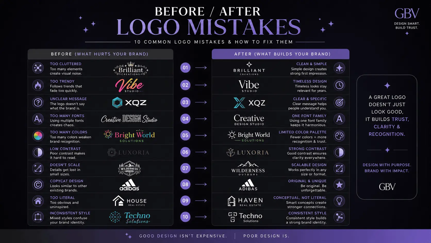
In this guide, we’ll examine the most common logo mistakes to avoid in 2026, why they happen, how they affect a brand, and what to do instead.
What You'll Learn
ToggleWhat Makes a Logo Effective?
Before discussing mistakes, it helps to establish what a logo actually needs to accomplish.
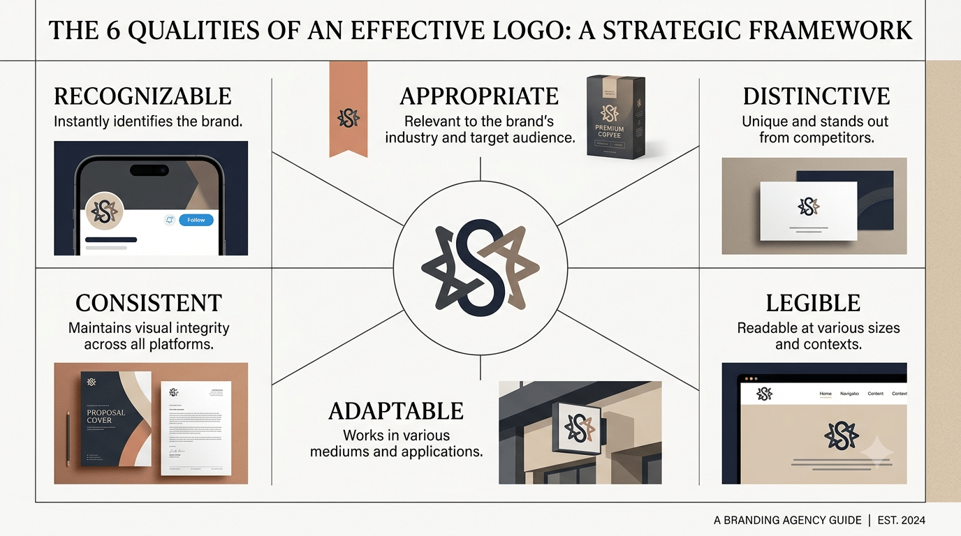
A useful logo should be:
Recognizable enough to become associated with the brand.
Appropriate for the business and its audience.
Distinctive enough to avoid unnecessary similarity to competitors.
Legible at the sizes and applications where it will be used.
Adaptable across different environments.
Consistent with the broader visual identity.
Notice what is missing:
“complicated.”
A logo does not become strategically stronger simply because it contains more detail.
In fact, complexity can create practical problems when the logo needs to work at small sizes.
If you are still deciding what belongs inside a complete brand identity, start with Brand Identity: A Beginner’s Guide to Building a Strong Visual Identity.
Mistake 1: Designing Before Defining the Brand
One of the most common mistakes is beginning with:
“What should the logo look like?”
before asking:
“What does this brand need to communicate?”
A logo exists within a brand system.
Before designing it, you should understand at least the basic strategic context:
- who the brand serves
- what category it operates in
- how it wants to be perceived
- what differentiates it
- what personality it should communicate
- where the logo will be used
Without this information, the design process becomes subjective.
The client chooses what they personally like.
The designer chooses what looks visually interesting.
Neither necessarily reflects the brand strategy.
Better approach
Establish the brand foundation first.
Then translate that foundation into visual direction.
The logo becomes a strategic expression rather than an isolated graphic.
Mistake 2: Trying to Explain the Entire Business With the Logo
A logo does not need to tell the entire story of a business.
This is particularly important for small businesses.
A restaurant does not necessarily need a fork, plate, chef hat, building, food icon, and business name inside its logo.
A design studio does not need a pencil, computer, color wheel, cursor, and geometric shape.
When every concept is placed into one mark, the logo becomes visually crowded.
The better question is:
What is the simplest distinctive identifier that can represent this brand?
The rest of the story can be communicated through the brand’s typography, imagery, messaging, color, content, products, and customer experience.
Mistake 3: Following Trends Too Closely
Design trends change.
A logo is expected to represent a business for much longer than a social media trend lasts.
This creates a problem when a company builds its identity around whatever style is popular at the moment.
A logo can quickly start looking dated when the visual trend disappears.
That does not mean every modern logo should be traditional.
Contemporary design is perfectly appropriate when it fits the brand.
The issue is trend dependence.
Ask instead:
Does this design express the brand, or does it simply resemble what is currently popular?
That distinction can save a business from unnecessary redesigns.
Mistake 4: Using Too Many Colors
Color can contribute strongly to recognition and personality.
But adding more colors does not automatically create a stronger logo.
Multiple colors can create:
- reproduction problems
- visual clutter
- weaker hierarchy
- difficult monochrome applications
- inconsistent usage
A logo should have a clear primary version that can function independently of color.
This is particularly important because logos may eventually appear in environments where the original color treatment is unavailable.
Your broader brand palette can contain more colors than your logo requires.
That distinction is often overlooked.
Mistake 5: Choosing a Font Because It Looks Nice
Typography carries meaning.
A typeface can feel:
- modern
- traditional
- technical
- editorial
- playful
- premium
- approachable
- institutional
But a typeface that looks attractive on a font website may not be appropriate for the brand.
For example, a highly decorative typeface might look impressive in a large presentation but become difficult to read when the logo is reduced.
Typography should therefore be evaluated in context.
Consider:
Legibility
Character
Distinctiveness
Industry relevance
Scalability
Relationship with the rest of the identity
The goal isn’t to find the most beautiful font.
It is to find the type treatment that supports the brand.
Mistake 6: Making the Logo Too Complicated
Complex logos often look impressive when presented large on a screen.
The problem appears when the logo is reduced.
Small details disappear.
Thin lines become unclear.
Illustrations lose definition.
Tiny text becomes unreadable.
This is why a logo needs to be tested at the sizes where it will actually be used.
A good design process should include real applications rather than evaluating the logo only on a presentation board.
Mistake 7: Ignoring Small-Size Applications
A logo might look excellent on a desktop website.
Now reduce it to a small social profile image.
Then place it on a mobile interface.
Then imagine it on a document header.
Then consider a small product label.
Does it still work?
This is where many logo designs fail.
The solution is not necessarily to create a completely different logo for every application.
Instead, a professional identity can include responsive logo variations where appropriate.
For example:
Primary logo
The complete version.
Secondary logo
A simplified horizontal or stacked configuration.
Symbol or mark
A compact identifier for small spaces.
This creates flexibility without sacrificing consistency.
Mistake 8: Ignoring Black-and-White Performance
A strong logo should not depend entirely on color to remain recognizable.
Testing a logo in one color reveals problems that can be hidden by a full-color presentation.
Ask:
Does the logo still work when color is removed?
If important shapes disappear or the hierarchy collapses, the design may need refinement.
Black-and-white testing is not about making every logo literally monochrome in daily use.
It is a practical test of structural strength.
Mistake 9: Copying a Competitor
Competitive research is useful.
Copying is not.
Sometimes businesses intentionally or unintentionally move toward the visual language of a competitor because that competitor already appears successful.
This can create two problems.
First, the logo becomes less distinctive.
Second, customers may associate the business with the wrong company.
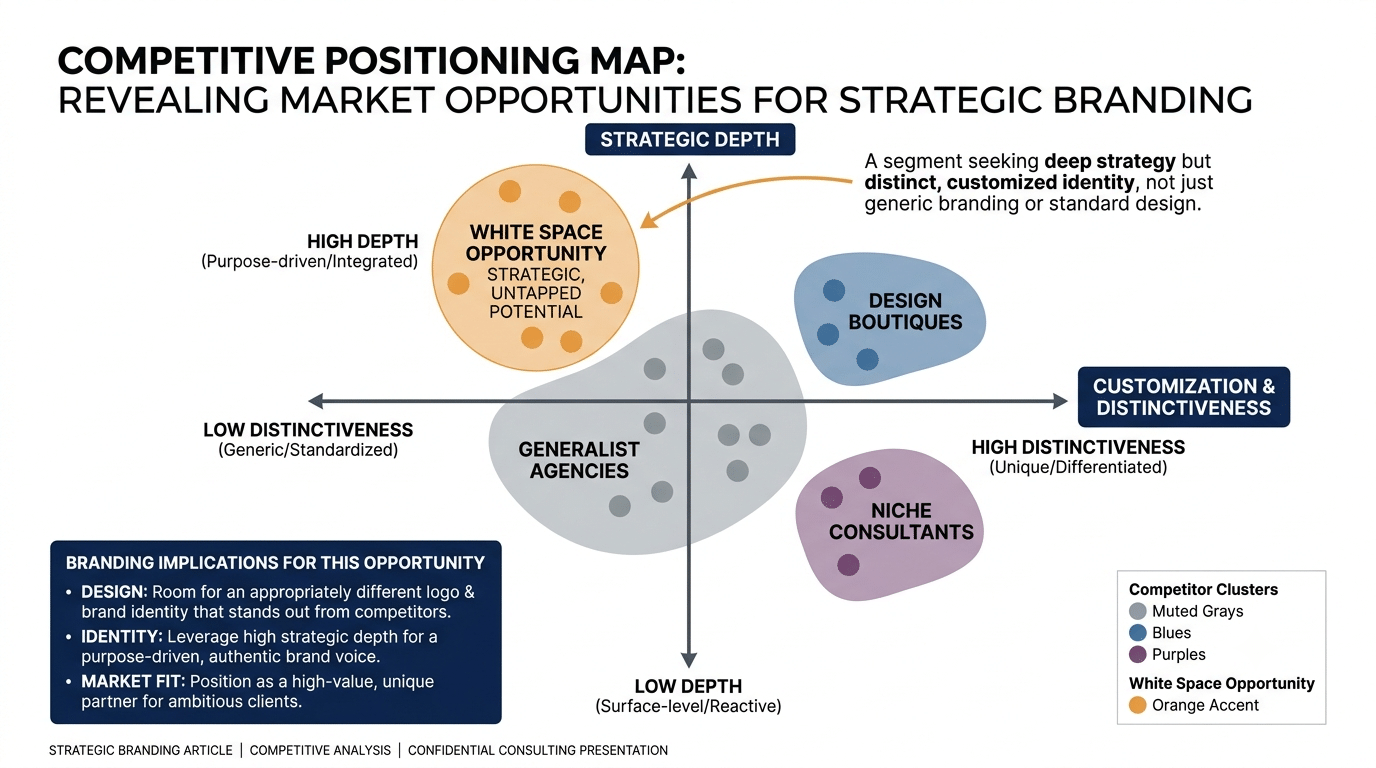
A competitor audit should therefore identify:
What visual patterns dominate the category?
and then:
Where is there room to look appropriately different?
The objective is not to become different for the sake of being different.
It is to develop a recognizable position.
You can learn more about the strategic side of this in the Brand Positioning Guide 2026.
Mistake 10: Designing for Personal Preference Instead of the Audience
This is particularly common with founder-led businesses.
The founder says:
“I love this color.”
or:
“This font feels premium.”
Personal preference is not irrelevant.
But it should not be the only criterion.
A logo ultimately operates in a communication environment.
The audience needs to understand and recognize the brand.
That means design decisions should consider:
Audience expectations
Category context
Brand personality
Positioning
Practical usage
The question should not only be:
“Do I like it?”
It should also be:
“Does it help the brand communicate what it needs to communicate?”
Mistake 11: Using Generic Icons
Certain symbols have become heavily associated with particular industries.
For example:
- lightbulbs for ideas
- globes for global businesses
- leaves for sustainability
- crowns for luxury
- speech bubbles for communication
- arrows for growth
- generic buildings for real estate
These symbols are not automatically bad.
The problem is that they can make a brand look interchangeable.
If you use a familiar symbol, consider whether there is a meaningful way to make the visual treatment distinctive.
Sometimes the strongest solution is not to illustrate the obvious category symbol at all.
Mistake 12: Using Too Many Design Elements
A logo often becomes weaker when it tries to combine:
icon + wordmark + tagline + descriptor + decorative shape + multiple colors
into one locked composition.
This can work in specific contexts, but it should not become the only logo configuration.
A better identity system separates the components.
For example:
Logo
Wordmark
Symbol
Tagline
Descriptor
Each can have a role without forcing everything into one arrangement.
Mistake 13: Adding a Tagline Inside the Logo Without Considering Scale
Taglines can be useful.
But placing a long tagline permanently inside the primary logo can create problems.
At smaller sizes, the tagline becomes unreadable.
It also restricts how the logo can be used.
A more flexible approach is often to maintain the tagline as a separate brand element that can accompany the logo when appropriate.
This gives the identity more flexibility.
Mistake 14: Not Creating a Logo System
A logo is rarely used in one environment.
A business may need it across:
- website
- social media
- documents
- presentations
- packaging
- advertisements
- digital products
- merchandise
One fixed logo configuration may not be appropriate everywhere.
That is why a professional logo package often includes variations and clear usage rules.
This is one of the differences between simply having a logo and having a usable visual identity system.
For a deeper introduction, see 7 Essential Elements of a Strong Brand Identity.
Mistake 15: Designing Without Testing Real Applications
A logo should not be approved solely because it looks good on a presentation slide.
Test it.
Put it on a website header.
Use it as a profile image.
Place it on a business document.
Reduce it significantly.
Put it against light and dark backgrounds.
View it from a distance.
Print it.
If relevant, test it on packaging or signage.
Real-world testing often exposes issues that aren’t visible during the initial design presentation.
Mistake 16: Creating a Logo That Cannot Be Edited or Reused Properly
A professional logo should be supplied in appropriate formats.
A business may eventually need:
Vector artwork
for scalable applications,
and appropriate raster exports
for digital use.
The exact file package depends on the project, but the important principle is that the business should not be trapped with one low-resolution image.
A logo is a long-term business asset.
Its technical delivery matters.
Mistake 17: Treating the Logo as the Entire Brand
This is perhaps the biggest conceptual mistake.
A company can have a beautiful logo and still have a weak brand.
Why?
Because branding extends far beyond the logo.
Your:
positioning
messaging
visual identity
brand voice
customer experience
content
reputation
and consistency
all contribute to how the brand is perceived.
The logo is an identifier.
It is not the entire identity.
For a deeper explanation, read Logo vs Brand: What’s the Difference?.
A Practical Logo Review Framework
Before approving a logo, move beyond the question:
“Does it look good?”
Instead, review it through five lenses.
Strategic Fit
Does the design support the brand’s positioning and personality?
Distinctiveness
Does it have enough character to be recognized within its category?
Legibility
Does it remain clear at realistic sizes?
Flexibility
Can it work across the brand’s important applications?
System Compatibility
Does it work with the broader color, typography, imagery, and layout system?
If the answer to one of these is weak, refine the logo before finalizing it.
How to Fix a Weak Logo Without Starting From Scratch
Not every weak logo requires a complete redesign.
Sometimes the problem is the system around it.
A logo may become stronger through:
simplifying unnecessary details
improving typography
adjusting spacing
creating responsive variations
establishing clearer usage rules
refining the color application
improving contrast
separating the tagline
In other cases, the underlying concept itself may be too generic or disconnected from the brand.
Then a redesign may be appropriate.
The important thing is to diagnose the problem before deciding on the solution.
A Better Logo Design Process
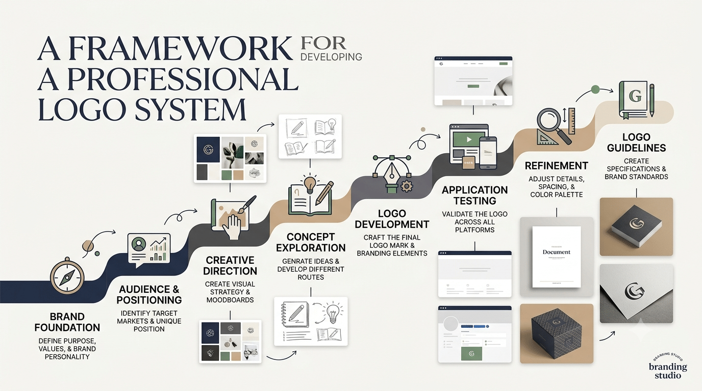
A strong process generally moves from strategy toward execution.
Brand foundation
↓
Audience and positioning
↓
Creative direction
↓
Concept exploration
↓
Logo development
↓
Application testing
↓
Refinement
↓
Logo system and guidelines
This order matters.
When the logo is designed first and strategy is considered afterward, the business often ends up trying to make the strategy fit the visual.
The stronger approach is to let the strategy inform the design.
What Should a Professional Logo Package Include?
The exact deliverables depend on the project.
However, a useful logo system may include:
Primary logo
The main configuration.
Secondary logo
An alternative arrangement for different spaces.
Symbol or icon
A compact version for small applications.
Color versions
Appropriate variations for different backgrounds.
Monochrome version
For single-color applications.
File formats
Suitable vector and digital exports.
Basic usage guidance
Information about spacing, backgrounds, sizing, and incorrect usage.
The objective is not to provide dozens of files simply to make the package look substantial.
Every version should have a practical purpose.
Final Takeaway
A strong logo is not necessarily the most complicated, artistic, or trendy logo.
It is the one that performs its role within a larger brand system.
Avoid designing before understanding the brand.
Avoid copying competitors.
Avoid unnecessary complexity.
Avoid choosing fonts and colors purely because they look attractive in isolation.
Test the logo at realistic sizes.
Build appropriate variations.
And remember that your logo is only one part of your brand.
A recognizable brand comes from repeated, consistent signals across strategy, messaging, visual identity, content, and customer experience.
Design the logo to serve the brand—not the other way around.
Frequently Asked Questions
What are the most common logo mistakes?
Common mistakes include designing without a clear brand strategy, copying competitors, following trends too closely, using excessive detail, choosing inappropriate typography, using too many colors, ignoring small-size applications, and treating the logo as the entire brand.
How simple should a logo be?
A logo should be as simple as necessary to remain recognizable, legible, distinctive, and usable. Simplicity is not an absolute rule; the appropriate level of detail depends on the brand and its applications.
Should a logo have a tagline?
It can, but a tagline does not always need to be permanently integrated into the primary logo. Keeping it as a separate element can provide greater flexibility, particularly when the logo needs to appear at small sizes.
How many colors should a logo use?
There is no universal number. What matters is whether the color system supports the brand and whether the logo remains functional when color is restricted or removed.
Should a logo be redesigned in 2026?
Not simply because it is 2026. A redesign should be based on an actual problem or strategic change, such as poor legibility, outdated positioning, weak differentiation, technical limitations, or a broader brand evolution.
Can AI create a professional logo?
AI can help explore visual concepts and creative directions, but generating an attractive symbol is different from developing a strategically appropriate and technically usable identity system. Human strategic and design judgment remains important.
Is a logo the same as a brand identity?
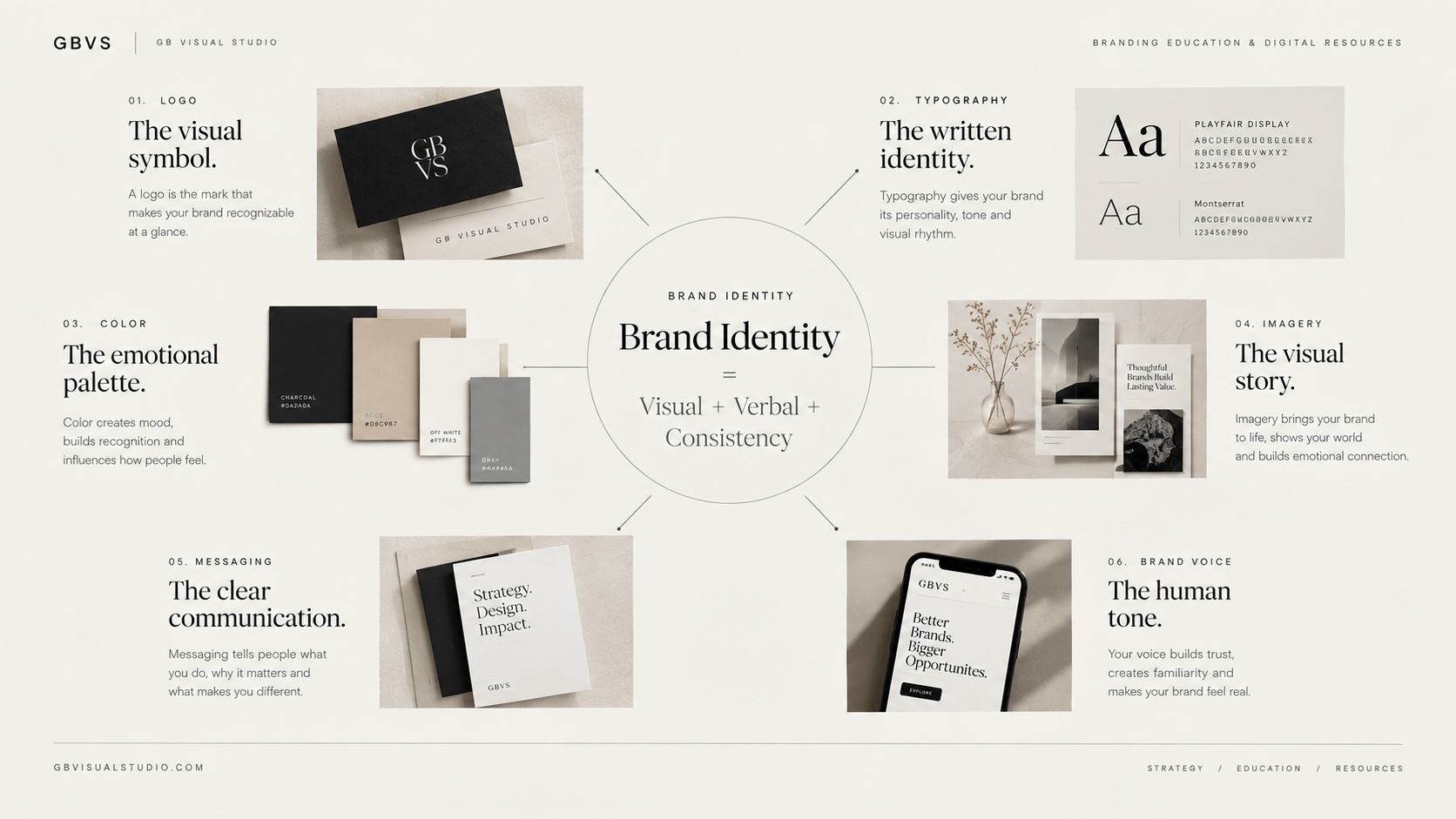
No. A logo is one component of a brand identity. Brand identity can include typography, colors, imagery, graphic elements, layout, photography, logo systems, and other visual expressions.
Should a small business invest in professional logo design?
The appropriate approach depends on the business’s needs, budget, positioning, and stage. A small business does not necessarily need an elaborate identity system, but it does benefit from a logo that is appropriate, usable, recognizable, and consistent with its broader brand.