
When people hear the words brand identity, they often think of a logo.
Then perhaps a color palette.
Then a few fonts.
Maybe an Instagram template.
But a strong brand identity is much more than a collection of design assets.
Your brand identity is the system your business uses to show up consistently and communicate who it is.
It is what turns an abstract brand strategy into something people can actually see, hear, recognize, and experience.
That is why two businesses can have equally attractive logos but completely different levels of brand clarity.
One has a collection of attractive assets.
The other has a cohesive identity.
The difference is usually strategic.
A strong identity starts by understanding what the business stands for, who it serves, how it wants to be perceived, and what makes it different. Current brand identity guidance similarly places audience, values, positioning, personality, and strategy before visual execution.
So if you’re building a brand from scratch, refreshing an existing business, or simply wondering why your visuals don’t feel consistent, this guide will help you understand what brand identity actually is—and how to build one without turning the process into a pile of disconnected design decisions.
What You'll Learn
ToggleWhat Is Brand Identity?
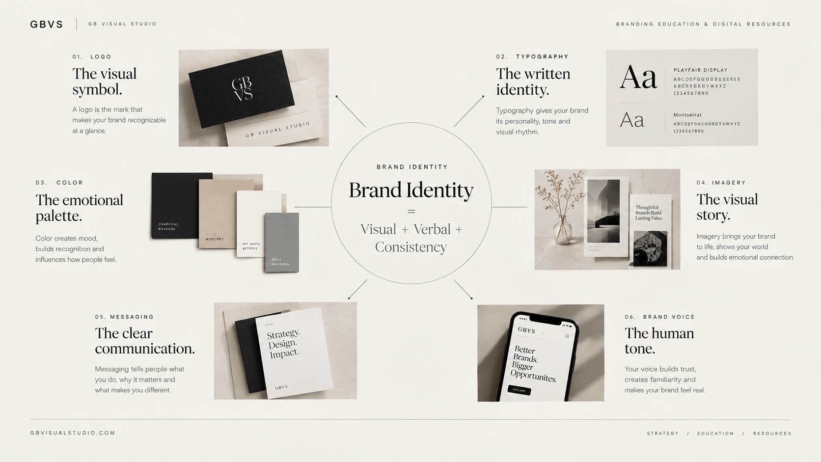
Brand identity is the collection of visual and verbal elements a business deliberately creates to represent itself.
That includes your logo, colors, typography, imagery, graphic style, messaging, voice, and the rules that determine how these elements work together.
Shopify’s current brand identity guide similarly defines identity through visual and verbal elements such as logo, colors, typography, imagery, and voice, emphasizing consistent application across touchpoints.
A useful distinction is:
Branding is the larger process.
Brand strategy is the thinking.
Brand identity is the expression.
Brand image is the perception.
You control the identity you create.
You influence—but cannot completely control—the image people form from it.
That distinction matters.
You can design a sophisticated identity, but if your messaging is unclear, your customer experience is poor, or your positioning is confusing, the audience may form a completely different impression.
So brand identity should never operate in isolation.
It should be an expression of the strategy underneath it.
If you haven’t read the broader pillar yet, start with the complete beginner’s guide to branding. It explains how brand strategy, positioning, identity, messaging, and experience connect.
Why Does Brand Identity Matter?
Your audience encounters your business before they fully understand it.
They may see an Instagram post.
A website header.
A product thumbnail.
A presentation.
An email.
A sales page.
A proposal.
A packaging design.
Each interaction contributes another piece to their understanding of your business.
A strong identity helps those pieces feel like they belong to the same brand.
That consistency matters because recognition is rarely created by one exposure.
It is created through repeated, coherent exposure.
And this is where many small businesses struggle.
They may have a logo, but their social graphics look completely different from their website.
Their website uses one visual style while their product pages use another.
Their typography changes depending on the template.
Their photography has no consistent direction.
Nothing is necessarily “bad.”
It simply doesn’t feel like one system.
A useful brand identity fixes that by creating visual and verbal rules that can be repeated.
Brand Identity Is Not Just a Logo
This is probably the most important misconception to remove early.
A logo identifies you.
It does not explain your entire brand.
Imagine removing the logo from your website for a moment.
Could someone still recognize the brand through the typography, colors, photography, layout, tone, messaging, and overall design language?
If the answer is no, your identity may be relying too heavily on one asset.
A strong identity creates multiple recognition cues.
The logo is one.
Color can be another.
Typography can be another.
Imagery, composition, language, layout, packaging, motion, sound, and even recurring content formats can contribute.
This is why brand identity should be treated as a system rather than a logo package.
Difference Between Brand Identity and Visual Identity
These terms overlap, but they are not always identical.
Brand identity can include both visual and verbal expression.
Visual identity focuses specifically on the visual layer.
Your visual identity can include:
- logo system
- color palette
- typography
- imagery
- graphic elements
- layouts
- iconography
- illustration
- photography direction
Brand identity can extend beyond those visuals into voice, messaging, personality, and other expressions of the brand.
This distinction becomes particularly useful when building a brand system.
You don’t want your designer working on the visual identity without understanding the verbal identity.
The two should support one another.
A sophisticated brand that speaks casually but visually presents itself as extremely formal may create tension.
Likewise, a playful brand using extremely rigid visual language may communicate the wrong personality.
The Core Elements of a Strong Brand Identity
There is no universal number of brand identity elements.
Some businesses need a relatively simple system.
Others need extensive systems covering packaging, digital products, physical spaces, campaigns, video, social media, and multiple sub-brands.
But several components appear repeatedly in strong identity systems.
Logo
The logo is the primary identifying mark.
A professional logo system should usually account for different contexts rather than assuming one version will work everywhere.
You may need a primary logo, secondary arrangement, symbol or mark, and versions that work against different backgrounds.
But don’t make the mistake of spending all your creative energy here.
The logo should fit the system.
It should not have to carry the entire brand.
For a deeper discussion, see Logo vs Brand: What’s the Difference?
Color
Color can become one of your strongest recognition tools.
But choosing colors because they look attractive is not enough.
Your palette should support the personality and positioning of the brand.
A luxury-oriented identity may require a different visual treatment from a playful children’s brand.
A technology company may need a different visual language from a handmade craft business.
There is no universally “professional” color.
Context matters.
Your color system should also be practical.
Think about how the colors work on websites, social posts, presentations, documents, product interfaces, backgrounds, buttons, and accessibility requirements.
A beautiful palette that becomes unusable in real applications isn’t a strong system.
For more depth, connect this article to Color Psychology in Brand Guidelines.
Typography
Typography is often underestimated because people treat fonts as decoration.
They are not.
Typography influences hierarchy, personality, readability, and visual rhythm.
A modern geometric sans serif communicates differently from a traditional serif.
A narrow display typeface creates a different impression from a neutral system font.
But typography is not only about personality.
It also needs hierarchy.
You should know what your headline style is, how supporting headings behave, what body text looks like, how captions work, and how typography behaves on smaller screens.
A brand identity becomes easier to maintain when these decisions are defined rather than improvised every time.
Imagery
Your photography and imagery can become a major recognition signal.
This includes more than choosing a filter.
Think about:
subject matter, composition, lighting, color treatment, perspective, cropping, and mood.
Suppose your brand communicates thoughtful, premium strategy.
Random stock photography showing generic business meetings may immediately weaken that positioning.
The image might technically be “professional,” but it does not belong to your visual world.
Imagery should reinforce the brand rather than simply fill empty space.
Graphic Elements
Graphic elements give an identity additional structure.
These could include lines, frames, shapes, patterns, textures, icons, illustration styles, or recurring compositions.
They should not exist simply because the design feels empty.
Their job is to make the visual system more recognizable and flexible.
A good graphic device can appear across social media, presentations, web pages, downloadable resources, and marketing materials without making everything look identical.
Brand Voice
Although voice isn’t visual, it belongs in the broader brand identity system.
Your brand needs to sound like the same business that it looks like.
A serious financial consultancy and an energetic creative studio should not necessarily communicate in the same way.
Define the personality behind your writing.
Then establish boundaries.
For example, perhaps the brand is:
clear, intelligent, direct, practical, and approachable.
That gives writers and creators a reference point.
It becomes easier to decide not only what the brand should say, but what it wouldn’t say.
Start With Strategy Before Design
This is where the identity process becomes significantly more effective.
Do not open Canva or Illustrator and immediately start experimenting with colors.
Start with the business.
Who are you trying to reach?
What problem are you solving?
What alternatives does your audience have?
What do you want to be known for?
What makes your approach different?
What personality should the brand communicate?
These questions create the foundation from which visual decisions can be made.
Current 2026 brand identity guidance continues to emphasize that identity design should begin with foundational decisions about audience, values, positioning, and personality rather than starting with the logo.
That is also why a visual identity that looks good in isolation can still be strategically wrong.
The design may be attractive.
The problem is that it communicates the wrong thing.
A Practical Process for Building Brand Identity
Once your strategy is reasonably clear, the visual identity process becomes much easier.
Start by translating your positioning into a creative direction.
Instead of saying:
“I want something modern.”
That is too broad.
Ask:
“What should modern mean for this specific brand?”
Perhaps it means minimal layouts, restrained color, strong typography, editorial photography, and generous whitespace.
Another brand might interpret modern as bright color, expressive typography, bold compositions, and motion.
The word itself isn’t enough.
You need to translate strategic attributes into visible decisions.
Build the visual system
Now develop your logo, color palette, typography, imagery direction, graphic elements, and layout principles.
The important word here is system.
Don’t judge each element independently.
Put them together.
Does the logo work with the typography?
Do the colors create enough contrast?
Does the photography fit the graphic language?
Does the layout create a recognizable rhythm?
Does everything support the personality?
The identity should feel coherent when the pieces appear together.
Test it in real situations
This step is frequently skipped.
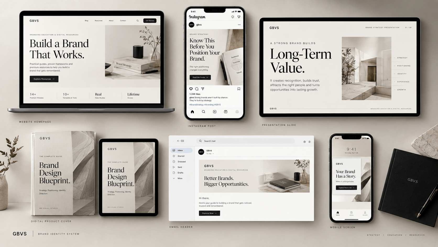
Place the identity on a website.
Create an Instagram post.
Design a presentation slide.
Create an email header.
Mock up a product page.
Look at a mobile screen.
The identity needs to work beyond the brand presentation board.
Current identity guidance also emphasizes applying the system consistently across customer touchpoints rather than treating the identity as a static collection of assets.
Brand Guidelines Make the Identity Repeatable
Even an excellent identity can become inconsistent if nobody knows how to use it.
That is where brand guidelines become useful.
A practical brand guide might document:
how the logo should be used,
which colors are primary and secondary,
how typography is structured,
what imagery should look like,
how layouts should behave,
what tone the brand uses,
and examples of correct and incorrect application.
The purpose isn’t to create rules for the sake of rules.
It is to reduce guesswork.
If five people create content for your business, they should not each interpret the identity differently.
The guidelines create a shared reference.
And as your business grows, this becomes increasingly important.
The Most Common Brand Identity Mistakes
One mistake I see repeatedly is designing the identity around personal taste instead of strategic relevance.
You may personally love purple.
That does not automatically mean purple is the right color for your brand.
You may love minimalist design.
That does not automatically mean minimalism communicates your positioning.
Your preferences matter, but they should not be the only decision-making criteria.
Another common mistake is using too many visual elements.
More fonts, colors, patterns, icons, and styles do not necessarily create more personality.
They can create noise.
Another mistake is inconsistency across platforms.
The website may look polished while social content feels completely unrelated.
And perhaps the most expensive mistake is redesigning without understanding why the existing identity isn’t working.
Before replacing something, diagnose the problem.
Is the issue recognition?
Positioning?
Readability?
Inconsistency?
Outdated applications?
Poor scalability?
Weak differentiation?
The answer should influence the solution.
How to Know Whether Your Brand Identity Is Strong
A strong identity should pass a simple test:
Remove the logo. Does the brand still feel identifiable?
You can also ask:
Does the visual system reflect the intended personality?
Does the identity make sense for the target audience?
Can the system work across different formats?
Does it remain recognizable when the content changes?
Can another designer use the guidelines without constantly asking questions?
Does the identity still support the positioning?
These questions are more useful than simply asking whether the design looks “premium.”
Premium is not a strategy.
Consistency, relevance, clarity, and distinctiveness are more useful evaluation criteria.
Brand Identity in 2026: Where AI Fits
AI is increasingly useful for generating visual directions, exploring concepts, creating variations, and accelerating production.
But there is a significant difference between generating visual material and building a brand identity.
AI can produce hundreds of aesthetic directions.
The strategic challenge is knowing which direction belongs to the brand.
That requires judgment.
It requires understanding the audience, category, positioning, personality, differentiation, and intended perception.
So use AI as a production and exploration tool where it makes sense.
Don’t allow the tool to become the strategist.
The stronger your strategic foundation, the more useful AI becomes because you can evaluate its output against clear criteria.
A Simple Way to Think About Brand Identity
If branding is the overall process of shaping what your business means, think of brand identity as the recognizable expression of that meaning.
Your strategy answers:
Who are we?
Who are we for?
What makes us different?
What should we stand for?
Your identity then answers:
What should that look like?
What should that sound like?
How should it behave consistently?
When those answers align, the brand starts to feel intentional.
When they don’t, you get a business that may look polished but feels disconnected.
What Should You Do Next?
If your current brand identity feels inconsistent, don’t immediately redesign everything.
Start by identifying the gap.
Maybe your strategy is unclear.
Maybe your positioning is too broad.
Maybe your messaging and visuals contradict each other.
Maybe your identity is actually strong but hasn’t been systemized.
Or perhaps the visual identity genuinely needs to be rebuilt.
Once you understand the problem, the design decision becomes much easier.
If you need to work through the strategic foundation first, start with the Brand Clarity Checklist.
If your strategy is already clear and your challenge is translating it into a cohesive visual system, the GBVS Brand Design Blueprint is the natural next resource.
And if you’re still learning the fundamentals, return to the complete Branding Beginner’s Guide and use this article as the deeper identity section of that journey.
Final Thought
Your brand identity should not simply make your business look better.
It should make your brand easier to recognize, understand, and remember.
That requires more than a logo.
It requires a connected system of strategy, visual language, verbal expression, and consistent application.
Start with meaning.
Translate that meaning into design.
Build rules around the design.
Then apply the system consistently.
That is how a collection of brand assets becomes a real brand identity.
4 Comments
[…] If you want to understand the visual side first, read Brand Identity: A Beginner’s Guide to Building a Strong Visual Identity. […]
[…] you’re still figuring out that foundation, start with the Brand Identity: A Beginner’s Guide to Building a Strong Visual Identity and then explore 7 Essential Elements of a Strong Brand Identity to develop the system […]
[…] you want to build that structure from the beginning, continue with Brand Identity: A Beginner’s Guide to Building a Strong Visual Identity, then explore 7 Essential Elements of a Strong Brand Identity to understand the individual […]
[…] Brand Identity Beginner Guide goes deeper into this […]