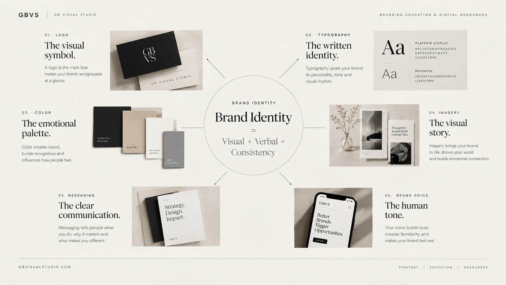
A strong brand identity is not created by finding one great logo.
It is created by making several different elements work together.
Your logo might be memorable, but if your typography feels unrelated, your photography changes from platform to platform, and your messaging sounds different everywhere, the brand can still feel inconsistent.
That is why building a brand identity requires a systematic approach.
Think about the brands you recognize immediately.
You may notice their colors first. You might recognize their typography, packaging, photography, layout, tone of voice, or even the way they structure their content.
Recognition rarely comes from one element.
It comes from a collection of consistent signals.
This is particularly important for small businesses, creators, freelancers, startups, and digital-product brands because every customer interaction contributes to the perception of the business.
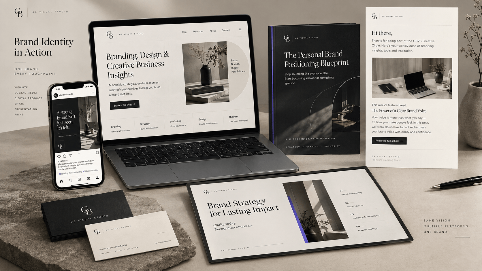
Your website, Instagram profile, sales page, emails, product graphics, proposals, and presentations all need to feel as though they belong to the same brand.
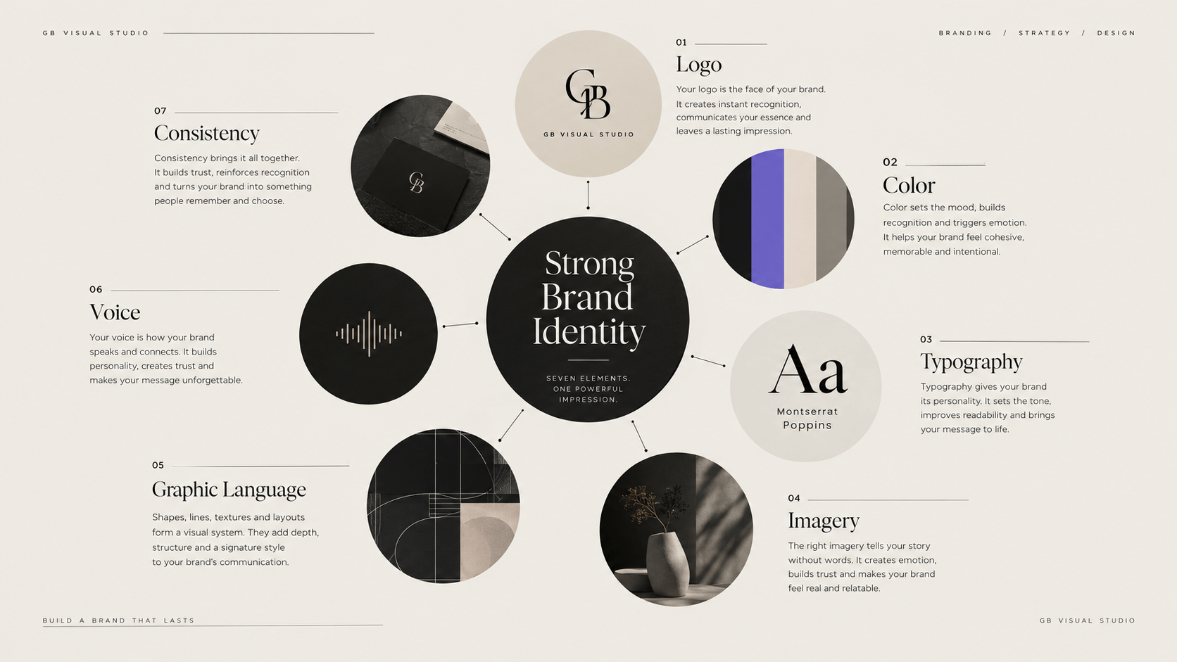
This guide breaks down seven essential elements that help create that consistency.
If you need the broader context first, start with the complete beginner’s guide to branding, which explains how strategy, positioning, identity, messaging, and customer experience fit together.
What You'll Learn
ToggleWhat Makes a Brand Identity Strong?
Before looking at individual elements, there is an important distinction to make.
A strong brand identity is not necessarily complicated.
It does not need twelve colors, five fonts, elaborate graphics, or hundreds of templates.
In fact, unnecessary complexity can make an identity harder to manage.
A strong identity is one where the different elements support the same strategic idea.
Your audience should be able to encounter different pieces of your brand without feeling that they came from completely different businesses.
That means coherence matters more than quantity.
A useful way to evaluate an identity is to ask:
If I removed the logo, would the remaining design still feel like the same brand?
If the answer is yes, you probably have multiple recognizable brand cues working together.
1. Logo System
The logo is usually the most obvious part of a brand identity.
It is also one of the most misunderstood.
A logo’s primary job is identification.
It gives your audience a visual mark they can associate with your business.
It does not need to explain everything your business does.
A good logo should therefore be appropriate to the brand, recognizable, adaptable, and functional across different sizes and applications.
The important word is system.
A business may need a primary logo, a secondary arrangement, a simplified mark, or different configurations for different contexts.
A website header might require a horizontal version.
A social profile might need a compact symbol.
A product cover might require another configuration.
The goal is not to create more logos unnecessarily.
It is to make the identity usable.
This is also why logo design should happen after the strategic foundation has been considered. If you want to understand the distinction more clearly, see Logo vs Brand: The Difference Explained.
2. Color System
Color can become one of the strongest recognition signals within an identity.
But choosing colors should involve more than asking which colors you personally like.
Your palette should support the personality, positioning, audience, and practical requirements of the brand.
For example, a business positioning itself as sophisticated and editorial might use a restrained palette differently from a playful children’s education brand.
Neither approach is automatically better.
The question is whether the visual decision supports the intended perception.
A useful color system usually includes a clear primary palette and supporting colors rather than an unlimited collection of unrelated shades.
You also need to consider where those colors will be used.
A color that looks excellent in a moodboard may not work well for body text, buttons, backgrounds, presentations, or mobile interfaces.
Accessibility and contrast matter too.
This is why color should be treated as part of a functional system, not merely decoration.
For a deeper exploration, connect this article with Color Psychology in Brand Guidelines.
3. Typography System
Typography is one of the easiest ways to create personality without adding unnecessary decoration.
A typeface can feel modern, traditional, editorial, technical, playful, understated, or expressive.
But choosing a font is only the beginning.
A strong typography system establishes hierarchy.
You need to know how headlines behave, how subheadings work, what body text looks like, how captions are treated, and how typography scales across devices.
Without that structure, every new piece of content becomes another design decision.
One Instagram graphic might use a bold display font.
The next uses a completely different typeface.
The website uses something else.
Eventually, the audience receives no consistent typographic signal.
A well-designed system removes much of that uncertainty.
It gives the brand a recognizable rhythm.
And typography should always remain readable.
A beautiful typeface that makes your website difficult to scan is not doing its job.
4. Imagery and Photography
Imagery is often where a brand identity either becomes distinctive or becomes generic.
Many businesses use stock photography because it is convenient.
The problem is not stock photography itself.
The problem is using imagery without a clear visual direction.
Think about the characteristics that should remain consistent:
Lighting.
Composition.
Subject matter.
Color treatment.
Perspective.
Cropping.
Backgrounds.
Mood.
For example, a strategy-focused consulting brand might use restrained editorial photography, architectural compositions, workspace details, and carefully framed portraits.
A youthful creative brand might use more energetic compositions, stronger color, and expressive imagery.
The important thing is that the imagery reinforces the same positioning as the rest of the identity.
This becomes even more important when businesses begin using AI-generated imagery.
The ability to create unlimited visuals makes visual direction more important, not less.
Without rules, more image generation can simply produce more inconsistency.
5. Graphic Language
Graphic language is the collection of visual devices that gives your identity additional character.
This could include shapes, lines, patterns, borders, textures, icons, illustrations, compositions, or recurring layout treatments.
These elements can be particularly useful when a logo alone isn’t enough to create a distinctive visual presence.
Imagine a social media feed.
If every post contains the logo in the corner, the logo is doing most of the recognition work.
But if the brand also has a recognizable typographic hierarchy, image treatment, spacing system, composition style, and recurring graphic language, the content can feel branded without repeatedly displaying the logo.
That is a more mature approach to identity design.
The objective is not to decorate every piece of content.
It is to create a visual language that can adapt across different applications.
A good graphic element should have a reason to exist.
If removing it makes no difference to the identity, it may not be necessary.
6. Brand Voice and Messaging
Brand identity isn’t entirely visual.
How your business communicates is another major part of how people experience it.
Your brand voice establishes the personality behind the words.
Perhaps your brand is direct and analytical.
Maybe it is warm and educational.
Maybe it is sophisticated and editorial.
Or perhaps it is energetic and informal.
The correct choice depends on the brand.
The important thing is consistency.
If your visual identity communicates premium expertise but your copy uses exaggerated sales language and generic marketing clichés, the two layers can conflict.
Your voice should support your positioning.
Messaging should then communicate the actual value of the business clearly.
This is particularly important for content-driven brands.
Your audience may interact with your written communication far more often than they interact with your logo.
That means your words are part of your identity.
For a deeper exploration, continue with the Brand Voice Complete Beginner Guide.
7. Consistency and Application
This is the element that connects all the others.
You can have an excellent logo.
A thoughtful color system.
Beautiful typography.
A distinctive photography style.
Strong graphics.
And a well-defined voice.
But if these elements are not applied consistently, the identity becomes difficult to recognize.
Consistency does not mean making everything identical.
Your Instagram post should not look exactly like your website.
Your sales page should not look exactly like your presentation.
Different formats require different design decisions.
Consistency means that the underlying brand logic remains recognizable even when the application changes.
That is an important distinction.
A strong brand identity has flexibility without losing its character.
How These Seven Elements Work Together
The real strength of a brand identity does not come from the individual components.
It comes from the relationship between them.
Imagine a fictional creative strategy studio positioned around clarity, sophistication, and practical expertise.
Its typography might be restrained and highly structured.
Its color palette might be minimal.
Its photography might use clean editorial compositions.
Its graphic language might rely on grids and strong spacing.
Its voice might be direct and educational.
Its logo might be simple rather than overly illustrative.
None of those decisions exists independently.
They all communicate the same underlying idea.
That is what makes the identity feel coherent.
Now imagine replacing the typography with an overly playful display font, introducing ten bright colors, switching to casual meme-style messaging, and using unrelated
stock photography.
Each individual element might look attractive.
Together, however, they would communicate a completely different brand.
This is why identity design should always be evaluated as a system.
How to Build These Elements Without Making Your Brand Look Cluttered
A common beginner mistake is assuming that every element needs to be visually prominent.
It doesn’t.
Your identity needs hierarchy.
Perhaps typography is the dominant recognition cue.
Color provides secondary recognition.
Photography establishes mood.
Graphic elements provide flexibility.
The logo identifies the business.
Voice establishes personality.
Consistency connects everything.
When every element tries to be the hero, the identity becomes noisy.
A stronger approach is to decide which elements should carry the most visual weight and which should support them.
This is particularly important for social media.
Your content should not look like a collection of seven different branding techniques forced into one graphic.
Instead, the elements should work quietly together.
What If You Are Building a Brand Yourself?
You don’t necessarily need a large design team to establish a strong foundation.
Start by documenting the strategic decisions first.
Then define the visual direction.
Then build a small but usable system.
For example, instead of creating twenty different templates immediately, create a few adaptable structures that demonstrate how the brand should behave.
Instead of selecting fifteen colors, establish a controlled palette.
Instead of downloading dozens of fonts, establish a hierarchy.
Instead of collecting hundreds of images, define the visual characteristics your imagery should follow.
This approach makes the identity easier to maintain.
It also makes future design work faster because you are no longer starting from zero.
If you’re doing the process yourself, the Build a Brand Identity Without a Designer guide can take you deeper into that process.
A Brand Identity Should Evolve—Without Losing Its Core
Brands change.
Businesses introduce new products.
Audiences evolve.
Markets become more competitive.
Visual trends change.
Technology changes.
That doesn’t mean your identity should be redesigned every time something changes.
A useful identity has enough flexibility to evolve while maintaining recognizable core elements.
This is one reason a system is more valuable than a single visual style.
You can update an application without destroying the foundation.
You can introduce a campaign color without replacing the entire palette.
You can create a new content format without abandoning your typography.
You can incorporate AI-generated visuals without losing your established imagery direction.
The identity becomes an adaptable framework rather than a fixed picture.
The Real Test of a Strong Brand Identity
Ultimately, don’t judge your identity only from the brand presentation board.
Judge it in use.
Put it on your website.
Create a social post.
Build a sales page.
Design a product thumbnail.
Write an email.
Open everything on a mobile device.
Then step back.
Does it feel like one brand?
Can you identify the recurring visual signals?
Does the voice match the visual personality?
Does the identity support the positioning?
Can someone else use the system without completely changing it?
If yes, you are moving beyond individual design assets and toward a genuine identity system.
Where to Go Next
A strong brand identity begins before the design file.
It starts with understanding the business, the audience, the competitive environment, and the position you want to occupy.
Then those decisions can influence the visual and verbal system.
If you are still working through that foundation, begin with the Brand Clarity Checklist.
If your strategy is already clear but you need a structured process for translating it into a complete visual direction, explore the GBVS Brand Design Blueprint.
And for the broader strategic context, return to the complete Branding Beginner’s Guide.
Final Thought
A strong brand identity does not need to shout.
It needs to be recognizable, coherent, relevant, and repeatable.
Your logo identifies the brand.
Color creates another recognition cue.
Typography establishes hierarchy and personality.
Imagery creates atmosphere.
Graphic language adds flexibility.
Voice gives the brand a human character.
And consistency turns all of those elements into a recognizable system.
The goal is not to make every piece of content look identical.
The goal is for every piece of communication to feel like it came from the same brand.
That is what turns seven individual elements into one strong identity.