
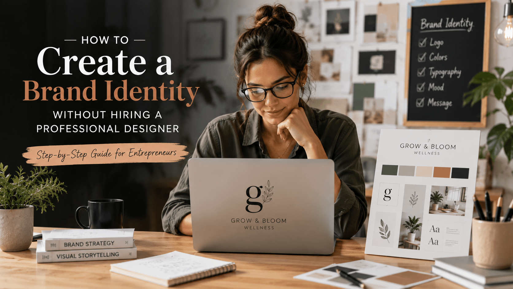
Building a brand identity can feel like something you need a professional designer to do.
You may think you need an expensive logo package, a complete brand book, custom illustrations, professional photography, and dozens of carefully designed assets before you can look established.
You don’t.
If you’re a freelancer, creator, consultant, startup founder, or small business owner, you can build a functional brand identity without a designer—provided you approach it as a system rather than simply decorating your business.
The important distinction is this: DIY branding isn’t about replacing professional design with random templates. It’s about making deliberate decisions about how your business should look, sound, and appear consistently.
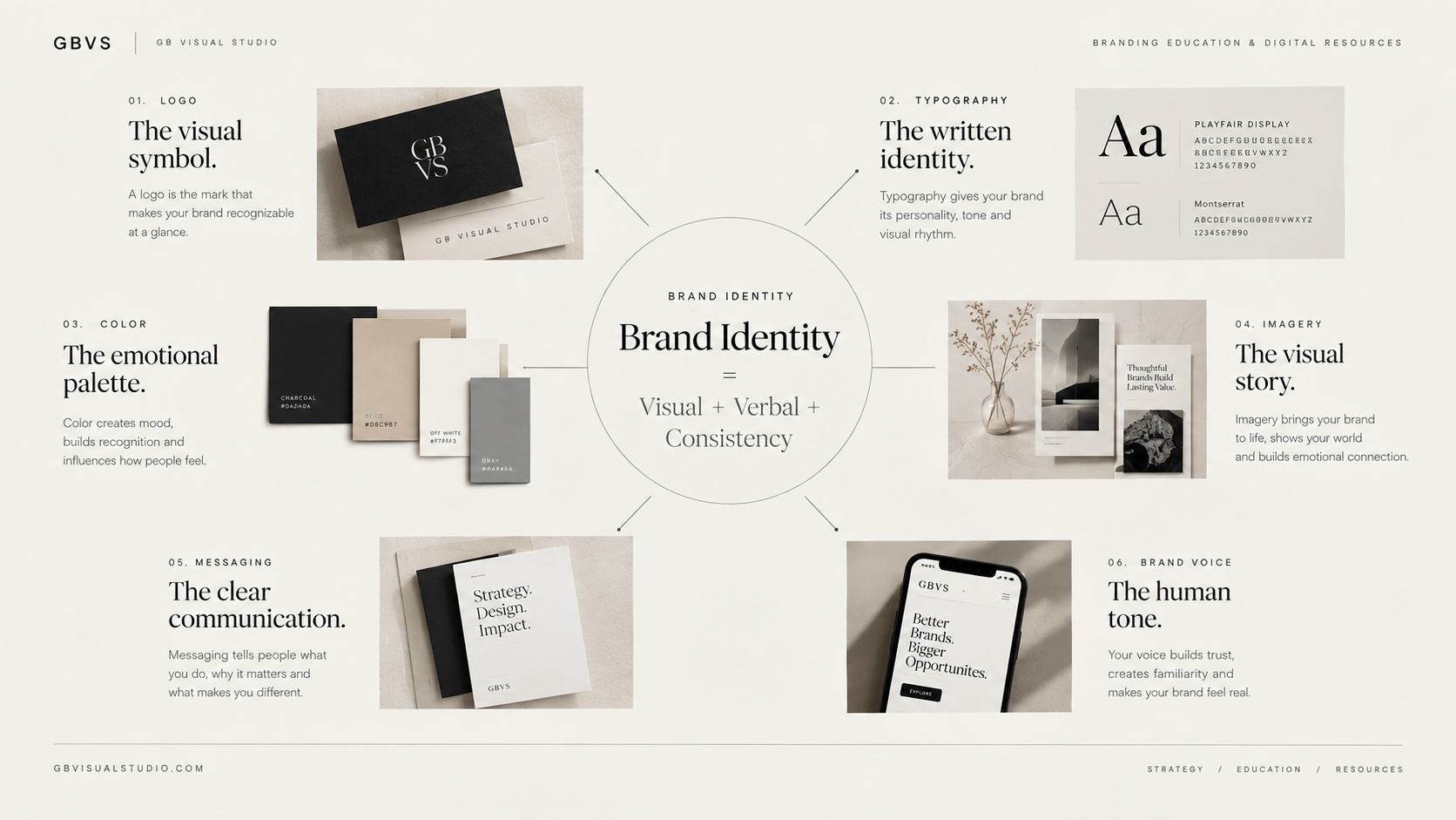
A brand identity typically combines visual and verbal elements such as your logo, colors, typography, imagery, and brand voice.
The goal is not to create the most sophisticated identity possible.
The goal is to create one that is clear, recognizable, appropriate for your audience, and consistent enough to use repeatedly.
What You'll Learn
ToggleStart With Strategy, Not Design
The most common DIY branding mistake is opening a design tool before deciding what the brand actually needs to communicate.
You choose a font because it looks elegant. Then a color because it looks modern. Then a logo template because it looks professional.
A week later, you have a collection of attractive elements that don’t necessarily belong together.
Your visual identity should come from the foundation of your brand: what you offer, who you serve, what makes your approach different, and how you want people to perceive you.
This is why brand identity shouldn’t begin with the logo. Current brand identity guidance similarly recommends defining the brand foundation, audience, and competitive landscape before developing the visual system.
If you haven’t clarified those decisions yet, start with the Branding Complete Beginner’s Guide and then move into your visual identity.
Before designing anything, complete these sentences:
My brand helps: [specific audience]
They need help with: [specific problem]
We help them by: [your solution]
Our brand should feel: [three to five characteristics]
We should not feel: [three characteristics to avoid]
That short exercise gives your design decisions a direction.

1. Define Your Brand Personality
Think about your brand as a personality rather than a collection of graphics.
Should it feel sophisticated or approachable?
Minimal or expressive?
Technical or conversational?
Bold or understated?
Playful or serious?
There is no universally correct personality. The important thing is consistency between your personality, audience, positioning, and visual choices.
For example, a financial consulting brand might want to communicate clarity, authority, and stability. A children’s creative studio may require a completely different visual language.
This is where many DIY brands become visually confused. They attempt to combine every characteristic they like.
Instead, select three to five personality traits that should consistently guide your decisions.
For example:
Strategic + Minimal + Confident + Human
Now you have a filter.
If a design element feels playful and chaotic, ask whether it actually supports the intended personality.
If it doesn’t, remove it.
This principle is more valuable than knowing how to use every design feature in your software.
2. Research Your Competitors Before Choosing Your Style
You don’t need expensive market research to understand the visual landscape around your business.
Create a simple competitor board.
Look at 10–15 brands that target a similar audience. Study their websites, Instagram profiles, advertisements, packaging, thumbnails, and other public-facing materials.
Don’t copy them.
Instead, identify patterns.
Perhaps most competitors use dark backgrounds and bold sans-serif typography. Maybe everyone uses muted beige and minimalist photography. Maybe the entire category relies on the same blue-and-white visual language.
These patterns tell you what your audience is already accustomed to seeing.
They also reveal opportunities for differentiation.
A recent Shopify guide similarly recommends researching competitors’ visual landscapes to identify overused patterns and potential gaps before developing a brand identity.
Create two columns:
Common in my industry
and
What I could do differently
This simple comparison can prevent your brand from becoming another version of the same template.
3. Build a Small Color Palette
You don’t need 12 brand colors.
In fact, starting with fewer colors can make a DIY identity easier to manage.
A practical starting system might contain:
- one primary brand color
- one secondary or supporting color
- one accent color
- one or two neutral colors
The exact combination depends on your positioning.
More importantly, define the role of each color.
For example, your primary color could be used for major brand moments, while the accent is reserved for buttons, highlights, or important information.
Don’t choose colors only because you personally like them.
Consider how they interact with your audience, category, personality, and overall visual system.
For a deeper explanation, continue to Color Psychology in Brand Guidelines.
Also test your colors outside the moodboard. Put them on an actual website section, social post, presentation, or product graphic.
A palette that looks beautiful in isolation may become difficult to use when applied to real content.
4. Choose Typography You Can Actually Use
Typography is one of the easiest ways to make a DIY brand look inconsistent.
You don’t need five fonts.
Start with one primary typeface and, if necessary, one complementary typeface.
Your primary font should handle most communication: website headings, social graphics, documents, and marketing materials.
Your secondary typeface can create contrast where needed.
Then define basic roles:
Heading: Typeface A
Body: Typeface B
Accent: optional
Also establish simple rules for weight and hierarchy.
For example:
H1 — Bold
H2 — Semibold
Body — Regular
Caption — Medium
The objective is not typographic complexity.
It’s repeatability.
If you can open a blank design tomorrow and immediately know which font belongs where, you’ve created a usable system.
5. Create a Simple Logo System
Your logo does not need to carry your entire brand.
It needs to identify your business and work reliably across different applications.
For a small business, a simple wordmark can often be more practical than an elaborate symbol.
Create the minimum useful variations:
Primary logo — your main version
Secondary version — alternative layout for restricted spaces
Icon/mark — where a small square format is required
Monochrome version — for situations where color isn’t appropriate
Then test your logo at different sizes.
Put it on:
- a website header
- an Instagram profile
- a social graphic
- a document
- a small mobile layout
If it stops working when reduced, simplify it.
You can also read Logo vs. Brand: What’s the Difference? to understand why the logo should be treated as one component of the larger identity.
6. Establish an Imagery Direction
This is an area where DIY brands often become inconsistent.
One Instagram post uses stock photography.
The next uses a 3D illustration.
The next uses a completely different AI-generated aesthetic.
The result feels like several businesses sharing the same account.
Instead, decide what your imagery should generally look like.
For example:
Editorial photography + natural lighting + neutral backgrounds + close compositions + subtle shadows
Or:
Minimal graphics + geometric forms + high contrast + generous whitespace
You don’t need every image to be identical.
You need them to feel like they belong to the same visual world.
Your imagery style should also make sense for the brand personality you’ve already established.
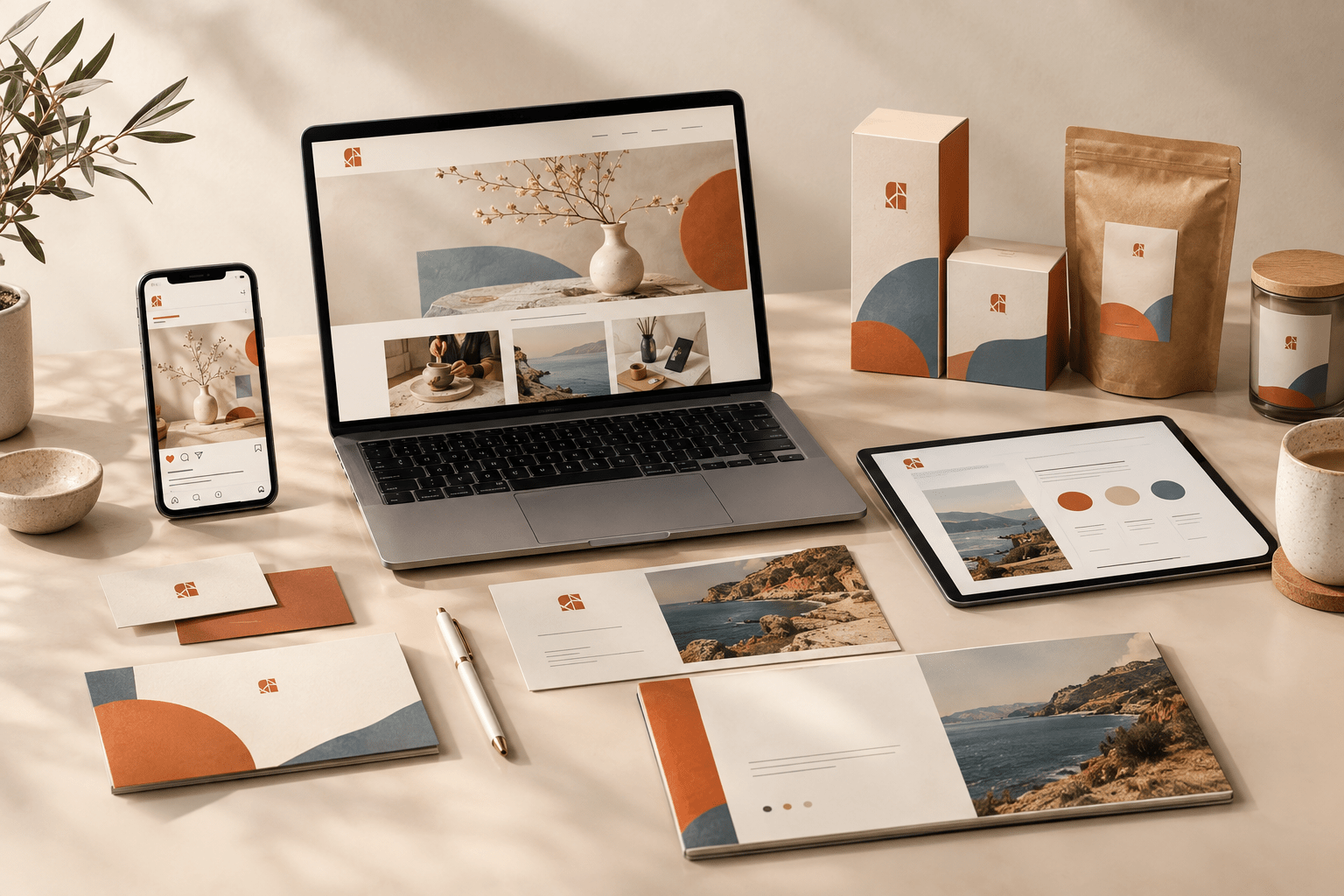
7. Create a Small Brand Asset Library
Once your core decisions are made, organize them.
Create one folder containing:
01 — Logos
02 — Colors
03 — Fonts
04 — Templates
05 — Images
06 — Icons & Graphics
07 — Brand Guidelines
This sounds simple, but it changes how consistently you work.
Instead of recreating your visual identity every time you publish something, you’re working from a controlled system.
You can also create reusable templates for recurring content.
For example, if you publish educational Instagram posts every week, create one master layout.
If you send newsletters, create a consistent email structure.
If you publish blog articles, establish consistent featured-image dimensions and typography.
Consistency becomes much easier when you reduce the number of decisions you have to make repeatedly.
8. Turn Everything Into Simple Brand Guidelines
You don’t need a 50-page brand book.
For a new or small business, a concise document can be enough.
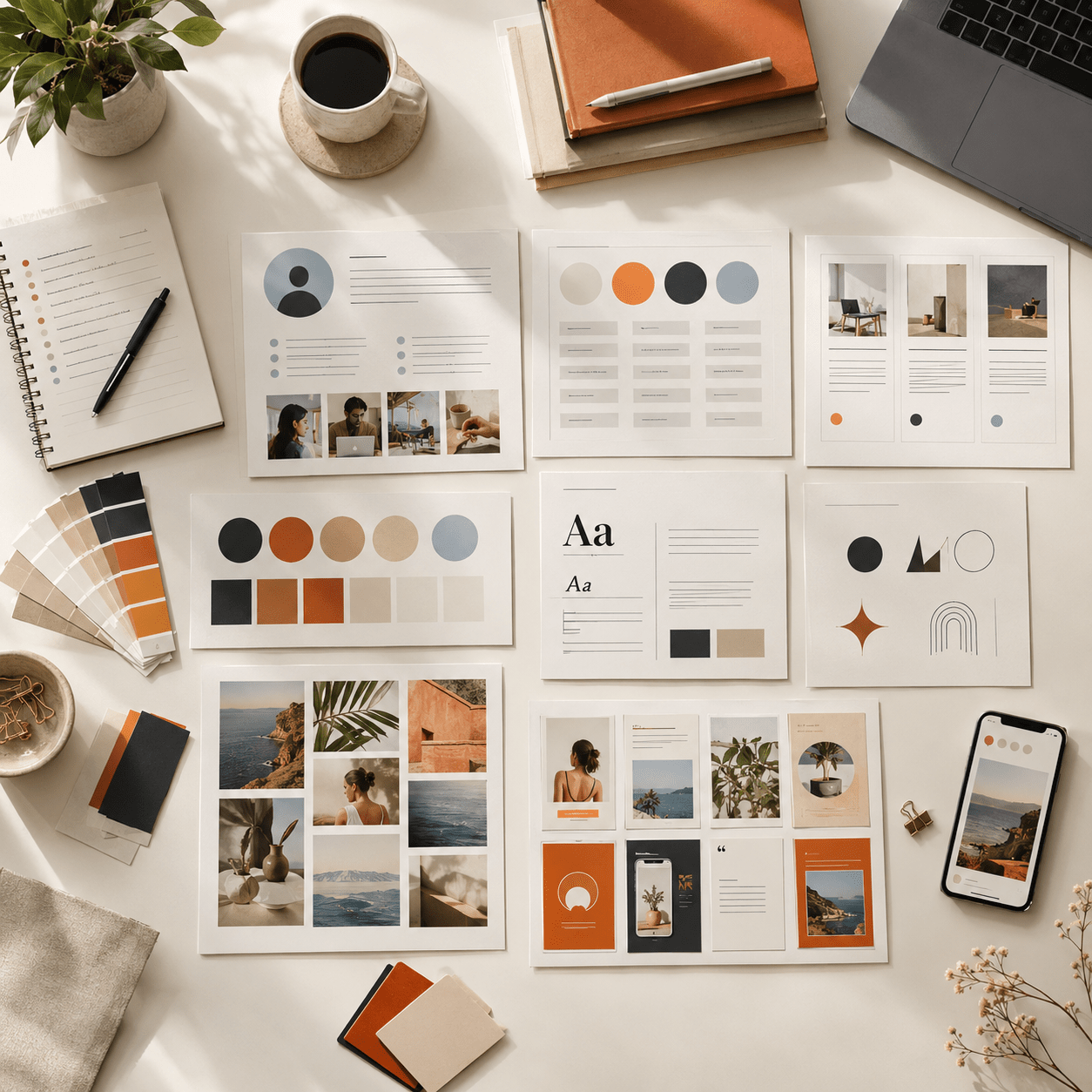
Your first brand guide might include:
Brand foundation — purpose, audience, positioning, personality
Logo — approved versions and basic usage
Colors — names, HEX codes, and roles
Typography — fonts and hierarchy
Imagery — photography or graphic direction
Graphic elements — patterns, shapes, icons, or other recurring elements
Voice — how the brand communicates
Examples — a few correctly applied designs
Brand guidelines are useful because they don’t merely identify the assets; they explain how those assets should be used.
That distinction matters.
A folder containing five colors isn’t a brand system.
A document explaining which color to use, where to use it, and why is much closer to one.
9. Test the Identity Before Calling It Finished
Don’t judge your brand identity only inside the design file.
Put it into real situations.
Create a fake Instagram post.
Build a simple homepage.
Design a presentation slide.
Create an email header.
Make a product graphic.
Then place all of them side by side.
Ask:
Do these look like the same business?
If you remove the logo, can you still recognize the visual direction?
Does the typography remain consistent?
Are the colors being used intentionally?
Does the imagery support the personality?
Does the brand still look appropriate when the content changes?
This is where the identity becomes a system rather than a moodboard.
You Don't Need a Designer for Every Stage
There is an important distinction between building an initial brand identity yourself and never needing professional design expertise.
DIY branding can be a sensible starting point when you’re validating an idea, launching a small business, or working with limited resources.
As your business grows, professional help can become valuable for strategic positioning, identity refinement, custom design systems, packaging, campaigns, art direction, or larger brand transitions.
The objective isn’t to avoid designers forever.
It’s to understand enough about your own brand that you don’t outsource decisions you haven’t made yet.
A designer can translate strategy into a stronger identity.
They shouldn’t have to invent the strategy blindly.
What About AI and Design Tools?
AI and accessible design platforms can make the production side of branding much faster.
You can use them to explore typography combinations, generate moodboard directions, develop content variations, organize ideas, or prototype layouts.
But speed doesn’t replace judgment.
An AI tool can produce 50 logo concepts.
That doesn’t tell you which concept actually fits your positioning.
A template platform can give you thousands of combinations.
That doesn’t tell you which combination distinguishes your business.
Use tools to accelerate exploration and production. Keep the strategic decisions human.
Google’s current guidance also emphasizes creating useful, people-first content rather than producing material primarily to manipulate search visibility. The same principle is useful for branding: tools should support the underlying purpose rather than become the purpose.
The DIY Brand Identity Framework
If you want to simplify the entire process, think about it in this order:
Strategy → Personality → Audience → Differentiation → Color → Typography → Logo → Imagery → Templates → Guidelines → Application
Notice what isn’t first:
Logo.
Your logo is part of the identity, not the foundation of it.
A strong DIY brand identity comes from making a small number of connected decisions and repeating them consistently.
You don’t need to design everything at once.
Start with the essentials. Use them. Observe where the system breaks. Improve it.
Then expand.
Final Thought
Building a brand identity without a designer is possible.
Building a good one requires more than choosing attractive fonts and colors.
The real skill is learning to make connected decisions.
Your audience influences your positioning. Your positioning influences your personality. Your personality influences your visual direction. Your visual direction influences your typography, color, imagery, and design system.
When those decisions work together, even a relatively simple brand can feel intentional.
And when your business reaches the point where professional design makes sense, you’ll have something even more valuable than a collection of assets: a clear strategic foundation for a designer to build upon.
If you’re still figuring out that foundation, start with the Brand Identity: A Beginner’s Guide to Building a Strong Visual Identity and then explore 7 Essential Elements of a Strong Brand Identity to develop the system further.
Frequently Asked Questions
Can I create a brand identity without a designer?
Yes. A small business can establish a functional identity by defining its brand foundation, personality, audience, visual direction, colors, typography, logo, imagery, and basic usage rules. Professional design becomes more valuable as the brand’s complexity and requirements increase.
What should I design first when creating a brand identity?
Start with strategy and brand personality rather than the logo. Clarify who you serve, what you offer, how you differ, and how you want the brand to feel. Then translate those decisions into visual elements.
How many colors should a DIY brand have?
There is no universal number, but a small palette is easier to manage consistently. Starting with a primary color, supporting color, accent, and neutrals is often enough for an early-stage brand.
Do I need a brand guideline document?
A simple brand guide is highly useful. It gives you a reference for applying your logo, colors, typography, imagery, and voice consistently across your website, social media, marketing materials, and other touchpoints.
Should I hire a designer later?
You can. DIY branding can establish the initial system, while a professional designer can later refine or expand the identity when your business requires a more sophisticated strategy or visual system.
2 Comments
[…] you’re doing the process yourself, the Build a Brand Identity Without a Designer guide can take you deeper into that […]
[…] If you’re building your identity yourself, continue with How to Build a Brand Identity Without a Designer. […]