Choosing brand colors looks simple until you actually have to make the decision.
You open a color picker and suddenly there are thousands of possibilities.
Warm or cool?
Dark or light?
Muted or saturated?
One color or five?
Should the brand use blue because it feels trustworthy? Green because it suggests growth? Black because it feels premium?
These questions are common because color is one of the most visible parts of a visual identity.
But there is a problem with the way color psychology in branding is often explained.
You will frequently see simplified rules such as:
Blue means trust.
Red means energy.
Green means nature.
Purple means creativity.
Those associations can be useful as starting points, but they are not universal laws.
The same color can communicate very different things depending on the shade, surrounding colors, typography, imagery, industry, culture, and overall brand positioning.
A dark green used with a refined serif typeface can feel completely different from a bright green used with playful typography.
So the better question isn’t:
“What does this color mean?”
It is:
“What does this color communicate in this particular brand system?”
That shift makes color selection much more strategic.
In this guide, we’ll look at how color psychology actually works in branding, how to choose a brand color palette, how to avoid common mistakes, and how to document your choices inside practical brand guidelines.
What You'll Learn
ToggleWhat Is Color Psychology in Branding?
Color psychology in branding refers to the study and application of how colors can influence perception, emotion, attention, associations, and behavior in a brand context.
The important phrase is “in a brand context.”
Color does not operate independently.
People interpret it alongside everything else they see.
Consider a simple black-and-white logo.
On its own, it could communicate almost anything.
Now place it inside a luxury editorial identity with elegant typography, restrained photography, generous whitespace, and premium materials.
The perception changes.
Put the same black logo into a playful children’s brand with bright illustrations and rounded typography.
The surrounding system changes the interpretation.
This is why color should be treated as one component of a broader visual identity rather than a standalone psychological trigger.
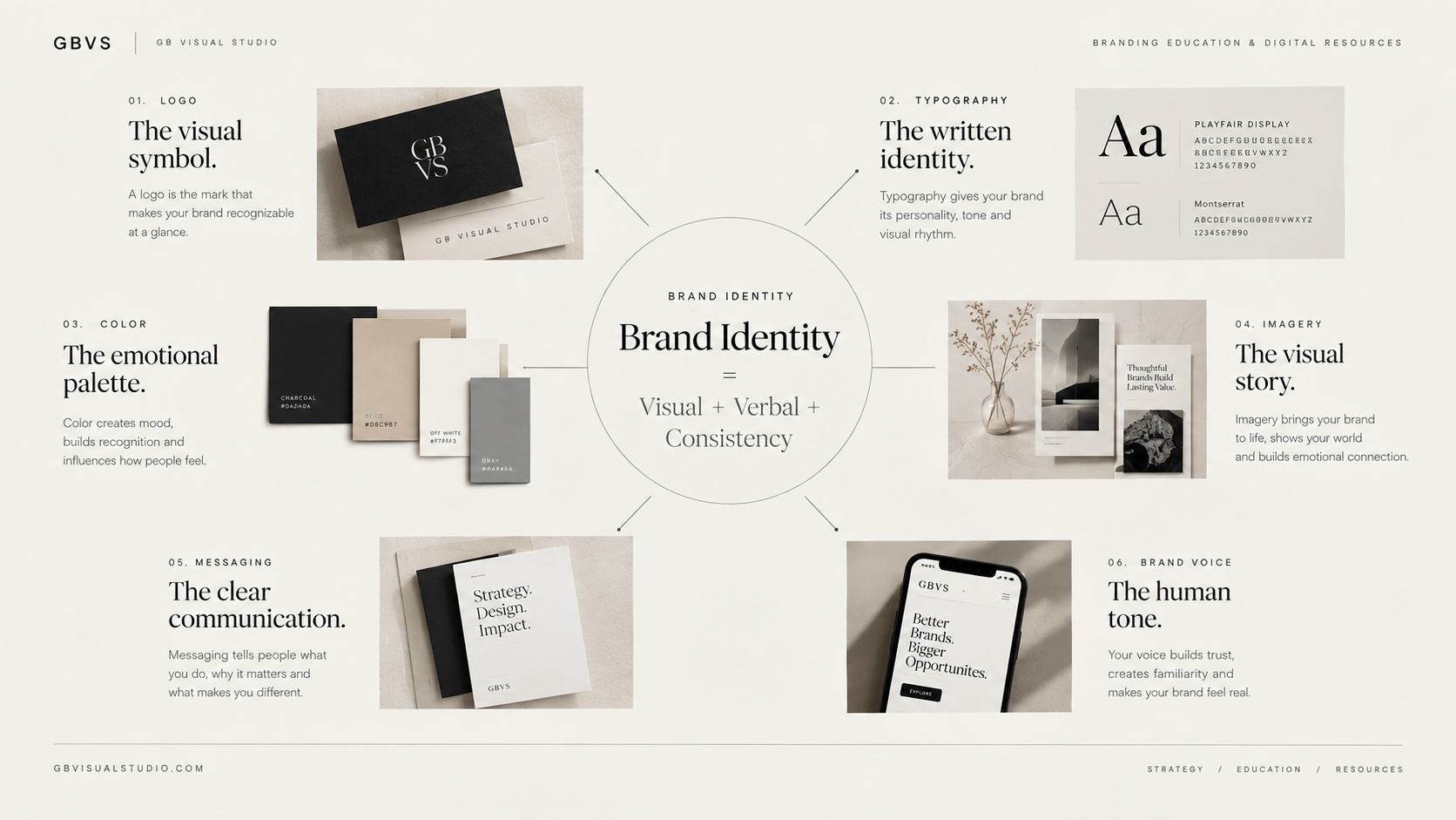
If you are unfamiliar with the larger system, first read Brand Identity: A Beginner’s Guide.
That article explains how color works alongside logo, typography, imagery, graphic language, and brand voice.
Why Brand Color Matters
Color has an important practical advantage:
It can become recognizable through repetition.
When a business consistently uses a particular color combination across its website, social media, packaging, advertising, and other touchpoints, those colors can become associated with the brand.
This does not happen simply because a company selected a particular hex code.
It happens because the audience repeatedly encounters a relatively consistent visual signal.
That is why a brand palette should not be treated as a decorative collection of colors.
It should be treated as a recognition system.
Your primary color might appear on important brand surfaces.
A secondary color might support campaigns.
A neutral palette might handle backgrounds and typography.
An accent color might be reserved for calls to action or important interface states.
The exact structure depends on the business.
What matters is that each color has a purpose.
Color Meaning Is Not Universal
This is one of the most important concepts to understand before selecting brand colors.
There is no universal dictionary where every color produces exactly one psychological response.
Context changes meaning.
Culture changes associations.
Industry expectations influence interpretation.
Saturation changes personality.
Brightness changes visual weight.
Color combinations change perception.
Even the same color can feel completely different depending on its surrounding environment.
For example, blue can appear:
- conservative,
- technological,
- calm,
- corporate,
- youthful,
- sophisticated,
- clinical,
depending on how it is used.
A deep navy paired with an elegant serif communicates something very different from electric blue paired with a futuristic sans serif.
So rather than asking whether blue is “good” for your brand, ask what specific version of blue, combined with what other design decisions, supports your intended positioning.
That is a much more useful branding question.
Start With Brand Strategy, Not a Color Wheel
This is one of the most important concepts to understand before selecting brand colors.
There is no universal dictionary where every color produces exactly one psychological response.
Context changes meaning.
Culture changes associations.
Industry expectations influence interpretation.
Saturation changes personality.
Brightness changes visual weight.
Color combinations change perception.
Even the same color can feel completely different depending on its surrounding environment.
For example, blue can appear:
- conservative,
- technological,
- calm,
- corporate,
- youthful,
- sophisticated,
- clinical,
depending on how it is used.
A deep navy paired with an elegant serif communicates something very different from electric blue paired with a futuristic sans serif.
So rather than asking whether blue is “good” for your brand, ask what specific version of blue, combined with what other design decisions, supports your intended positioning.
That is a much more useful branding question.
A Better Way to Choose Brand Colors
Instead of asking:
“Which colors look good?”
begin with:
“What should this brand feel like?”
Then make the question more specific.
Perhaps you want the brand to feel:
calm but not passive,
premium but not intimidating,
creative but not chaotic,
modern but not trend-dependent,
professional but not corporate.
Now your color selection becomes a design problem rather than a random preference exercise.
You can explore several palettes and compare how they communicate those characteristics.
This is much closer to how a professional identity system should be developed.
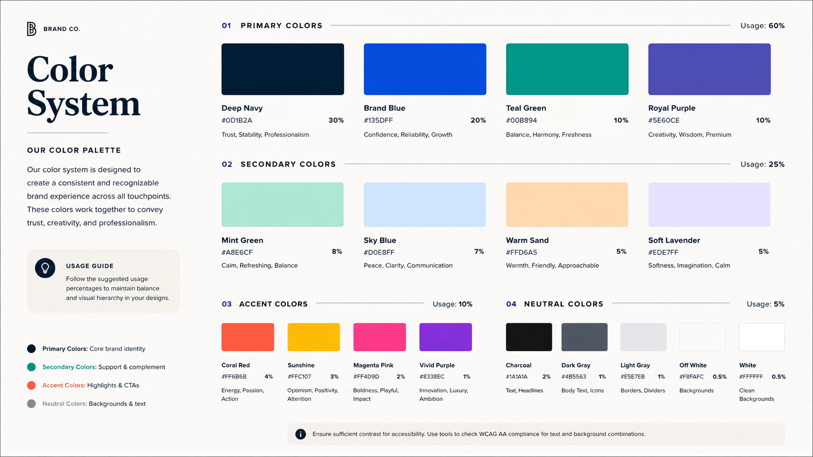
The 5 Roles Inside a Brand Color Palette
Not every brand needs the same number of colors.
But assigning roles makes a palette significantly easier to use.
1. Primary Brand Color
This is the color most strongly associated with the visual identity.
It may appear in important brand surfaces, graphics, social content, packaging, or other recurring applications.
The primary color should be distinctive enough to contribute to recognition.
However, it should also be practical.
If the color is extremely bright or difficult to combine with other elements, using it consistently can become difficult.
A primary color doesn’t have to appear everywhere.
It simply needs a clear role.
2. Secondary Colors
Secondary colors expand the visual system.
They can support campaigns, categories, illustrations, graphics, backgrounds, or content variations.
They should still feel connected to the primary color.
A common mistake is selecting secondary colors independently.
Imagine choosing a sophisticated dark blue as the primary color and then adding random orange, green, pink, and purple because each one looks attractive individually.
You may end up with a collection of nice colors rather than a coherent palette.
Secondary colors should have a relationship with the primary system.
3. Accent Color
An accent color has a specific job.
It may be used to attract attention to:
buttons,
links,
important information,
highlights,
interactive states,
or particular campaign elements.
Because accents are visually powerful, they often work better when used selectively.
If everything is an accent, nothing is an accent.
This is particularly relevant to website design.
If every button, heading, icon, border, and graphic uses a bright accent color, the interface can become visually noisy.
4. Neutral Colors
Neutrals are frequently underestimated.
White, off-white, beige, gray, charcoal, and black may occupy more visual space than the brand’s most recognizable color.
They create breathing room.
They support readability.
They establish contrast.
They allow stronger colors to become more noticeable.
For many modern brands, the neutral system is actually the foundation on which the rest of the palette operates.
A palette containing one memorable brand color and a thoughtful neutral system can be considerably more usable than a palette containing ten saturated colors.
5. Functional Colors
Functional colors communicate states rather than personality.
For example:
success,
warning,
error,
information,
disabled,
selected,
or interactive states.
These colors need special consideration because users may depend on them to understand what is happening.
This is where brand aesthetics and usability can come into conflict.
A brand may have a beautiful palette, but the interface still needs to communicate states clearly.
That means functional colors shouldn’t be chosen purely for visual consistency.
They must perform their job.
How to Build a Brand Color Palette
Once the strategic direction is clear, begin exploring palettes.
Don’t choose the final colors immediately.
Create several directions.
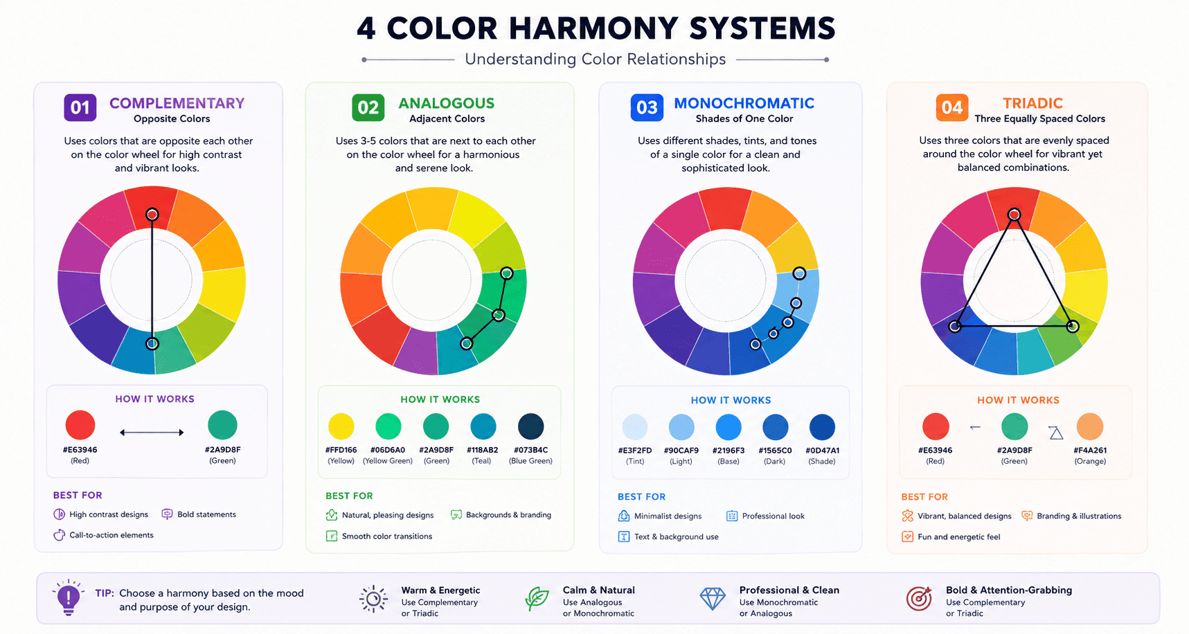
For example, if a brand should feel intelligent, premium, approachable, and modern, develop three different visual routes.
One could be restrained and monochromatic.
Another could combine a deep neutral with a warm accent.
A third could use a cooler contemporary palette.
Then compare them against the strategy.
Which one best expresses the intended personality?
Which one works for the audience?
Which one is distinctive within the category?
Which one remains usable across different applications?
This process prevents you from falling in love with a color simply because it looks attractive in isolation.
Think About Saturation and Brightness
“Blue” isn’t one color.
Neither is “green,” “red,” or “purple.”
A muted dusty blue and a highly saturated electric blue may have entirely different visual personalities.
The same applies to brightness.
A dark burgundy and a bright red can create very different levels of visual intensity.
When evaluating a palette, look beyond the basic color name.
Consider:
Hue + saturation + brightness + temperature + surrounding colors.
These characteristics influence how the palette behaves.
This is one reason professionally developed brand palettes often contain subtle variations rather than simply five random color names.
Test the Palette in Context
Never finalize brand colors solely from a palette presentation.
Put them into actual designs.
Create a homepage.
Create a social media graphic.
Create a digital product cover.
Create an email header.
Create a presentation.
Create a mobile interface.
Then examine the system.
You may discover that the “perfect” palette doesn’t actually work.
Perhaps the accent color is too dominant.
Perhaps the primary color doesn’t provide enough contrast.
Perhaps the neutral gray makes body text difficult to read.
Perhaps the colors look sophisticated in print but flat on a screen.
Real-world testing exposes those problems.
This is one of the most important differences between choosing colors and building a brand color system.
Color Contrast Is a Design Requirement, Not an Optional Detail
A brand color can look beautiful and still be unusable for text.
This is particularly important for websites and digital products.
WCAG 2.2 defines minimum contrast requirements for normal text, large text, and certain user-interface components. For normal text, the commonly applied minimum contrast ratio is 4.5:1, while large text has a lower threshold of 3:1.
This means you should not simply place your brand color on white because the combination looks attractive.
Test it.
The same applies to text placed over photographs, colored backgrounds, gradients, buttons, and interactive components.
Accessibility should be part of the identity system from the beginning.
Not something added after the brand is finished.
Brand Colors and Accessibility
Suppose your brand’s signature color is a pale lavender.
It looks excellent as a large background.
But when used as small body text on white, it may have insufficient contrast.
The solution isn’t necessarily to abandon the color.
You can assign it a different role.
Use the lighter version for backgrounds.
Create a darker variation for text.
Use charcoal for body copy.
Reserve the original color for decorative or larger elements.
This is why professional color systems often contain multiple shades of related colors.
The goal isn’t to force one exact color into every situation.
The goal is to preserve brand recognition while maintaining usability.
Don't Confuse Color Psychology With Color Stereotypes
One of the weakest approaches to branding is:
“My business is about growth, therefore I need green.”
That skips several important questions.
What kind of growth?
Who is the audience?
What category are you competing in?
What colors are already dominant in the category?
Would using green make you blend in?
What shade of green would communicate the intended personality?
What colors should accompany it?
How would the system work digitally?
The color should emerge from the broader strategic and creative direction.
This is where differentiation becomes particularly important.
If every competitor in your category uses the same blue because “blue means trust,” choosing another color—or using blue in a genuinely distinctive way—may create a stronger visual position.
The objective isn’t to follow the category automatically.
It is to understand the category before making a deliberate decision.
How Color Changes Across Industries
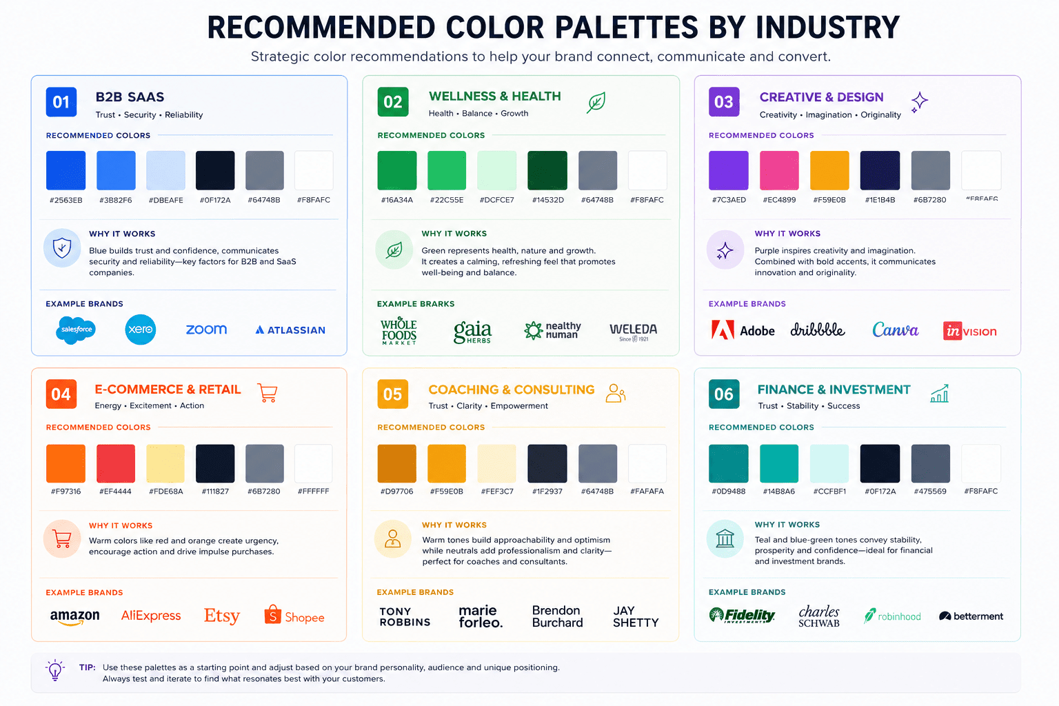
Industry conventions can influence expectations.
A healthcare company may need to consider associations with cleanliness, safety, calmness, or clinical credibility.
A food brand might use color to communicate appetite, freshness, tradition, energy, or natural ingredients.
A technology company might use color to communicate innovation, precision, accessibility, or sophistication.
But these are contextual patterns, not mandatory rules.
If every business in a category follows the same palette, the category can become visually repetitive.
That creates an opportunity for differentiation.
A brand doesn’t have to reject category conventions completely.
It can reinterpret them.
For example, instead of using the expected bright blue, a technology brand might use a deep mineral blue with warm neutrals and editorial photography.
The category remains understandable.
The identity becomes more distinctive.
Cultural Context Matters
Color can carry different associations across cultures and contexts.
This becomes especially important for brands operating internationally.
A color decision made for an audience in one market may not communicate exactly the same way in another.
That doesn’t mean you need a completely different brand palette for every country.
It means you should understand the audience you are communicating with.
If a brand serves multiple cultural markets, test important color choices within those contexts rather than assuming that one interpretation applies universally.
This is particularly important for campaigns, celebrations, packaging, and culturally significant communications.
The broader principle is simple:
Color meaning is contextual.
How to Document Colors in Brand Guidelines
Once the palette is finalized, don’t leave it inside an Illustrator file and expect everyone to remember it.
Document it.
A practical brand guideline should show each important color with its values.
Depending on your applications, this can include:
HEX for web and digital design.
RGB for screen-based applications.
CMYK for print production.
Pantone where precise spot-color reproduction is required.
But values alone aren’t enough.
Document the role of each color.
For example:
Primary: core brand expression.
Secondary: supporting visual applications.
Accent: attention and selected interactive elements.
Neutral: backgrounds and typography.
Functional: interface states.
Then show examples.
Demonstrate what happens when colors are combined.
Show approved text/background combinations.
Show button states.
Show examples of incorrect use.
The goal is to make the palette actionable.
Where Should Each Brand Color Be Used?
A common mistake is defining colors without defining their application.
Your guidelines should answer practical questions.
Should the primary color be used for headlines?
Can it be used for large backgrounds?
Should buttons always use the accent color?
Can the logo appear in the accent color?
Should body text remain neutral?
Can social media graphics use secondary colors independently?
What happens when the brand appears on photography?
These decisions create consistency.
For example, imagine your palette contains:
Primary: deep charcoal
Secondary: warm beige
Accent: muted lavender
Neutral: white and soft gray
You might decide that charcoal is the dominant text and structural color, beige creates warmth, lavender is reserved for selected highlights and calls to action, and white provides visual space.
The colors now have a hierarchy.
They aren’t simply six swatches sitting next to each other.
Your Palette Should Have a Visual Hierarchy
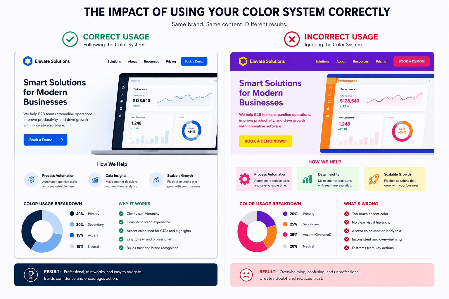
One of the easiest ways to make a brand look amateur is to use every color equally.
Imagine opening a website where the header is blue, the buttons are green, the headings are purple, the background is yellow, and the illustrations contain five additional colors.
There may be nothing inherently wrong with any individual color.
The problem is hierarchy.
A stronger system determines which colors dominate and which colors support.
A useful starting principle is:
Dominant → supporting → accent.
The exact percentages depend on the identity and application.
Don’t treat a ratio such as 60/30/10 as a universal law.
Use it as a conceptual reminder that colors need different levels of visual importance.
The palette should guide the eye rather than compete for attention.
Don't Change Your Brand Colors Every Trend Cycle
Color trends can be useful for inspiration.
They should not automatically determine your core identity.
A color that is fashionable this year may feel dated later.
If your brand changes its primary color every time a design trend changes, you sacrifice accumulated recognition.
Instead, separate your core identity from temporary campaign expression.
Your core palette can remain relatively stable.
Campaigns can introduce additional colors within controlled boundaries.
This gives the brand room to participate in current visual culture without constantly rebuilding its foundation.
That distinction becomes particularly useful for brands publishing frequently on social media.
Your content can evolve.
Your identity doesn’t need to restart every month.
How AI Can Help With Brand Color Exploration
AI tools can accelerate color exploration.
You can ask an AI system to generate palette directions based on attributes such as:
editorial,
minimal,
technical,
playful,
luxury,
organic,
bold,
or approachable.
This can be useful during exploration.
But don’t outsource the final decision.
AI-generated palettes can be aesthetically appealing while being strategically generic, inaccessible, or impractical.
Use AI to generate options.
Use strategy and design judgment to evaluate those options.
You should still check:
contrast,
digital usability,
print reproduction,
category differentiation,
brand fit,
and consistency with the rest of the identity.
AI can increase the speed of exploration.
It doesn’t eliminate the need for judgment.
For a deeper look at the relationship between AI and branding strategy, see AI Brand Strategy Guide 2026.
Common Brand Color Mistakes
Choosing colors based entirely on personal preference
You may love a particular color.
That is useful information, but it isn’t sufficient strategy.
The brand needs to work for its audience, category, positioning, and applications.
Choosing too many colors
More colors create more combinations.
More combinations create more opportunities for inconsistency.
Start with a controlled system and expand only when there is a real reason.
Using the same color for everything
A primary color doesn’t need to dominate every surface.
Give your palette hierarchy.
Ignoring contrast
A beautiful brand color is still a problem if users cannot comfortably read the text placed over it.
Copying competitor palettes
Studying competitors is useful.
Copying their visual language makes differentiation harder.
Look at the category to understand conventions, then make deliberate decisions about where to conform and where to differentiate.
Designing only for Instagram
Your palette needs to survive beyond social media.
Test it on websites, presentations, emails, documents, products, advertisements, and other relevant touchpoints.
Treating color psychology as a formula
“Color X equals emotion Y” is too simplistic.
Use color associations as hypotheses.
Then evaluate the complete system.
A Practical Brand Color Test
The strategy test
Does the palette support the brand’s positioning and personality?
The recognition test
Does it create distinctive visual cues rather than looking interchangeable with competitors?
The usability test
Can you actually use the palette for websites, social content, documents, products, and other relevant applications?
The accessibility test
Can important text and interface elements meet appropriate contrast requirements? WCAG provides measurable criteria rather than relying on subjective judgment.
The consistency test
Can another designer use the palette correctly without needing to guess what each color is supposed to do?
If the palette passes these tests, you have something much more useful than a moodboard.
You have a brand color system.
Example: Turning a Moodboard Into a Real Color System
Imagine a new creative consultancy starts with a moodboard containing:
dark gray,
cream,
soft lavender,
muted blue,
and pale gray.
At the moodboard stage, these are simply attractive colors.
The next step is assigning roles.
Dark gray becomes the primary structural color.
Cream becomes a warm background.
Soft lavender becomes the signature accent.
Muted blue becomes a supporting color for selected content categories.
Pale gray becomes a secondary neutral.
Now the palette has structure.
Next, test it.
Does dark gray work as body text?
Does lavender work for buttons?
Does cream provide enough contrast with the text?
Can blue distinguish content without overpowering the identity?
Does the combination still feel coherent on mobile?
The process transforms an aesthetic idea into a usable identity.
That is the real purpose of brand guidelines.
Color Is One Part of the Identity System
Your brand color palette cannot compensate for weak positioning.
It cannot fix unclear messaging.
It cannot make an irrelevant product suddenly relevant.
And it cannot create differentiation by itself.
Color works because it interacts with the other elements of the brand identity.
Typography changes how the color feels.
Photography changes its emotional context.
Layout changes its visual weight.
Messaging changes the meaning surrounding it.
Your logo provides another recognition cue.
Consistency reinforces all of them.
This is why the best color decisions usually happen inside a larger identity process rather than in isolation.
You can explore the other components in 7 Essential Elements of a Strong Brand Identity.
When Should You Change Your Brand Colors?
Not every visual problem requires a new palette.
Before changing your colors, identify the actual problem.
Perhaps the colors are inconsistent.
Perhaps the hierarchy isn’t defined.
Perhaps the palette doesn’t work digitally.
Perhaps the brand has changed its positioning.
Perhaps the colors have become too similar to competitors.
Perhaps accessibility has become an issue.
Perhaps the existing system was never documented.
These situations require different solutions.
Sometimes the answer is a complete rebrand.
Sometimes it is simply better guidelines.
Sometimes it is a revised secondary palette.
Sometimes the primary color can remain exactly the same.
A redesign should solve a defined problem.
It shouldn’t happen merely because another palette looks attractive.
How to Put Your Brand Colors Into Everyday Use
Once the system is finalized, build it into your actual workflow.
Your website design system should use the approved values.
Your social templates should reference the same palette.
Your presentation templates should use the same colors.
Your product graphics should follow the hierarchy.
Your email templates should use the same rules.
Your designers should have access to the documented values.
Your content team should know which colors are appropriate for which applications.
This is where the difference between brand identity and a simple color palette becomes obvious.
A palette is a collection.
A brand color system is a set of decisions.
A Simple Color Guideline Structure
If you’re creating brand guidelines for a small business, you don’t need a 100-page manual just to explain color.
A concise section can contain:
Color overview
Show the complete palette.
Color values
Document HEX, RGB, and CMYK where appropriate.
Color roles
Explain primary, secondary, accent, neutral, and functional uses.
Combination examples
Show recommended pairings.
Contrast examples
Show approved text and background combinations.
Application examples
Show the palette on real brand materials.
Misuse examples
Show combinations or applications that should be avoided.
This is enough to turn abstract design decisions into practical instructions for everyday work.
Frequently Asked Questions
What colors are best for branding?
There is no universally best brand color.
The appropriate palette depends on the brand’s positioning, audience, category, personality, differentiation, and applications. A strong palette is strategically relevant and practically usable rather than simply attractive.
How many colors should a brand have?
There is no fixed number.
Many identities use a primary color, supporting colors, neutrals, and functional colors, but the appropriate structure depends on the brand’s needs.
The objective is controlled flexibility rather than a specific number.
Does color psychology really work in branding?
Color can influence perception and associations, but it should not be treated as a universal formula.
Context, culture, shade, saturation, surrounding colors, typography, imagery, and brand positioning all affect interpretation.
Should a logo use the same color everywhere?
Not necessarily.
A brand may need different approved versions for different backgrounds and applications.
What matters is documenting which versions are appropriate and maintaining consistency.
Should I follow current color trends?
Use trends as inspiration rather than automatically replacing your core palette.
A strong identity should be recognizable beyond a single design trend.
How do I choose brand colors for a website?
Start with the broader identity, then assign clear roles to primary, secondary, accent, neutral, and functional colors.
Test the palette in actual interface designs and verify text and interface contrast rather than relying only on visual preference.
Final Thought
Good brand color selection isn’t about finding the prettiest palette.
It is about finding a palette that belongs to the brand.
Your colors should support the positioning.
They should make sense for the audience.
They should create recognition.
They should differentiate where appropriate.
They should work alongside typography, imagery, layout, and messaging.
And, critically, they should remain usable in the real environments where customers encounter the brand.
The strongest brand color systems therefore don’t begin with:
“What color should my business use?”
They begin with:
“What should my brand communicate, and how can color consistently support that idea?”
Once you answer that question, choosing colors becomes much less random.
You aren’t simply selecting swatches.
You’re building a visual language.
And when that language is documented in practical brand guidelines, everyone who creates something for the business has a clearer understanding of how the brand should look, feel, and function.
That is when color stops being decoration and becomes part of the brand itself.