People often remember a brand before they remember its name.
A familiar color.
A distinctive typeface.
A recognizable logo.
A consistent style.
These visual cues create instant recognition.
That’s the power of brand identity.
Many beginners believe a logo is enough to represent a business.
In reality, a logo is just one piece of a much larger system.
A strong brand identity brings together your visuals, personality, and messaging into one consistent experience.
It helps customers recognize your business, trust your professionalism, and remember you long after they’ve visited your website.
In this guide, you’ll learn what brand identity is, why it matters, and how to build a visual identity that supports your overall brand strategy.
What You'll Learn
ToggleWhat Is Brand Identity?
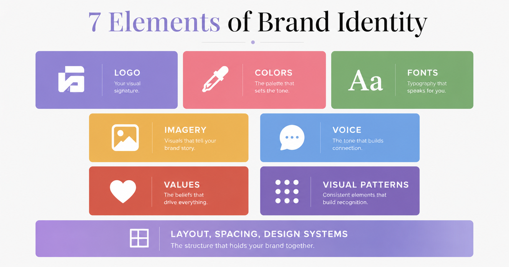
Brand identity is the collection of visual and verbal elements that represent your business and help people recognize, remember, and trust your brand.
It includes everything customers can see and experience visually.
For example:
- Logo
- Color palette
- Typography
- Photography
- Icons
- Illustrations
- Graphic elements
- Layout styles
- Brand voice
- Messaging
Together, these elements create a consistent impression across every platform.
A strong brand identity makes your business feel familiar, professional, and trustworthy
Think of Brand Identity Like Your Appearance
Imagine meeting someone for the first time.
Before they speak, you notice:
- Their clothing
- Hairstyle
- Body language
- Expressions
- Overall presentation
Those details shape your first impression.
Businesses work the same way.
Before customers read your website copy or compare your prices, they notice your visual identity.
Your colors.
Your typography.
Your photography.
Your layout.
Your logo.
These details influence how people feel about your business within seconds.
Brand Identity Is More Than a Logo
One of the biggest misconceptions beginners have is believing that designing a logo completes their branding.
It doesn’t.
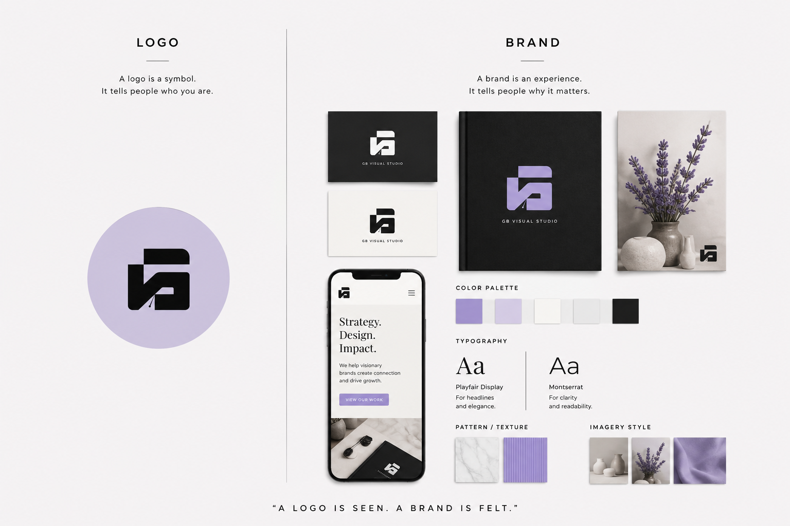
A logo is simply a symbol.
Brand identity is the complete visual system surrounding that symbol.
Without supporting elements like typography, colors, imagery, and consistent layouts, even a beautiful logo struggles to build recognition.
Think of it this way:
- Your brand strategy defines who you are.
- Your brand identity shows people who you are.
- Your marketing helps people discover you.
Each plays a different role, but they work best together.
Before you start designing your logo or choosing brand colors, it’s worth building a solid strategy first. Our Brand Strategy Guide walks you through the process of defining your purpose, positioning, audience, and messaging before moving on to visual design.
Or
If you’re still learning the basics of branding, you may want to read our Complete Guide to Branding before continuing with this article.
Why Brand Identity Matters
Good design isn’t only about looking attractive.
It’s about creating clarity.
A consistent brand identity helps customers recognize your business wherever they encounter it.
Let’s look at why that’s important.
Brand Identity Builds Recognition
Recognition is one of the first steps toward trust.
When customers repeatedly see the same colors, typography, and design style, your business becomes easier to remember.
Think about the brands you instantly recognize.
Often, you can identify them before seeing the company name.
That’s the result of consistent visual branding.
Brand Identity Builds Trust
Professional design communicates professionalism.
When your website, social media, packaging, and marketing materials all share a consistent appearance, customers feel more confident in your business.
Consistency suggests reliability.
Inconsistency creates uncertainty.
Brand Identity Creates Consistency
Without a defined visual identity, every new design becomes a different style.
One Instagram post may look modern.
The next looks playful.
Your website feels minimal.
Your emails feel corporate.
Customers notice those inconsistencies.
A documented brand identity keeps every touchpoint aligned.
Brand Identity Supports Marketing
Marketing attracts attention.
Brand identity makes that attention memorable.
Whether someone discovers your business through Pinterest, Google, Instagram, YouTube, or email, your visual identity helps connect every interaction into one recognizable brand experience.
Brand Identity Adds Business Value
A recognizable visual identity helps businesses:
- Increase brand recognition
- Build credibility
- Create customer loyalty
- Support premium pricing
- Improve marketing consistency
- Strengthen long-term growth
Good design isn’t simply decoration.
It’s a business asset.
Brand Identity vs Brand vs Branding
These terms are closely related, but they have different meanings.
| Term | Meaning |
|---|---|
| Brand | The perception people have of your business. |
| Branding | The ongoing process of shaping that perception. |
| Brand Strategy | The long-term plan that guides your brand. |
| Brand Identity | The visual and verbal system that customers recognize. |
Here’s a simple way to remember them.
Strategy decides.
Identity communicates visually.
Branding creates experiences.
The brand lives in your customer’s mind.
The Core Elements of Brand Identity
A memorable brand identity isn’t built from a logo alone.
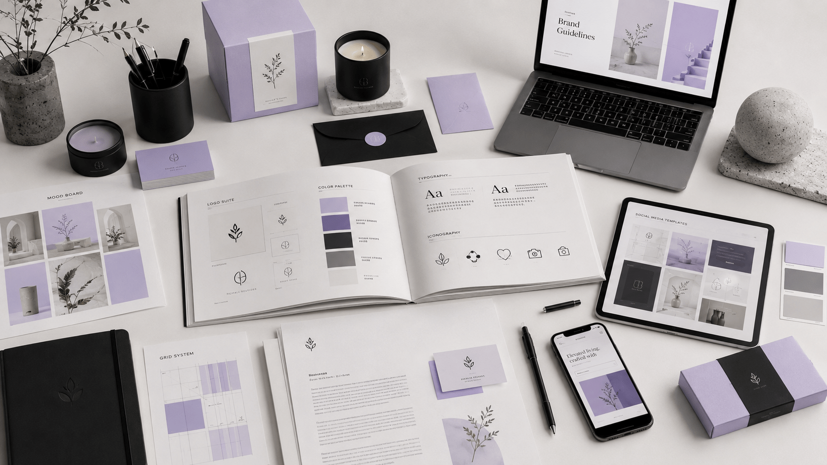
It’s a complete visual system where every element works together to create a consistent experience.
Let’s explore the ten core elements every beginner should understand.
1. Logo System
Your logo is the face of your brand.
It’s often the first visual element people notice.
However, a professional logo system includes more than one version.
A complete logo system typically contains:
- Primary logo
- Secondary logo
- Icon or symbol
- Monogram
- Horizontal version
- Vertical version
- Light version
- Dark version
Having multiple variations ensures your logo remains clear across websites, social media, packaging, presentations, and print materials.
A logo should be simple, memorable, scalable, and timeless.
It should represent your brand not decorate it.
2. Brand Color Palette
Color is one of the fastest ways people recognize a brand.
Studies have shown that consistent color usage can improve brand recognition over time.
Instead of choosing colors you personally like, choose colors that support your strategy and personality.
A professional brand palette usually includes:
Primary Colors: Your main brand colors are used most frequently.
Secondary Colors: Supporting colors that add flexibility.
Neutral Colors: White, black, gray, or beige tones are used for balance.
Accent Colors: Used sparingly to highlight important buttons, links, or calls to action.
A simple system often follows the 60-30-10 rule:
- 60% Primary color
- 30% Secondary color
- 10% Accent color
Using colors consistently across every platform strengthens recognition.
Once you’ve chosen your colors, learn how they influence customer perception in our Brand Color Psychology Guide.
3. Typography
Typography communicates personality before anyone reads your words.
For example:
- Serif fonts often feel classic and trustworthy.
- Sans-serif fonts usually feel modern and clean.
- Display fonts can add personality when used carefully.
Most brands only need two or three fonts.
A typical system includes:
- Heading font
- Body font
- Optional accent font
Avoid using many different fonts.
Consistency always creates a stronger identity.
4. Photography Style
Photography should feel like part of your brand.
Instead of using random stock images, define a clear style.
Ask yourself:
- Bright or dark?
- Minimal or detailed?
- Lifestyle or product-focused?
- Editorial or documentary?
- Warm or cool color tones?
When every image follows the same style, your brand feels more professional.
5. Illustration Style
Not every business uses illustrations.
But if yours does, consistency matters.
Define:
- Line thickness
- Shapes
- Color usage
- Detail level
- Perspective
- Texture
Whether illustrations are playful or sophisticated, they should always feel like they belong to the same brand.
6. Iconography
Icons improve navigation and communication.
Choose one consistent icon style.
For example:
- Outline icons
- Filled icons
- Rounded icons
- Geometric icons
Mixing different icon styles creates visual inconsistency.
7. Graphic Elements
Graphic elements make your brand recognizable beyond the logo.
These may include:
- Shapes
- Borders
- Patterns
- Gradients
- Textures
- Dividers
- Decorative lines
- Background elements
Think about how these elements work together across your website, presentations, packaging, and social media.
Small details often create the strongest recognition.
8. Layout System
Great brands don’t arrange content randomly.
They follow consistent layout principles.
Decide:
- Grid system
- Spacing
- Margins
- Alignment
- Button styles
- Card designs
- Section spacing
Consistent layouts improve readability and user experience.
They also make future design work much faster.
9. Brand Voice and Messaging
Although brand voice isn’t purely visual, it strongly supports your brand identity.
Imagine a luxury website using playful slang.
Or a children’s brand using formal corporate language.
The experience would feel inconsistent.
Your words should match your visuals.
For example:
A premium visual identity should usually be supported by:
- Clear language
- Confident tone
- Professional messaging
- Helpful communication
Your visuals should always match the way your brand communicates, learn how to develop a consistent tone in our Brand Voice Guide.
10. Brand Guidelines
Everything you’ve created should be documented.
Brand guidelines ensure consistency as your business grows.
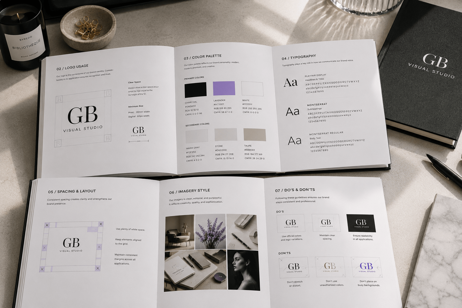
A basic brand guideline includes:
- Logo usage
- Color palette
- Typography
- Photography
- Icons
- Graphic elements
- Voice
- Messaging
- Spacing
- Do’s and Don’ts
Without documentation, consistency becomes difficult.
With documentation, everyone creates on-brand materials.
How These Elements Work Together
Think of your brand identity as an orchestra.
The logo isn’t the entire performance.
It’s one instrument.
Colors.
Typography.
Photography.
Layouts.
Icons.
Voice.
Illustrations.
Each contributes to the overall experience.
When they work together, customers recognize your business instantly.
How to Build a Brand Identity
Now that you understand the core elements of a brand identity, it’s time to put them together into a system that supports your business.
You don’t need to create everything in one day.
The goal is to build a consistent identity that grows with your brand.
Follow these steps.
Step 1: Start with Your Brand Strategy
A strong visual identity begins with strategy.
Before opening a design tool, answer these questions:
- Who is your ideal customer?
- What problem do you solve?
- What makes your business different?
- What emotions should customers feel?
- What personality should your brand communicate?
Your visual identity should reflect these answers.
If your strategy isn’t documented yet, start here:
Before choosing colors or designing a logo, I recommend reading our Brand Strategy Guide to build a strong foundation for your visual identity.
or
If you’re new to branding, start with our Branding Guide before diving into brand identity.
Step 2: Create a Mood Board
A mood board helps define the visual direction of your brand before you start designing.
Collect inspiration that reflects your desired style.
Include examples of:
- Photography
- Typography
- Color palettes
- Packaging
- Websites
- Editorial layouts
- Textures
- Patterns
Look for recurring themes.
Do your references feel minimal, bold, elegant, playful, or modern?
A clear mood board keeps future design decisions consistent.
Step 3: Design Your Logo System
Your logo should be simple enough to work across different sizes and platforms.
Instead of creating a single logo, build a flexible logo system.
Include:
- Primary logo
- Secondary logo
- Icon or favicon
- Horizontal version
- Vertical version
- Monochrome version
- Light and dark variations
Test every version on websites, business cards, social media profiles, and mobile devices.
A versatile logo system ensures your brand looks professional everywhere.
Step 4: Choose Your Color Palette
Select colors that support your positioning and personality.
Rather than following trends, choose colors you’ll be comfortable using for years.
Document:
- HEX codes
- RGB values
- CMYK values (for print)
- Usage guidelines
Define when each color should be used and how much space it occupies within your designs.
If you’re unsure how to choose colors that reflect your brand’s personality and influence customer perception, explore our Color Psychology in brand guidelines Guide before finalizing your palette.
Step 5: Select Typography
Typography should be easy to read and consistent.
Limit your system to:
- One heading font
- One body font
- One optional accent font
Document:
- Font sizes
- Line spacing
- Heading hierarchy
- Font weights
- Button styles
A documented typography system creates consistency across every platform.
Step 6: Define Supporting Visual Elements
Your identity extends beyond logos and colors.
Create supporting assets including:
- Icon style
- Illustration style
- Patterns
- Graphic shapes
- Dividers
- Image treatments
- Social media templates
These details help your brand feel recognizable even when your logo isn’t visible.
Step 7: Create Brand Guidelines
Once everything is complete, organize it into one document.
Your brand guidelines should include:
- Logo usage
- Minimum logo size
- Clear space rules
- Color palette
- Typography
- Photography style
- Iconography
- Graphic elements
- Voice and tone overview
- Layout examples
- Incorrect usage examples
This document becomes the single source of truth for anyone creating content for your business.
Step 8: Apply Your Brand Identity Consistently
The final step is consistency.
Use your visual identity across every customer touchpoint.
This includes:
- Website
- Blog
- Social media
- Email newsletters
- Presentations
- Proposals
- Product packaging
- Digital products
- Advertisements
The more consistently people experience your brand, the easier it becomes to recognize and trust.
Common Brand Identity Mistakes
Even well-designed brands can become inconsistent over time.
Avoid these common mistakes.
Mistake 1: Designing Before Planning
Many beginners jump straight into designing a logo.
Without a clear strategy, visual decisions often lack direction.
Always start with purpose, audience, and positioning.
Mistake 2: Using Too Many Fonts
A brand with five different fonts feels inconsistent.
Keep your typography system simple.
Two fonts are enough for most businesses.
Mistake 3: Choosing Trendy Colors
Color trends change quickly.
Instead of following what’s popular today, choose colors that support your personality and audience.
Timeless branding lasts longer than trendy branding.
Mistake 4: Inconsistent Photography
Mixing dark, bright, vintage, and modern photography styles creates confusion.
Choose one visual direction and stick to it.
Mistake 5: Ignoring Accessibility
Beautiful design should also be functional.
Use sufficient contrast.
Choose readable font sizes.
Avoid placing light text on light backgrounds.
Accessible brands create better experiences for everyone.
Mistake 6: Not Creating Brand Guidelines
Without documentation, consistency depends on memory.
As your business grows, different people will create content.
Brand guidelines keep everything aligned.
Conclusion
A memorable brand identity isn’t created by accident.
It’s built intentionally.
Every color.
Every font.
Every image.
Every layout.
Every design decision communicates something about your business.
When these elements work together consistently, customers begin to recognize your brand before they even read your name.
That’s the true purpose of brand identity.
Don’t aim to create the most complicated design system.
Aim to create one that’s clear, consistent, and easy to apply.
Your visual identity should make your business feel familiar, professional, and trustworthy at every customer touchpoint.
Define your audience and Build a stronger brand?
Download and get practical foundation worksheets for your Ideal Customer Profile, Brand Strategy, Brand Positioning, Brand Voice, and Brand Identity all in one place.